

Pics: Granville IslandModerators: Greg B, Nnnnsic, Geoff, Glen, gstark, Moderators
Forum rules
Please note that image critiquing is a matter of give and take: if you post images for critique, and you then expect to receive criticism, then it is also reasonable, fair and appropriate that, in return, you post your critique of the images of other members here as a matter of courtesy. So please do offer your critique of the images of others; your opinion is important, and will help everyone here enjoy their visit to far greater extent. Also please note that, unless you state something to the contrary, other members might attempt to repost your image with their own post processing applied. We see this as an acceptable form of critique, but should you prefer that others not modify your work, this is perfectly ok, and you should state this, either within your post, or within your signature. Images posted here should conform with the general forum guidelines. Image sizes should not exceed 950 pixels along the largest side (height or width) and typically no more than four images per post or thread. Please also ensure that you have a meaningful location included in your profile. Please refer to the FAQ for details of what "meaningful" is.
Previous topic • Next topic
24 posts
• Page 1 of 1
Pics: Granville Islandcomments/suggestions/critiques welocme...


Fantastic...
You have made me really want to goto Granville Island. I love the colours (or should that be colors Thanks for sharing W00DY Andrew
Nikon D3 and lot's of Nikon stuff!!
I love the third Photo, the hands.
I think it is great. I experimented with a different crop that excluded the other, blurry hands and thought this makes the hands in focus even more special. Cheers CD
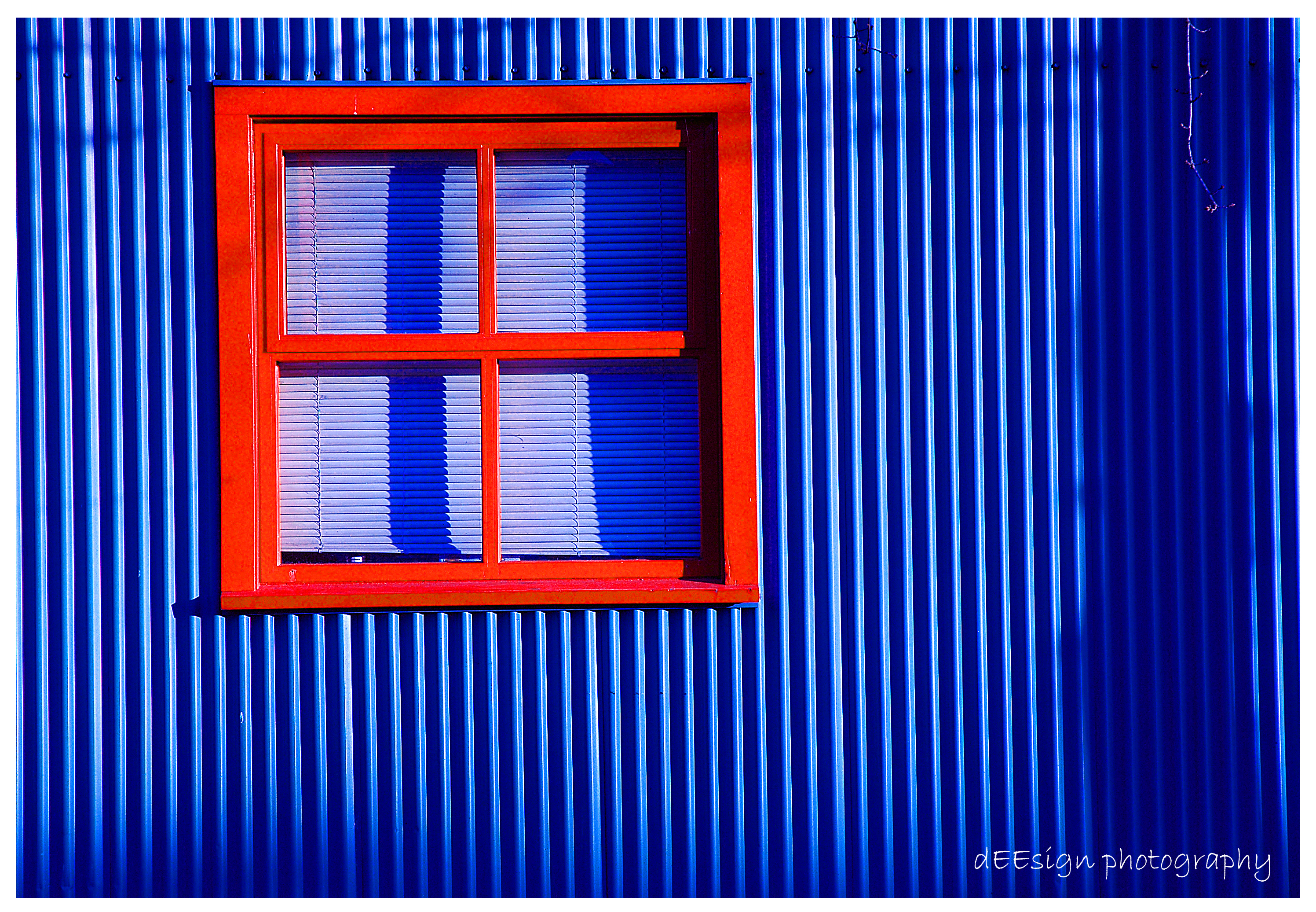
The hands and the blue wall with window are superb. The colours are exceptional and the sharpness of the first shot is great.
Chris
-------------------------------- I started my life with nothing and I’ve still got most of it left
flipfrog,
I actually like them all. Excellent work again. Special mention for the second shot, such vivid colours. BTW: the first shot is missing a direction sign to 'Birddog's place. ta ta for now; fozzie
When people ask what equipment I use - I tell them my eyes.
shot 1&2 definately need a colour cast removal. but shot 3&4 PHEW! absoutely smokin. especially shot 3 lighting, contrast and sharpness absoutely brilliant. keep it going.
shoot it real.
look! and see. Shoot and feel
Interesting - cos for me it's the colour cast that makes the shot. Flipfrog all of these are great, but the hands is superb. You have a great eye for that magic shot. Peter
Disclaimer: I know nothing about anything. *** smugmug galleries: http://www.stubbsy.smugmug.com ***
1&2 the colours are a bit much for me, i'm sorry. makes it seem too cartoonish to me.
3. hands: i REALLY love this shot - there is so much left unsaid. i imagine a real heat-to-heart discussion in a cafe. the b&w brings out the reality of the discussion. i find the logo quite distracting in this shot though 4. bridge windows: i'm not sure what this one is trying to say.
thanks for the input people!
the hands shot that alot of you seem to like is a shot of my co-student in my photography class....he is a retired physician who is the most laid back and kool kat you'd ever meet....im sure he has a thousand great stories to tell, but he just sits back and always listens to what everyone else has to say... he's obviously filled with ~wisdom~ ..which i called this shot.
BRAVO! All four.
The black and white...... tremendous! Just wonderful. Wow! (Curious, the B&W, which lense?)
Yep love all of them except the 1st. Not sure what it is. Think the colors are a bit over the top, especially the sky. Looks almost like a Photoshop gradient.
I like #3 and #4 for some reason. Even though #3 is a bit cliched. #4 looks very industrial, dark and grimey. I like!
The shot of the clenched(?) hands is very compelling, really like that. Also the shot through the grimy windows at the industrial site is a very powerful image, only whinge is the scribbled writing on the windows detracts me from the scene... Everyone's different someone else may think that adds to the image, wonder what the overall image would be through untouched grimy windows, implying no-one's been there for ages or something... Really powerful images...
Cheers, Mudder Aka Andrew
Yep, I like the scribble on the windows, though it might be good without it as well.
All of these are great. I like the hands as well. There's something funky about the signs though. They are pointed slightly downwards, which makes me a little sad considering the slightly happy colors. One of these days as it gets warmer we should meet at a court (Ambleside or Kits) and play some ball. I can't really jump but I've got like 2 zillion moves on the low post. The game at Ambleside on Sunday looked like a pretty good one.
OK - I have said my piece on the pics but I suppose one of us ignorant Ausies had to ask the question - where is Granville Island
Chris
-------------------------------- I started my life with nothing and I’ve still got most of it left
I think all the shots say something to me. They are suberb and i love them. Great art, well done.
What flash did you use for the first image, with the signs? Steve.
|D700| D2H | F5 | 70-200VR | 85 1.4 | 50 1.4 | 28-70 | 10.5 | 12-24 | SB800 | Website-> http://www.stevekilburn.com Leeds United for promotion in 2014 - Hurrah!!!
a few others form Granville Island...

just a snapshot: "KISS MY A$$" 
Killakoala:
no flash for any of these shots... Dooda: bball sounds good man! Chris: Granville Island is a public market in Vancouver...one of the most frequently visited tourist attractions in all of Canada believe it or not...
Sydney city of light, nice shothi
like your shot: http://forum.d70users.com/images/avatar ... 617ad9.jpg you got a gallery link to this image? best Wendell
Previous topic • Next topic
24 posts
• Page 1 of 1
|