|
Got a thin skin? Then look elsewhere. Post a link to an image that you've made, and invite others to offer their critiques. Honesty is encouraged, but please be positive in your constructive criticism. Flaming and just plain nastiness will not be tolerated. Please note that this is not an area for you to showcase your images, nor is this a place for you to show-off where you have been. This is an area for you to post images so that you may share with us a technique that you have mastered, or are trying to master. Typically, no more than about four images should be posted in any one post or thread, and the maximum size of any side of any image should not exceed 950 px.
Moderators: Greg B, Nnnnsic, Geoff, Glen, gstark, Moderators
Forum rules
Please note that image critiquing is a matter of give and take: if you post images for critique, and you then expect to receive criticism, then it is also reasonable, fair and appropriate that, in return, you post your critique of the images of other members here as a matter of courtesy. So please do offer your critique of the images of others; your opinion is important, and will help everyone here enjoy their visit to far greater extent.
Also please note that, unless you state something to the contrary, other members might attempt to repost your image with their own post processing applied. We see this as an acceptable form of critique, but should you prefer that others not modify your work, this is perfectly ok, and you should state this, either within your post, or within your signature.
Images posted here should conform with the general forum guidelines. Image sizes should not exceed 950 pixels along the largest side (height or width) and typically no more than four images per post or thread.
Please also ensure that you have a meaningful location included in your profile. Please refer to the FAQ for details of what "meaningful" is.
 by Mr Darcy on Sat Sep 13, 2008 2:18 pm by Mr Darcy on Sat Sep 13, 2008 2:18 pm
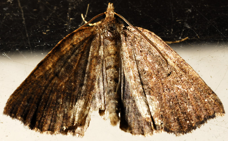
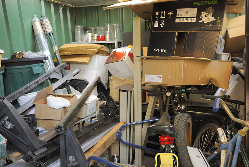
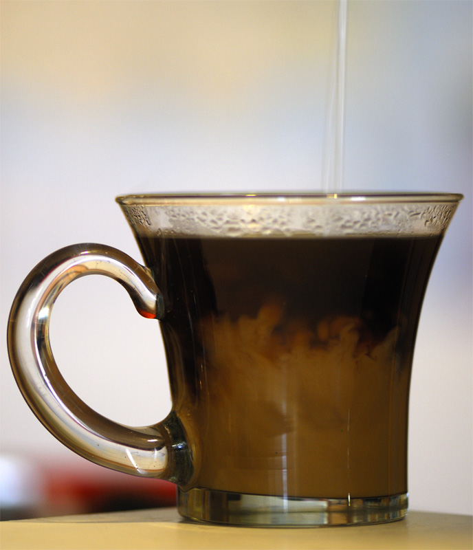
My entry in this competition: http://www.dslrusers.com/viewtopic.php?f=11&t=33889Theme 1: …moth NOt too many around at this time of year, but I raced the spiders to this one...  Theme 2: Theme 2: Now, I'm colourblind, but you can't tell me this isn't … mauve Theme 3: …mayhem Theme 3: …mayhem Not too much mayhem going on round here. This was the beat I could do   Theme 4: …milk Theme 4: …milk Greg
It's easy to be good... when there is nothing else to do
-

Mr Darcy
- Senior Member
-
- Posts: 3414
- Joined: Thu Oct 26, 2006 11:35 pm
- Location: The somewhat singed and blackened Blue Mountains
 by Big Red on Sun Sep 14, 2008 1:17 am by Big Red on Sun Sep 14, 2008 1:17 am
glad to see you managed to get them all 
-

Big Red
- Senior Member
-
- Posts: 2520
- Joined: Thu Dec 15, 2005 8:40 pm
- Location: Jacobs Well Qld ... mossie capital of the world
-
 by ATJ on Mon Sep 15, 2008 10:33 am by ATJ on Mon Sep 15, 2008 10:33 am
Greg,
Well done on finding a moth. I think the scratched glass takes away from this image and it probably could have done with less contrast.
I thought mauve was the easiest of the 4 to find subjects. I like the idea that you went with something a bit different, but I still think it is a bit of a cop-out going for the word rather than the colour, although there is a bit of mauve there.
There certainly is mayhem in that shed and you have exposed it well.
The last one is good for the subject, but the background (the vertical line and the red object) take away from the image.
-

ATJ
- Senior Member
-
- Posts: 3982
- Joined: Fri Feb 18, 2005 10:44 am
- Location: Blue Mountains, NSW
-
 by Mr Darcy on Mon Sep 15, 2008 11:10 am by Mr Darcy on Mon Sep 15, 2008 11:10 am
Thanks Andrew. The moth was less than cooperative. I saw it on the window, but by the time I had grabbed the camera and got outside, it had climbed to the top and refused to come down. I balanced on some packing to get the shot, nearly falling through the window in the process. I cloned out a lot of the clutter on the glass, but left some for context. Most if it is actually spider webs. We encourage them because they keep the mozzies down. On the book, I deliberately exposed the back with its shades of mauve. I treated it mainly as an exercise in selective focus though. I learned a lot. Even at f1.4 the books on either side were in focus, so I carefully arranged the books so that the ones on each side were not visible. I do wonder how many actually managed to get mauve. It is quite a specific colour, not purple or lavender or pink. but hey, we all know I am a (colour-blind) pedant  As for mayhem, I don't really think it qualifies (I wouldn't vote for it on those grounds). I hope others disagree though  Technically mayhem is an injury to an opponent to prevent him from attacking you. An example would be a sword cut above the eye to effectively blind your adversary. In the colloquial sense it seems to have taken on what should more correctly be called pandemonium (e.g. "there was mayhem on the roads this morning" - maybe journalists can't spell such long words  ) An action still seems to be implied though, not just the static chaos of my shed. On the last one, the vertical line is actually the milk being poured in, and was part of my concept from the start. I did think about a black ground to make it clearer, but I liked the ambiguity delivered in this shot. I do need to think about my backgrounds more though. It is all a learning process. Greg
It's easy to be good... when there is nothing else to do
-

Mr Darcy
- Senior Member
-
- Posts: 3414
- Joined: Thu Oct 26, 2006 11:35 pm
- Location: The somewhat singed and blackened Blue Mountains
 by ATJ on Mon Sep 15, 2008 2:34 pm by ATJ on Mon Sep 15, 2008 2:34 pm
Mr Darcy wrote:As for mayhem, I don't really think it qualifies (I wouldn't vote for it on those grounds). I hope others disagree though  Technically mayhem is an injury to an opponent to prevent him from attacking you. An example would be a sword cut above the eye to effectively blind your adversary. In the colloquial sense it seems to have taken on what should more correctly be called pandemonium (e.g. "there was mayhem on the roads this morning" - maybe journalists can't spell such long words  ) An action still seems to be implied though, not just the static chaos of my shed.
So... why was it included in the list of themes?
-

ATJ
- Senior Member
-
- Posts: 3982
- Joined: Fri Feb 18, 2005 10:44 am
- Location: Blue Mountains, NSW
-
 by Mr Darcy on Mon Sep 15, 2008 3:53 pm by Mr Darcy on Mon Sep 15, 2008 3:53 pm
So... why was it included in the list of themes?
Good question. I don't have a good answer. I asked for ideas from various sources, not just here. I don't recall where mayhem specifically came from. I added them all, without vetting them in any way*, to a small database, then wrote a random theme generator to pull out four themes. For this month only, I limited to themes beginning with "m" { If FirstLetterIsM(strTheme) then KeepTheme()**}. When I saw the themes, I thought "Erk" but decided to go with them anyway as others might be inspired by something that would daunt me, and we would all learn. As it was, I felt that both you and Shane captured the concept well, but I felt yours needed the text explanation for it to make sense, so I went with Shane's in the end. If you had had someone trying to get past the doors, I think you would have nailed it. This would have been akin to the chase scenes in countless movies where the hero slows the advancing villain by placing obstacles in his path. Certainly up there with the intent of mayhem, if without the physical violence. *Actually, I got a list of some 300 Emotion words from a psychologist friend. I felt they would sway the list too much and cut them down to about 10. I didn't fancy coming up with a photo for defeated, depressed, despairing, dismal all in the one month. **In reality, I filtered them using SQL a priori, but you get the idea. Greg
It's easy to be good... when there is nothing else to do
-

Mr Darcy
- Senior Member
-
- Posts: 3414
- Joined: Thu Oct 26, 2006 11:35 pm
- Location: The somewhat singed and blackened Blue Mountains
Return to Image Reviews and Critiques
|
