My new picsModerators: Greg B, Nnnnsic, Geoff, Glen, gstark, Moderators
Forum rules
Please note that image critiquing is a matter of give and take: if you post images for critique, and you then expect to receive criticism, then it is also reasonable, fair and appropriate that, in return, you post your critique of the images of other members here as a matter of courtesy. So please do offer your critique of the images of others; your opinion is important, and will help everyone here enjoy their visit to far greater extent. Also please note that, unless you state something to the contrary, other members might attempt to repost your image with their own post processing applied. We see this as an acceptable form of critique, but should you prefer that others not modify your work, this is perfectly ok, and you should state this, either within your post, or within your signature. Images posted here should conform with the general forum guidelines. Image sizes should not exceed 950 pixels along the largest side (height or width) and typically no more than four images per post or thread. Please also ensure that you have a meaningful location included in your profile. Please refer to the FAQ for details of what "meaningful" is.
Previous topic • Next topic
6 posts
• Page 1 of 1
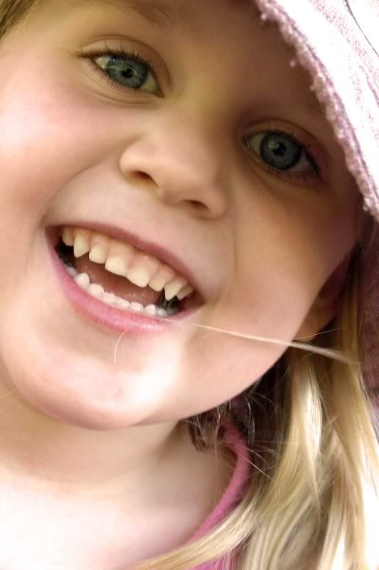
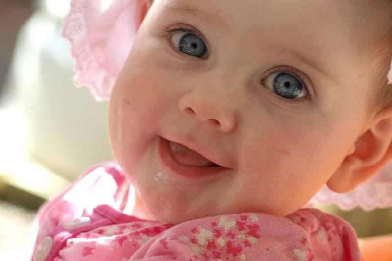
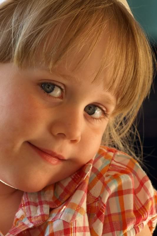
My new picsHi everyone, just posting some of my latest work, most of which i love. Some are overexposed in certain areas, but i think they add to the image, but please help me by critiqueing the work for me. Thanks everyone.
    2 x Fuji xt1,vg-xt1 grip, Fujinon xf 18-55mm 2.8-4, Fujinon xf 14mm, Fujinon 56mm 1.2.
Re: My new pics BS I think your first shot is better than the 2nd because of the light on the child's face, the light and shadows create form. I notice you favour the chopped forehead look, again not sure it totally works on the 2nd. A big improvement over the shots you first posted
http://wolfeyes.com.au Tactical Torches - Tactical Flashlights Police torch rechargeable torch military torch police military HID surefire flashlight LED torch tactical torch rechargeable wolf eyes flashlight surefire torch wolf eyes tactical torchpolice torch
Thank You
Re: My new picsThanks Glen, I agree about the 2nd image, it was by an error of being distracted while taking the image that my finger pushed the shoot button down fully resulting in the shot, i would havve prefered the whole face/forehead in the shot, but i still love the smile (being the mum makes me bias though!!) I totally agree in regards to the first shot with the light creating form, you don't think its over exposed too much? I only wish i could edit out the hair across the mouth, still learning cs2.
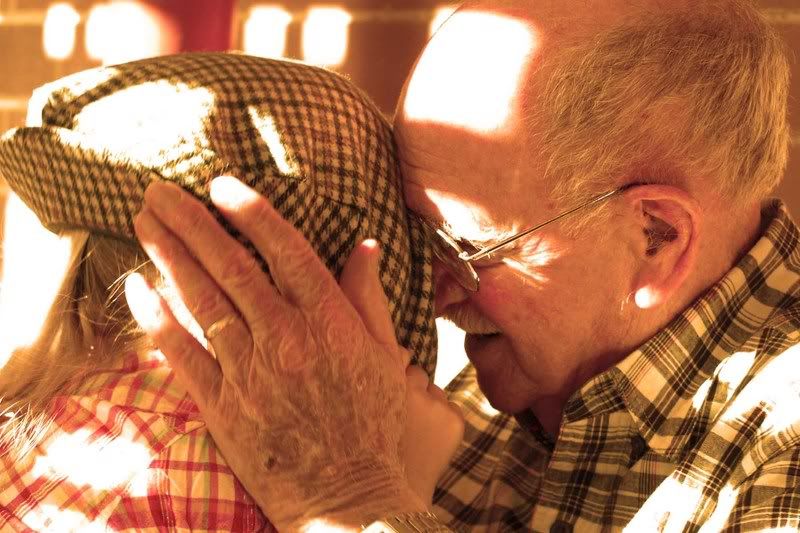
Do you think the warming filter i added to the old man image too warm? i loved it when i first shot it, although i warmed it up i think too much in cs2, would you agree? Thanks again glen. kristen 2 x Fuji xt1,vg-xt1 grip, Fujinon xf 18-55mm 2.8-4, Fujinon xf 14mm, Fujinon 56mm 1.2.
Re: My new picsKristen agree there are some hot spots in the first but the eye contact is so strong it overcomes these. I find the filter too warm, but that is personal taste. I thought it may have just been a late sunset shot.
http://wolfeyes.com.au Tactical Torches - Tactical Flashlights Police torch rechargeable torch military torch police military HID surefire flashlight LED torch tactical torch rechargeable wolf eyes flashlight surefire torch wolf eyes tactical torchpolice torch
Thank You
Re: My new picsI like #1 and #4 the eye contact in these are really good. I agree with the presence of hot spots in #1 but they are not too distracting. The warming of #3 is a tad over done, but it does give a great emotion to the shot. Well done
 Cameron
Nikon F/Nikon 1 | Hasselblad V/XPAN| Leica M/LTM |Sony α/FE/E/Maxxum/M42 Wishlist Nikkor 24/85 f/1.4| Fuji Natura Black Scout-Images | Flickr | 365Project
Re: My new pics#1, but crop it at the chin.
#3, this would have been better shot with some fill flash to help you deal with the contrasts of the shadows on the forehead. That was a very difficult shoot, btw. Also, as much as I love the exression on the gentleman's face, I cannot see with whom he's interacting, and that spoils this shot for me. It's almost a story, but it's missing an essential element. g.
Gary Stark Nikon, Canon, Bronica .... stuff The people who want English to be the official language of the United States are uncomfortable with their leaders being fluent in it - US Pres. Bartlet
Previous topic • Next topic
6 posts
• Page 1 of 1
|