|
Got a thin skin? Then look elsewhere. Post a link to an image that you've made, and invite others to offer their critiques. Honesty is encouraged, but please be positive in your constructive criticism. Flaming and just plain nastiness will not be tolerated. Please note that this is not an area for you to showcase your images, nor is this a place for you to show-off where you have been. This is an area for you to post images so that you may share with us a technique that you have mastered, or are trying to master. Typically, no more than about four images should be posted in any one post or thread, and the maximum size of any side of any image should not exceed 950 px.
Moderators: Greg B, Nnnnsic, Geoff, Glen, gstark, Moderators
Forum rules
Please note that image critiquing is a matter of give and take: if you post images for critique, and you then expect to receive criticism, then it is also reasonable, fair and appropriate that, in return, you post your critique of the images of other members here as a matter of courtesy. So please do offer your critique of the images of others; your opinion is important, and will help everyone here enjoy their visit to far greater extent.
Also please note that, unless you state something to the contrary, other members might attempt to repost your image with their own post processing applied. We see this as an acceptable form of critique, but should you prefer that others not modify your work, this is perfectly ok, and you should state this, either within your post, or within your signature.
Images posted here should conform with the general forum guidelines. Image sizes should not exceed 950 pixels along the largest side (height or width) and typically no more than four images per post or thread.
Please also ensure that you have a meaningful location included in your profile. Please refer to the FAQ for details of what "meaningful" is.
 by Mr Darcy on Tue Aug 11, 2009 12:25 am by Mr Darcy on Tue Aug 11, 2009 12:25 am
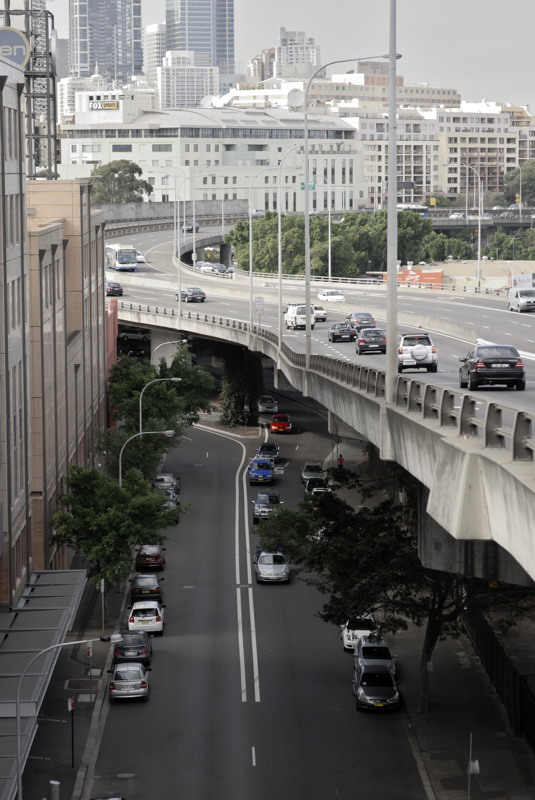
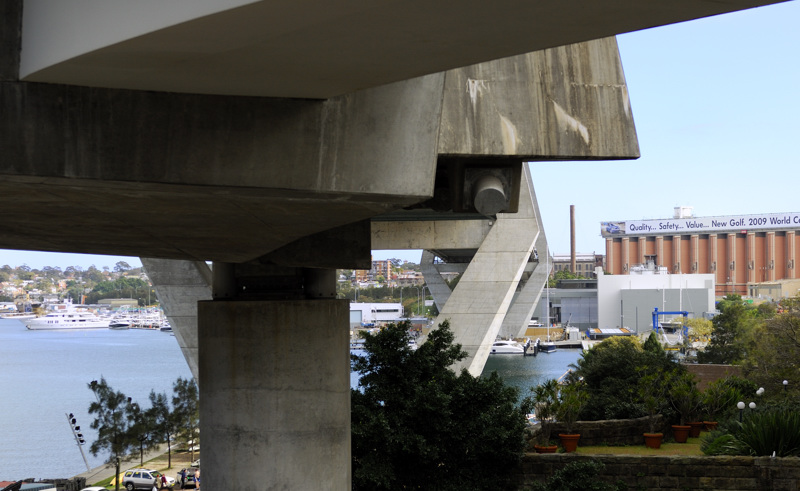
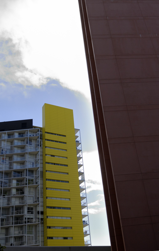
My first posts from the Anniversary Weekend walk were hereHere are some more Apart from THAT tower, this could have been taken in 1933:  I was very taken by the layers of the city that we saw. This encapsulated that feeling:  The underbelly of THAT bridge has some fascinating geometry:  More patterns. I had a great deal of difficulty chooing the rotation for this shot. In the end, I went for teh horizontAl at the base of the yellow tower. I am still not sure it was the best choice:  C&C invited Greg
It's easy to be good... when there is nothing else to do
-

Mr Darcy
- Senior Member
-
- Posts: 3414
- Joined: Thu Oct 26, 2006 11:35 pm
- Location: The somewhat singed and blackened Blue Mountains
 by biggerry on Tue Aug 11, 2009 10:05 am by biggerry on Tue Aug 11, 2009 10:05 am
I was very taken by the layers of the city that we saw. This encapsulated that feeling:
I like this one, I did not even look that way when walking up there! the idea of city layers is great, I would just straighten this one up - i think it needs about 0.5 degree CW, this could however just be me  The first image does have that old skool feeling, I reckon cloning that control tower pout would be the ticket... 
-

biggerry
- Senior Member
-
- Posts: 5930
- Joined: Tue May 13, 2008 12:40 am
- Location: Under the flight path, Newtown, Sydney
-
 by gstark on Tue Aug 11, 2009 6:18 pm by gstark on Tue Aug 11, 2009 6:18 pm
Greg,
The first two of these are excellent.
Yes, somebody needs to do something about that awful tower. Volunteers?
g.
Gary Stark
Nikon, Canon, Bronica .... stuff
The people who want English to be the official language of the United States are uncomfortable with their leaders being fluent in it - US Pres. Bartlet
-

gstark
- Site Admin
-
- Posts: 22926
- Joined: Thu Aug 05, 2004 11:41 pm
- Location: Bondi, NSW
 by colin_12 on Tue Aug 11, 2009 9:11 pm by colin_12 on Tue Aug 11, 2009 9:11 pm
I like the first and the last Greg.
I agree the first would be enhanced without the tower.
Regards Colin
Cameras, lenses and a lust for life
-

colin_12
- Senior Member
-
- Posts: 1853
- Joined: Thu Jan 04, 2007 7:10 pm
- Location: Hazelbrook
 by biggerry on Tue Aug 11, 2009 10:56 pm by biggerry on Tue Aug 11, 2009 10:56 pm
Yes, somebody needs to do something about that awful tower. Volunteers?
ASIO is now watching  oohh..you mean PP it!! nasty tower gone, plus a few other bits... 
-

biggerry
- Senior Member
-
- Posts: 5930
- Joined: Tue May 13, 2008 12:40 am
- Location: Under the flight path, Newtown, Sydney
-
 by Mr Darcy on Wed Aug 12, 2009 12:04 pm by Mr Darcy on Wed Aug 12, 2009 12:04 pm
Now if only my PP skills were up to that. I'd have had to use C4  A great improvement. Glad you stole that heater too. May it keep you warm at night  I actually liked it in the original as it echoed the tower. Greg
It's easy to be good... when there is nothing else to do
-

Mr Darcy
- Senior Member
-
- Posts: 3414
- Joined: Thu Oct 26, 2006 11:35 pm
- Location: The somewhat singed and blackened Blue Mountains
 by aim54x on Wed Aug 12, 2009 12:13 pm by aim54x on Wed Aug 12, 2009 12:13 pm
NIce work there Gerry...now lets not do that in life though (ASIO will not be happy). Can I borrow that heater?
Cameron Nikon F/Nikon 1 | Hasselblad V/XPAN| Leica M/LTM |Sony α/FE/E/Maxxum/M42Wishlist Nikkor 24/85 f/1.4| Fuji Natura BlackScout-Images | Flickr | 365Project
-

aim54x
- Senior Member
-
- Posts: 7305
- Joined: Fri Feb 01, 2008 10:13 pm
- Location: Penshurst, Sydney
-
 by biggerry on Wed Aug 12, 2009 8:51 pm by biggerry on Wed Aug 12, 2009 8:51 pm
Now if only my PP skills were up to that. I'd have had to use C4
A great improvement. Glad you stole that heater too. May it keep you warm at night
 All i did was use the clone stamp tool in photochop - it was pretty straightforward since it was clear what was behind the tower an dthe worst was in clear sky. the heater just involved some trial an error to get the tracks to look semi normal. I varied the brush size and had about 20% hardness from memory.. hope that helps The more I look at the picture the more it does remind me of the old skool image style - well done  NIce work there Gerry...now lets not do that in life though (ASIO will not be happy). Can I borrow that heater?
mmmm...toasty warm toes...sure cam, i just clone it over to you 
-

biggerry
- Senior Member
-
- Posts: 5930
- Joined: Tue May 13, 2008 12:40 am
- Location: Under the flight path, Newtown, Sydney
-
Return to Image Reviews and Critiques
|

