|
Got a thin skin? Then look elsewhere. Post a link to an image that you've made, and invite others to offer their critiques. Honesty is encouraged, but please be positive in your constructive criticism. Flaming and just plain nastiness will not be tolerated. Please note that this is not an area for you to showcase your images, nor is this a place for you to show-off where you have been. This is an area for you to post images so that you may share with us a technique that you have mastered, or are trying to master. Typically, no more than about four images should be posted in any one post or thread, and the maximum size of any side of any image should not exceed 950 px.
Moderators: Greg B, Nnnnsic, Geoff, Glen, gstark, Moderators
Forum rules
Please note that image critiquing is a matter of give and take: if you post images for critique, and you then expect to receive criticism, then it is also reasonable, fair and appropriate that, in return, you post your critique of the images of other members here as a matter of courtesy. So please do offer your critique of the images of others; your opinion is important, and will help everyone here enjoy their visit to far greater extent.
Also please note that, unless you state something to the contrary, other members might attempt to repost your image with their own post processing applied. We see this as an acceptable form of critique, but should you prefer that others not modify your work, this is perfectly ok, and you should state this, either within your post, or within your signature.
Images posted here should conform with the general forum guidelines. Image sizes should not exceed 950 pixels along the largest side (height or width) and typically no more than four images per post or thread.
Please also ensure that you have a meaningful location included in your profile. Please refer to the FAQ for details of what "meaningful" is.
 by Mr Darcy on Tue Oct 13, 2009 6:25 am by Mr Darcy on Tue Oct 13, 2009 6:25 am
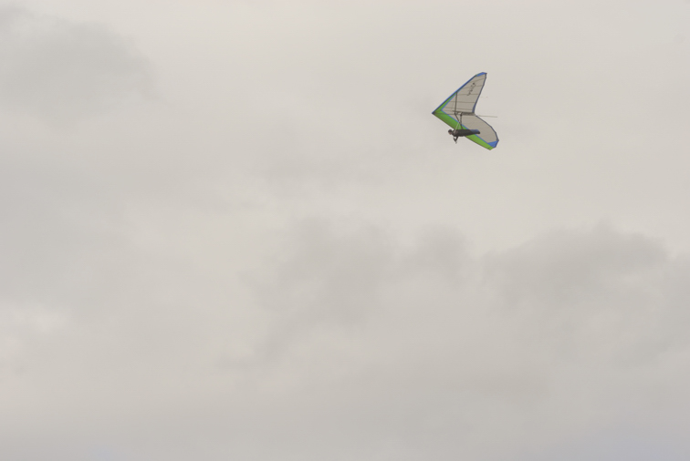
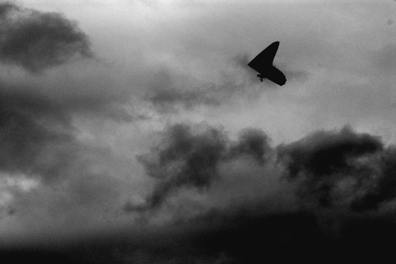
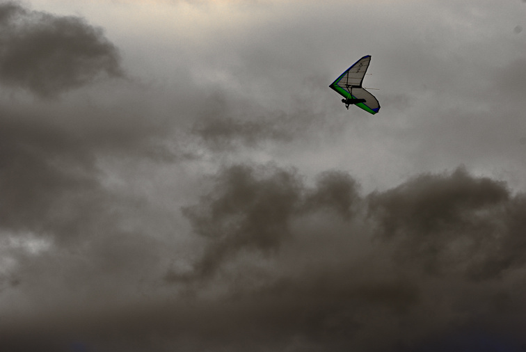
I posted one version of this here, but I was not happy with it. Here are a few more attempts. Also, I am inspired by KillaKoala to throw open the PP to the group. To this end, I am also supplying a full size, OOC(unretouched) JPG and the NEF. As with Killa, I reserve copyright. The original:  Darker as per Gary's Suggestion:  An almost workable attempt to keep the colour in the glider. Previous attempts were ditched:  Full size images http://www.swtd.com.au/images/GJK/_GJK2789.JPGhttp://www.swtd.com.au/images/GJK/_GJK2789.NEFGreg
It's easy to be good... when there is nothing else to do
-

Mr Darcy
- Senior Member
-
- Posts: 3414
- Joined: Thu Oct 26, 2006 11:35 pm
- Location: The somewhat singed and blackened Blue Mountains
 by chrisk on Wed Oct 14, 2009 1:35 pm by chrisk on Wed Oct 14, 2009 1:35 pm
greg, i really like the PP in #2. the noise and darkness you created looks ominous and surreal. i really like it.
EM1 l 7.5 l 12-40 l 14 l 17 l 25 l 45 l 60 l 75 l AW1 l V3
-

chrisk
- Senior Member
-
- Posts: 3317
- Joined: Fri Mar 09, 2007 8:50 pm
- Location: Oyster Bay, Sydney
-
 by surenj on Wed Oct 14, 2009 11:01 pm by surenj on Wed Oct 14, 2009 11:01 pm
My take, 
-

surenj
- Senior Member
-
- Posts: 7197
- Joined: Fri Sep 15, 2006 8:21 pm
- Location: Artarmon NSW
 by biggerry on Thu Oct 15, 2009 11:18 pm by biggerry on Thu Oct 15, 2009 11:18 pm
wow surenj, that rework is awesome...i also will chain you down and get the steps out of you for that one! That image could easily pass as one of those GFC advert images or similiar - ie 'getting thru troubled times',
Greg, I reckon you last BW rework is a winner, some where in the middle always seem to work... this version conveys that ominous feel quite well.
-

biggerry
- Senior Member
-
- Posts: 5930
- Joined: Tue May 13, 2008 12:40 am
- Location: Under the flight path, Newtown, Sydney
-
Return to Image Reviews and Critiques
|
