Pam

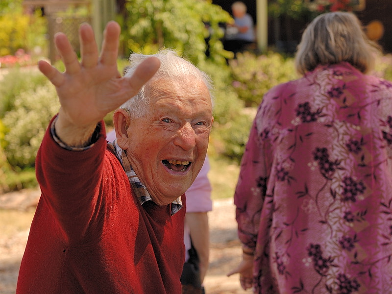
Goodbye
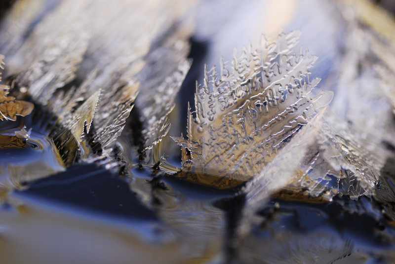
Ice 1
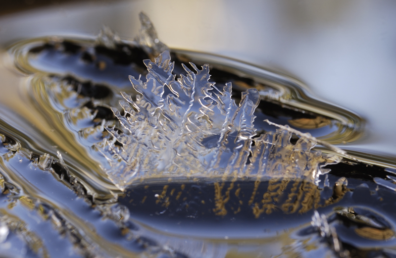
Ice 2
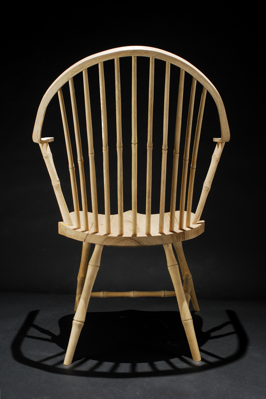
Chair
Coathanger or possibly without the tower if my PP is up to it

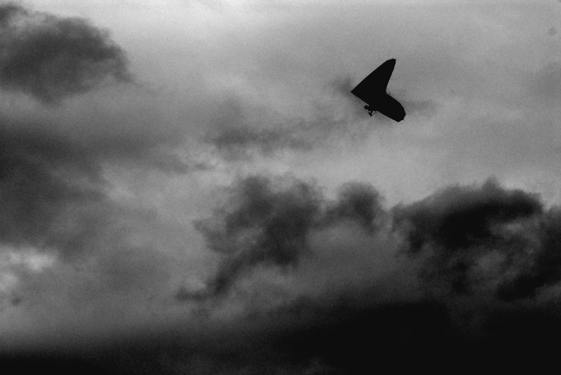
HangGlider
Potentials for exhibition late entry. Votes pleaseModerators: Greg B, Nnnnsic, Geoff, Glen, gstark, Moderators
Forum rules
Please note that image critiquing is a matter of give and take: if you post images for critique, and you then expect to receive criticism, then it is also reasonable, fair and appropriate that, in return, you post your critique of the images of other members here as a matter of courtesy. So please do offer your critique of the images of others; your opinion is important, and will help everyone here enjoy their visit to far greater extent. Also please note that, unless you state something to the contrary, other members might attempt to repost your image with their own post processing applied. We see this as an acceptable form of critique, but should you prefer that others not modify your work, this is perfectly ok, and you should state this, either within your post, or within your signature. Images posted here should conform with the general forum guidelines. Image sizes should not exceed 950 pixels along the largest side (height or width) and typically no more than four images per post or thread. Please also ensure that you have a meaningful location included in your profile. Please refer to the FAQ for details of what "meaningful" is.
Previous topic • Next topic
15 posts
• Page 1 of 1
Potentials for exhibition late entry. Votes pleasePotentials for exhibition
Pam  Goodbye  Ice 1  Ice 2  Chair  Coathanger or possibly without the tower if my PP is up to it  HangGlider  Greg
It's easy to be good... when there is nothing else to do
Re: Potentials for exhibition late entry. Votes pleaseIce 1 for me.
I do like the hang-glider as well though. I'll try to be a bit nicer, if you try to be a bit smarter.
Re: Potentials for exhibition late entry. Votes pleasei would normally choose the pepole shot but ice 2 is fascinating
Wendell Levi Teodoro
My Agents Press - Getty Images Creative Rep - T.I.D. FashionID, DBP Productions & The Nest Agency My Book - Zeduce
Re: Potentials for exhibition late entry. Votes pleaseIce two for me also..
The last thing I want to do is hurt you... but it's still on the list...
Re: Potentials for exhibition late entry. Votes pleaseIce 2 and the chair. I find the oof bit in the foreground very distracting.
Re: Potentials for exhibition late entry. Votes pleasei personally love the chair one. Somehow very theatrical.
Re: Potentials for exhibition late entry. Votes pleaseI agree with Mozzie the chair,
nikon 200- lenses- 18-70 / tamron 90 micro/ tokina 12-24 / sigma 70-200 / nikon 85 1.8 / SB600..
Re: Potentials for exhibition late entry. Votes pleaseIce 1 for me.
Re: Potentials for exhibition late entry. Votes pleaseice two!
Cameron
Nikon F/Nikon 1 | Hasselblad V/XPAN| Leica M/LTM |Sony α/FE/E/Maxxum/M42 Wishlist Nikkor 24/85 f/1.4| Fuji Natura Black Scout-Images | Flickr | 365Project
Re: Potentials for exhibition late entry. Votes pleaseIce #2
Chris
-------------------------------- I started my life with nothing and I’ve still got most of it left
Re: Potentials for exhibition late entry. Votes pleaseIf it's for an exhibition...
I'd choose the old man. Why? Because it's the one I'd look at the longest. It's a fantastic and feel good shot. Shot 1. Great shot. Thought provoking. I'd look at that and think... "I wonder wtf he's thinking and what he's so worried about?" However, My eye wanders to the left door frame that's not straight... Good? Bad? Inconcequetial? No Idea, it's totally subjective and just me thinking that it might have been a border to the pic... feel free to correct me if I"m wrong or on the wrong track... It's just what I'm thinking Shot 2: The old gentleman. Wow this is a cracker of a shot. Great expression, just makes me feel good looking at it... Starts me thinking what's going on? Is he leaving? Where are they going? Man he looks happy! Just a great feeling coming from this pic... again all subjective Pic 3: Ice 1. Too much going on here for me. I look at it and my eyes wander quickly and then focus on the OOF part jutting out at the front. Personally I'd move on. Pic 4: Good shot of the ice... interesting patterns on the ice crystals. If you were going to choose out of the ice crystals, I'd personally choose this shot. Pic 5: Great shot, nice lighting and nice shadows. Pic 6: Doesn't do it for me. There are 3 major points of interest in this photo. My eyes wander from one to the other, the bridge, the building and that stack on the left. Because I can't see the top of it, makes the image almost feel incomplete. (subjective again from me Pic 7: Good pic. Nice composition. However if I saw it in an exhibition. I'd think "nice pic... nice composition..." then move to the next one. Nothing that really draws me into it. IMHO, I'd choose no 2
Re: Potentials for exhibition late entry. Votes please
It's for this exhibition. It's not too late to join in if you want. Thanks for the detailed feedback. SOme Points #1 SHE might get upset at your comment #2. My favourite too, but as it is for potential sale, I am concerned that people will not buy a portrait of someone they do not know. I't's my father in law. #6 I know. I would take out the tower if my PP skills were up to it. If consensus were on this photo I would try real hard to remove it. It then becomes a very 1930s photo which I like. But did you notice the gas burner in the foreground that echoes the shape of the tower? Greg
It's easy to be good... when there is nothing else to do
Re: Potentials for exhibition late entry. Votes pleaseGreg, big fan of Ice 2 and the chair, which as you suggest are both saleable. Like Natskis I would prefer to see the top of the tower and top of the bridge, but I imagine that was the limitation of the lens used
http://wolfeyes.com.au Tactical Torches - Tactical Flashlights Police torch rechargeable torch military torch police military HID surefire flashlight LED torch tactical torch rechargeable wolf eyes flashlight surefire torch wolf eyes tactical torchpolice torch
Thank You
Re: Potentials for exhibition late entry. Votes please
Ohhh-errrr... apologies. it was 11pm at night...
Fair call, didn't notice the shelves... bet I would have if you did however change that doorway If you did want to fix this pic, I'd: - create a layer - copy the doorway ONLY into that layer - Freeform adjust that doorway - push it out a bit so that it's stright. - flatten image. I think that'd work. Always worth a try if you want to give it a crack
Fair point. Still a great shot
Previous topic • Next topic
15 posts
• Page 1 of 1
|