These are the raw files converted with no changes, click through to larger versions
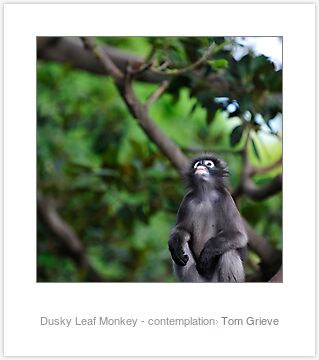
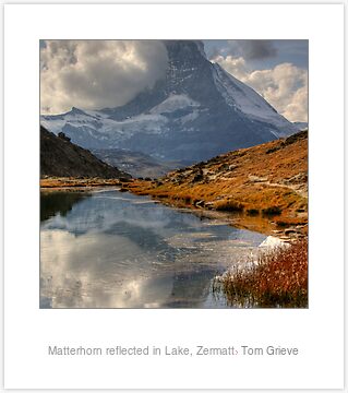
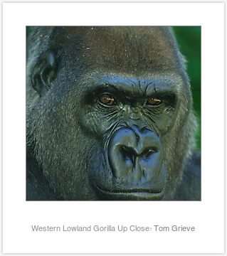
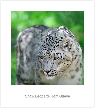
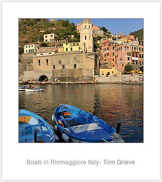
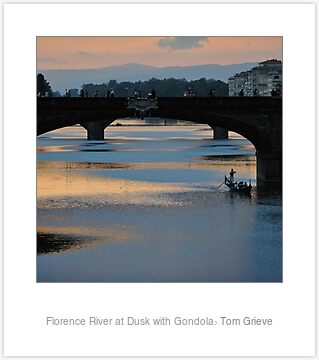
Thanks for looking ... any comments or suggestions greatly appreciated
Exhibition selectionsModerators: Greg B, Nnnnsic, Geoff, Glen, gstark, Moderators
Forum rules
Please note that image critiquing is a matter of give and take: if you post images for critique, and you then expect to receive criticism, then it is also reasonable, fair and appropriate that, in return, you post your critique of the images of other members here as a matter of courtesy. So please do offer your critique of the images of others; your opinion is important, and will help everyone here enjoy their visit to far greater extent. Also please note that, unless you state something to the contrary, other members might attempt to repost your image with their own post processing applied. We see this as an acceptable form of critique, but should you prefer that others not modify your work, this is perfectly ok, and you should state this, either within your post, or within your signature. Images posted here should conform with the general forum guidelines. Image sizes should not exceed 950 pixels along the largest side (height or width) and typically no more than four images per post or thread. Please also ensure that you have a meaningful location included in your profile. Please refer to the FAQ for details of what "meaningful" is.
Previous topic • Next topic
12 posts
• Page 1 of 1
Exhibition selectionsOK, have been going round and round in circles trying to decide .. so here's the current shortlist ... any picks?
These are the raw files converted with no changes, click through to larger versions       Thanks for looking ... any comments or suggestions greatly appreciated Last edited by tommyg on Wed Mar 24, 2010 6:13 pm, edited 1 time in total.
Re: Exhibition selectionsTom
#2 or #6 Craig
Lifes journey is not to arrive at our grave in a well preserved body but, rather to skid in sideways, totally worn out, shouting, "Wow what a ride." D70s, D300, 70-300ED, 18-70 Kit Lens, Nikkor 105 Micro. Manfrotto 190Prob Ball head. SB800 x 2.
Re: Exhibition selectionsI like the snow leopard Tom.
Regards Colin
Cameras, lenses and a lust for life
Re: Exhibition selections2, 4 or 6
Re: Exhibition selectionswow, hard choice, being a landscape man i would be inclined to go number 2, however at full size it may come second to the leopard...
 gerry's photography journey
No amount of processing will fix bad composition - trust me i have tried.
Re: Exhibition selectionsFrankly, any of them.
I personally keep coming back to #1 Greg
It's easy to be good... when there is nothing else to do
Re: Exhibition selections# 2 for me too. Great photo!
I'll try to be a bit nicer, if you try to be a bit smarter.
Re: Exhibition selectionsThese are very nice tommy!
I like the mighty Matterhorn "Old school" (Olympus OM 1&2SP )
Re: Exhibition selectionsHmm, Matterhorn is looking like a likely shot then - I have a landscape version of this photo that might work as well, will look for it
Although ... number 1 would be good too ... damn decisions ... Thanks people
Re: Exhibition selectionsHi, all interesting and technically great ..the difficult thing in knowing what to produce for commercial purposes is guessing what the audience would like on their wall and providing something they themselves could not do with their snapshot camera (albeit different quality). My personal fav is the leopard but I think commercially any of the scenery shots would do better in the market, especially somewhere well known (as they too may have visited) . Color and impact is also important so the boats could do well, the last would be a nice for the romatics, and the mountain would probably look sensational really big ...so any idea who your audience is ??? or what is popular in that area ?
DebT DebT
"so many dreams - so little time "
Previous topic • Next topic
12 posts
• Page 1 of 1
|