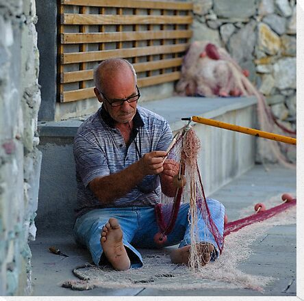
The starting image;
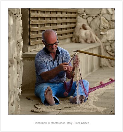
First conversion of the background to B&W;
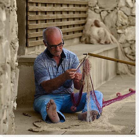
A little more refinement, leaving a little colour in the background, and having the net colour stay;
Cheers
Tom
Fisherman fixing his net - image updatedModerators: Greg B, Nnnnsic, Geoff, Glen, gstark, Moderators
Forum rules
Please note that image critiquing is a matter of give and take: if you post images for critique, and you then expect to receive criticism, then it is also reasonable, fair and appropriate that, in return, you post your critique of the images of other members here as a matter of courtesy. So please do offer your critique of the images of others; your opinion is important, and will help everyone here enjoy their visit to far greater extent. Also please note that, unless you state something to the contrary, other members might attempt to repost your image with their own post processing applied. We see this as an acceptable form of critique, but should you prefer that others not modify your work, this is perfectly ok, and you should state this, either within your post, or within your signature. Images posted here should conform with the general forum guidelines. Image sizes should not exceed 950 pixels along the largest side (height or width) and typically no more than four images per post or thread. Please also ensure that you have a meaningful location included in your profile. Please refer to the FAQ for details of what "meaningful" is.
Previous topic • Next topic
9 posts
• Page 1 of 1
Fisherman fixing his net - image updatedBeen having a play with CS4 and some photos from our recent overseas trip, interested what your thoughts are on this;
The starting image;  First conversion of the background to B&W;  A little more refinement, leaving a little colour in the background, and having the net colour stay;  Cheers Tom Last edited by tommyg on Wed Mar 24, 2010 12:01 pm, edited 6 times in total.
Re: Fisherman fixing his netA lovely Candid!
Thanks for sharing. I think this could make a nice B&W conversion as well. Geoff
Special Moments Photography Nikon D700, 50mm 1.4, 85mm 1.4, 70-200 2.8VR, SB800 & some simple studio stuff.
Re: Fisherman fixing his netI did a full B&W, but thought it lost a little, so have tried with just the background switched to B&W, although not fully happy with the changing of the colour of the net - working on that though
Re: Fisherman fixing his netI agree the net would look better with full colour. It would really make this shot with the backgound work you have done.
Regards Colin
Cameras, lenses and a lust for life
Re: Fisherman fixing his netExcellent candid portrait. I love the framing.
Alex
Re: Fisherman fixing his net - image updatedHad a bit more of a play to add the colours in the net back into the image ... does this add to the image do you think?
Thanks for the comments
Re: Fisherman fixing his net - image updated
Without being able to see the original, I can't comment If you make some changes and ask "Is this better", put in a second image with the changes, rather than replace the first. You are allowed up to four images in a post, and mods turn a blind eye if there is a good reason for more Also, the framing, while I understand the reason, makes the image smaller, and harder to judge I like this image though.As others have said, excellent framing. Greg
It's easy to be good... when there is nothing else to do
Re: Fisherman fixing his net - image updated
In fact, where there's a genuine reason, it would be encouraged. Where there's a change in processing, or an illustration of a technique, we recognise and accept that four images may often be restrictive. The four image guidelines mostly apply with images posted simply for critique; it's difficult to view and offer honest and worthwhile critique on more than four images at any time. g.
Gary Stark Nikon, Canon, Bronica .... stuff The people who want English to be the official language of the United States are uncomfortable with their leaders being fluent in it - US Pres. Bartlet
Re: Fisherman fixing his net - image updatedThat's what happens when you are playing with these things at midnight - I did add the 2 works originally, but then turned the computer off before I pressed submit - my Sony!
After reading the comments though, I thought I'd also add the original unedited version of the work as a comparison Cheers Tom
Previous topic • Next topic
9 posts
• Page 1 of 1
|