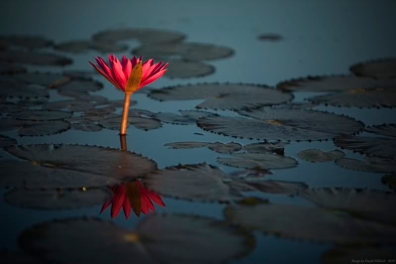
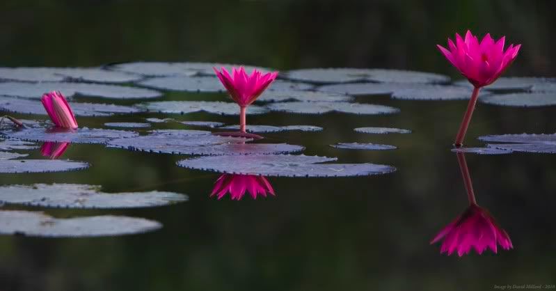
I took these at a local park here in Darwin at first light, a very pleasant time of day around here...
Comments, critiques, suggestions, recommendations... All welcome
David.


First PostModerators: Greg B, Nnnnsic, Geoff, Glen, gstark, Moderators
Forum rules
Please note that image critiquing is a matter of give and take: if you post images for critique, and you then expect to receive criticism, then it is also reasonable, fair and appropriate that, in return, you post your critique of the images of other members here as a matter of courtesy. So please do offer your critique of the images of others; your opinion is important, and will help everyone here enjoy their visit to far greater extent. Also please note that, unless you state something to the contrary, other members might attempt to repost your image with their own post processing applied. We see this as an acceptable form of critique, but should you prefer that others not modify your work, this is perfectly ok, and you should state this, either within your post, or within your signature. Images posted here should conform with the general forum guidelines. Image sizes should not exceed 950 pixels along the largest side (height or width) and typically no more than four images per post or thread. Please also ensure that you have a meaningful location included in your profile. Please refer to the FAQ for details of what "meaningful" is.
Previous topic • Next topic
9 posts
• Page 1 of 1
First PostHi all, long time lurker, first time poster.
I took these at a local park here in Darwin at first light, a very pleasant time of day around here... Comments, critiques, suggestions, recommendations... All welcome David.  
Re: First PostBoth images are very nice, I prefer the second for the complete symmetry, I would maybe just brighten and add alittle contrast to make it jump out at me, however that could just be my monitor. I would also just straighten that second one up, make a straigt line across the flowers.
good insight to pick the pano crop on that second one.  
welcome  gerry's photography journey
No amount of processing will fix bad composition - trust me i have tried.
Re: First PostHi and welcome.
Both are great compositionally. The first though is too dark overall, but paradoxically, the flower is blown in the reds. You have lost a lot of detail there. Increase the exposure overall, just a little - You don't want to lose that early evening feel - but reduce the exposure in the red channel. Perhaps just back off the saturation will do it. Otherwise you would need a PP program that will allow you to adjust each of the channels independently. Greg
It's easy to be good... when there is nothing else to do
Re: First PostWelcome!!!
I would crop in a bit on the first, and as Greg has said, maybe back off with the saturation a bit as well. I look forward too seeing more images! Cameron
Nikon F/Nikon 1 | Hasselblad V/XPAN| Leica M/LTM |Sony α/FE/E/Maxxum/M42 Wishlist Nikkor 24/85 f/1.4| Fuji Natura Black Scout-Images | Flickr | 365Project
Re: First PostWelcome to the forum David. Great first posts and we hope to see a lot more from you in the future. I'm a fan of bouncing warm colours off cool colours so your images work for me.
Regards
Matt. K
Re: First PostI like them both! Very interesting way of highlighting the subject with color. The symmetry in #2 is quite nice as well.
As mentioned, perhaps try to reduce the blown reds in the first. Welcome to the forum! 
Re: First PostHi David, and welcome.
Great first post; thanks for sharing. As others have mentioned, the reds in the first image are blown. Th issue here is that the sensors on our cameras don't always agree with red as a colour, and I frequently have to face a similar issue when shooting bands on a stage, as too often the stage lighting is predominately red. The difficulty is that you are facing a high contrast situation within the overall image: you don't want to over-expose and blow out the reds, but equally, you want to keep the dark background dark. If you're using some form of average metering - matrix in Nikon terms, or evaluative in Canon terms - then this becomes more problematic, as the metering system tries to bring everything back to what it thinks should be a normal type of image ... which is not what you're shooting. I generally use spot metering most of the time, and because of the tendency to blow reds, I will meter of the red, but dial down about 2/3 of stop to counter this. Cheers. g.
Gary Stark Nikon, Canon, Bronica .... stuff The people who want English to be the official language of the United States are uncomfortable with their leaders being fluent in it - US Pres. Bartlet
Re: First PostThanks for all the feedback guys. When I get an opportunity, I'll have a play with your suggestions (blown reds the common theme) and see how they come out. Just to answer a few questions:
I'll give it a go when I get a chance. I'm using CS3 and I understand what you're talking about. oh, and it was morning, not evening
Depending on the situation, I vary the metering mode. For this one I was in spot with -1 EV, however this was metered on the water, not the flower. As I mentioned, when I get a chance to have a play I will, but unfortunately for all of you, I'm off to Kakadu, Litchfield, and Katherine Gorge for the next week. I will no doubt have something to show when I get back. Thanks again. David
Re: First PostAs above, and thanks for sharing your photos
with us.
Previous topic • Next topic
9 posts
• Page 1 of 1
|