|
Got a thin skin? Then look elsewhere. Post a link to an image that you've made, and invite others to offer their critiques. Honesty is encouraged, but please be positive in your constructive criticism. Flaming and just plain nastiness will not be tolerated. Please note that this is not an area for you to showcase your images, nor is this a place for you to show-off where you have been. This is an area for you to post images so that you may share with us a technique that you have mastered, or are trying to master. Typically, no more than about four images should be posted in any one post or thread, and the maximum size of any side of any image should not exceed 950 px.
Moderators: Greg B, Nnnnsic, Geoff, Glen, gstark, Moderators
Forum rules
Please note that image critiquing is a matter of give and take: if you post images for critique, and you then expect to receive criticism, then it is also reasonable, fair and appropriate that, in return, you post your critique of the images of other members here as a matter of courtesy. So please do offer your critique of the images of others; your opinion is important, and will help everyone here enjoy their visit to far greater extent.
Also please note that, unless you state something to the contrary, other members might attempt to repost your image with their own post processing applied. We see this as an acceptable form of critique, but should you prefer that others not modify your work, this is perfectly ok, and you should state this, either within your post, or within your signature.
Images posted here should conform with the general forum guidelines. Image sizes should not exceed 950 pixels along the largest side (height or width) and typically no more than four images per post or thread.
Please also ensure that you have a meaningful location included in your profile. Please refer to the FAQ for details of what "meaningful" is.
 by ozimax on Mon Jun 21, 2010 3:21 pm by ozimax on Mon Jun 21, 2010 3:21 pm
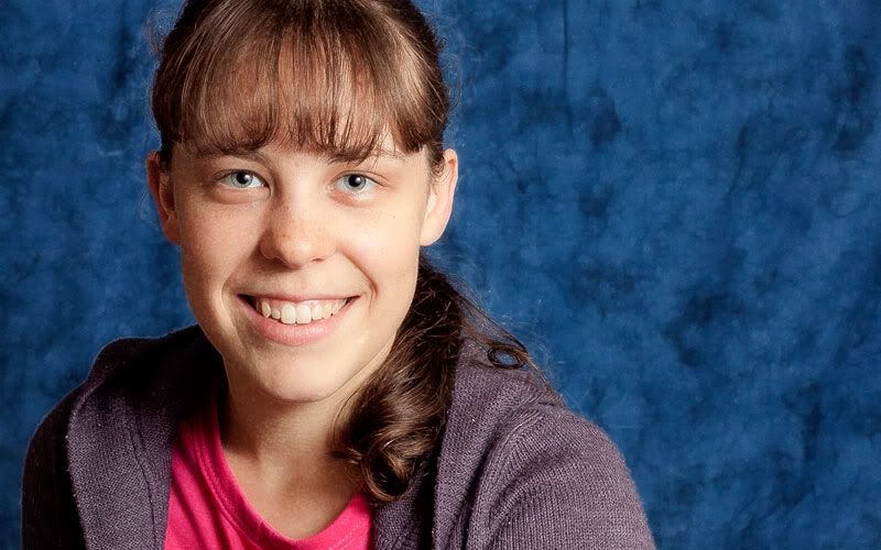
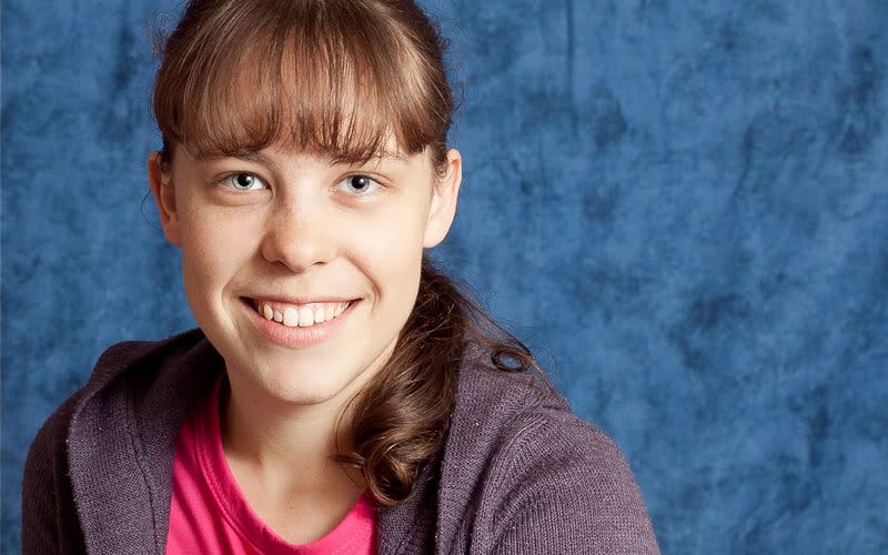
Attention all the portrait pros in DSLRusers land. I would be interested in your opinion on which of the following processing seems best. (I'm not concerned about sharpness. The original is razor sharp but heavy web compression has obviously made it softer). The image is that of my youngest daughter, who, unlike her mother, is always available to be a guinea pig for my photography! Mainly unprocessed, just tweaking WB and sharpening in PS camera raw.  Processed with a glamour PS action.  Processed with Portrait Professional  President, A.A.A.A.A (Australian Association Against Acronym Abuse)
Canon EOS R6, RF 24-105 F4, RF 70-200 F4, RF 35mm F1.8, RF 16mm F2.8
"And ye shall know the truth, and the truth shall make you free." (John 8:32)
-

ozimax
- Senior Member
-
- Posts: 5289
- Joined: Wed Jan 05, 2005 11:58 am
- Location: Coffs Harbour, NSW
 by Mr Darcy on Mon Jun 21, 2010 4:01 pm by Mr Darcy on Mon Jun 21, 2010 4:01 pm
I don't pretend to be a portrait specialist, but I would rate them
#1, #3, #2
The second looks positively unnatural
The only change I would make would be to warm the skin tones in #1 ever so slightly.
Greg
It's easy to be good... when there is nothing else to do
-

Mr Darcy
- Senior Member
-
- Posts: 3414
- Joined: Thu Oct 26, 2006 11:35 pm
- Location: The somewhat singed and blackened Blue Mountains
 by Remorhaz on Mon Jun 21, 2010 4:35 pm by Remorhaz on Mon Jun 21, 2010 4:35 pm
Yes - I also really didn't like what #2 did to the skin and if anything I like #1 and #3 about the same - which I guess means do nothing  D600, D7000, Nikon/Sigma/Tamron Lenses, Nikon Flashes, Sirui/Manfrotto/Benro SticksRodney - My Photo BlogWant: Fast Wide (14|20|24)
-

Remorhaz
- Senior Member
-
- Posts: 2547
- Joined: Thu Apr 29, 2010 8:14 pm
- Location: Sydney - Lower North Shore - D600
-
 by ozimax on Mon Jun 21, 2010 4:43 pm by ozimax on Mon Jun 21, 2010 4:43 pm
Thanks for the comments. I think the exercise may be one in futility because the web viewed images are so different from the full sized ones. Oh well, we tried.
President, A.A.A.A.A (Australian Association Against Acronym Abuse)
Canon EOS R6, RF 24-105 F4, RF 70-200 F4, RF 35mm F1.8, RF 16mm F2.8
"And ye shall know the truth, and the truth shall make you free." (John 8:32)
-

ozimax
- Senior Member
-
- Posts: 5289
- Joined: Wed Jan 05, 2005 11:58 am
- Location: Coffs Harbour, NSW
 by CraigVTR on Mon Jun 21, 2010 7:13 pm by CraigVTR on Mon Jun 21, 2010 7:13 pm
I don't think #2 works at all and #3 look over exposed to me. But I know nothing as I myself am asking for portrait advice in another thread. Sorry I cannot be any help.  Craig
Lifes journey is not to arrive at our grave in a well preserved body but, rather to skid in sideways, totally worn out, shouting, "Wow what a ride."
D70s, D300, 70-300ED, 18-70 Kit Lens, Nikkor 105 Micro. Manfrotto 190Prob Ball head. SB800 x 2.
-

CraigVTR
- Senior Member
-
- Posts: 1243
- Joined: Fri Feb 03, 2006 6:09 pm
- Location: Montville, Sunshine Coast, Queensland
-
 by sirhc55 on Mon Jun 21, 2010 9:23 pm by sirhc55 on Mon Jun 21, 2010 9:23 pm
#3  Chris
--------------------------------
I started my life with nothing and I’ve still got most of it left
-

sirhc55
- Key Member
-
- Posts: 12930
- Joined: Fri Sep 17, 2004 6:57 pm
- Location: Port Macquarie - Olympus EM-10
 by surenj on Mon Jun 21, 2010 11:48 pm by surenj on Mon Jun 21, 2010 11:48 pm
I am no portrait expert. I am expert on what I like though.  Depends on what you want to achieve with 'portrait professional'. Do you want the freckles gone? Do you want the pupil sizes to be equal? etc etc If not, #1 is the best. If yes, then you need to process manually to match those rather than run an action. If you wanted to 'beautify' a portrait, you may consider, sharpening eyes, smoothing skin, removing blemishes(while retaining texture), intensifying eye color, whitening teeth and whites of the eyes. Personally I want the color of the background changed to something less intrusive on the subject. Also a little less out of focus as well if possible to reduce the texture. The expression, eye contact etc are outstanding and it shows how much connection you have made with the subject.  I reckon keep it as it is. Very frame-able portrait.
-

surenj
- Senior Member
-
- Posts: 7197
- Joined: Fri Sep 15, 2006 8:21 pm
- Location: Artarmon NSW
 by surenj on Mon Jun 21, 2010 11:50 pm by surenj on Mon Jun 21, 2010 11:50 pm
Also, uncanny resemblence! Didn't notice initially 
-

surenj
- Senior Member
-
- Posts: 7197
- Joined: Fri Sep 15, 2006 8:21 pm
- Location: Artarmon NSW
 by Matt. K on Wed Jun 23, 2010 2:44 pm by Matt. K on Wed Jun 23, 2010 2:44 pm
OZIMAX What a brilliant young model you have there! Your image reminds me of a Chuck Close portrait (If you don't know him then just Google it to see examples). I think you have a masterpiece in the making here. Go back and do exactly what you did for the above portrait but turn the camera through to portrait mode. Get close enough to really fill the frame with her head only. Shoot at F8 or F11 with your sharpest lens.Get someone to make you a very large canvas print and Presto! Brilliant work of art! Regards
Matt. K
-

Matt. K
- Former Outstanding Member Of The Year and KM
-
- Posts: 9981
- Joined: Mon Sep 06, 2004 7:12 pm
- Location: North Nowra
 by ozimax on Wed Jun 23, 2010 4:30 pm by ozimax on Wed Jun 23, 2010 4:30 pm
Thanks Matt. I've often said that if my kids have their mother's brains and my good looks, they'll be set for life........no wonder they laugh me to scorn at every opportunity.   President, A.A.A.A.A (Australian Association Against Acronym Abuse)
Canon EOS R6, RF 24-105 F4, RF 70-200 F4, RF 35mm F1.8, RF 16mm F2.8
"And ye shall know the truth, and the truth shall make you free." (John 8:32)
-

ozimax
- Senior Member
-
- Posts: 5289
- Joined: Wed Jan 05, 2005 11:58 am
- Location: Coffs Harbour, NSW
 by zafra52 on Wed Jun 23, 2010 6:25 pm by zafra52 on Wed Jun 23, 2010 6:25 pm
As above, 1,3 and 2. I think you went a bit too far;
while 3 is too bright. I would also crop to a square
format. Too much empty space on her left.
-

zafra52
- Senior Member
-
- Posts: 4894
- Joined: Thu Dec 01, 2005 10:22 pm
- Location: Brisbane
Return to Image Reviews and Critiques
|


 I reckon keep it as it is. Very frame-able portrait.