|
Got a thin skin? Then look elsewhere. Post a link to an image that you've made, and invite others to offer their critiques. Honesty is encouraged, but please be positive in your constructive criticism. Flaming and just plain nastiness will not be tolerated. Please note that this is not an area for you to showcase your images, nor is this a place for you to show-off where you have been. This is an area for you to post images so that you may share with us a technique that you have mastered, or are trying to master. Typically, no more than about four images should be posted in any one post or thread, and the maximum size of any side of any image should not exceed 950 px.
Moderators: Greg B, Nnnnsic, Geoff, Glen, gstark, Moderators
Forum rules
Please note that image critiquing is a matter of give and take: if you post images for critique, and you then expect to receive criticism, then it is also reasonable, fair and appropriate that, in return, you post your critique of the images of other members here as a matter of courtesy. So please do offer your critique of the images of others; your opinion is important, and will help everyone here enjoy their visit to far greater extent.
Also please note that, unless you state something to the contrary, other members might attempt to repost your image with their own post processing applied. We see this as an acceptable form of critique, but should you prefer that others not modify your work, this is perfectly ok, and you should state this, either within your post, or within your signature.
Images posted here should conform with the general forum guidelines. Image sizes should not exceed 950 pixels along the largest side (height or width) and typically no more than four images per post or thread.
Please also ensure that you have a meaningful location included in your profile. Please refer to the FAQ for details of what "meaningful" is.
 by Remorhaz on Thu Jan 27, 2011 3:28 pm by Remorhaz on Thu Jan 27, 2011 3:28 pm
OK three more for your viewing pleasure - the first I actually took on the same day as the Shoe Shiner and it was probably my favourite from the day - in this case I asked and he kindly posed for me. 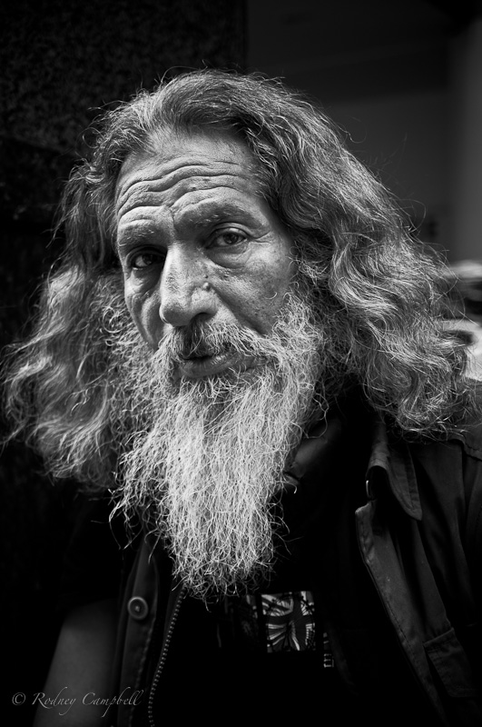 NIKON D90 + 17.0-50.0 mm f/2.8 @ 42 mm, 1/80 sec at f / 2.8, ISO 200 I liked the look of just these two people chatting and sitting on the steps of a modern tower on George St - I actually liked that lone leaf on the pavement so I decided not to clone it out  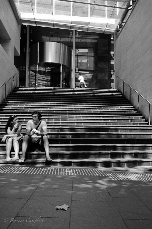 NIKON D90 + 17.0-50.0 mm f/2.8 @ 17 mm, 1/200 sec at f / 5.0, ISO 200 This last was taken into the tunnel entrance of Museum Train Station - very very dark - thus ISO 2000. Since it was 4:30PM and lots of people were heading home after work I had to wait ages for just one person to be walking away from me at the right spot for the nice silhouette and reflections. Wasn't sure whether to go for monochrome or not - I kinda liked the muted colours on the walls. 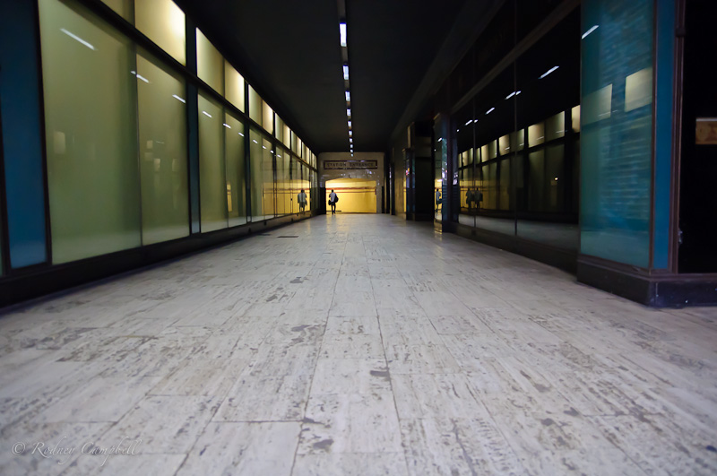 NIKON D90 + 17.0-50.0 mm f/2.8 @ 17 mm, 1/60 sec at f / 2.8, ISO 2000 As always I'd appreciate any feedback, comments, suggestions or critique... I've also taken quite a number during my Australia Day walkabout with my daughters yesterday - some that look OK - I'll post some up when I've processed them. D600, D7000, Nikon/Sigma/Tamron Lenses, Nikon Flashes, Sirui/Manfrotto/Benro SticksRodney - My Photo BlogWant: Fast Wide (14|20|24)
-

Remorhaz
- Senior Member
-
- Posts: 2547
- Joined: Thu Apr 29, 2010 8:14 pm
- Location: Sydney - Lower North Shore - D600
-
by gstark on Thu Jan 27, 2011 3:57 pm
Rodney, Great post on the first of these. Perfect choice of contrast settings, and perfect sharpening. A classic mono head shot. In the second, I too love the inclusion of the leaf; it adds some conflict into the image. Do you have just a poofteenth of a millimetre mode on the lh side of this image to include? The lady's hand is right up against the edge of the image here; just a little bit of space there would be nice. Third image - might have been nice to have shot this from one side or the other, and/or perhaps from a lower PoV? g.
Gary Stark
Nikon, Canon, Bronica .... stuff
The people who want English to be the official language of the United States are uncomfortable with their leaders being fluent in it - US Pres. Bartlet
-

gstark
- Site Admin
-
- Posts: 22926
- Joined: Thu Aug 05, 2004 11:41 pm
- Location: Bondi, NSW
by Remorhaz on Thu Jan 27, 2011 4:08 pm
gstark wrote:Great post on the first of these. Perfect choice of contrast settings, and perfect sharpening. A classic mono head shot.
Thanks - it's my favourite so far - although one of the shots from yesterdays shoot I've rated with the same number of stars In the second, I too love the inclusion of the leaf; it adds some conflict into the image. Do you have just a poofteenth of a millimetre mode on the lh side of this image to include? The lady's hand is right up against the edge of the image here; just a little bit of space there would be nice.
I didn't think I would have but I've just looked and I'd rotated the image a bit to level the step they are sitting on - I've cheated and rotated back just slightly which gave me a little more room on the left - thanks for the tip Third image - might have been nice to have shot this from one side or the other, and/or perhaps from a lower PoV?
I was quite low for this shot (sitting on the floor at the bottom of the steps) - I guess lower still could be lying on the floor or live view with the camera on the floor... D600, D7000, Nikon/Sigma/Tamron Lenses, Nikon Flashes, Sirui/Manfrotto/Benro SticksRodney - My Photo BlogWant: Fast Wide (14|20|24)
-
Remorhaz
- Senior Member
-
- Posts: 2547
- Joined: Thu Apr 29, 2010 8:14 pm
- Location: Sydney - Lower North Shore - D600
-
by colin_12 on Thu Jan 27, 2011 10:08 pm
I like the first Rodney. Classic portrait.  Regards Colin
Cameras, lenses and a lust for life
-

colin_12
- Senior Member
-
- Posts: 1853
- Joined: Thu Jan 04, 2007 7:10 pm
- Location: Hazelbrook
by surenj on Thu Jan 27, 2011 10:44 pm
#1 is superb!
-

surenj
- Senior Member
-
- Posts: 7197
- Joined: Fri Sep 15, 2006 8:21 pm
- Location: Artarmon NSW
by sirhc55 on Fri Jan 28, 2011 9:56 am
#1 - excellent
#2 - What I really like about this photo is the fact that the couple are not centred.
#3 - My favourite - the wait was worthwhile as you have captured, I believe, the loneliness of that one person.
Chris
--------------------------------
I started my life with nothing and I’ve still got most of it left
-

sirhc55
- Key Member
-
- Posts: 12930
- Joined: Fri Sep 17, 2004 6:57 pm
- Location: Port Macquarie - Olympus EM-10
by Mj on Fri Jan 28, 2011 10:00 am
yep...
#1 is spot on and a classic style.
#2 does nothing for me (I think it lacks purpose or composition of merit but others may see it different).
#3 another classic style... I would try again with a range of angles as Gary suggests and you might also like to see what desaturating the floor does to the overall feel.
Photography is not a crime, but perhaps my abuse of artistic license is?
-

Mj
- Senior Member
-
- Posts: 1048
- Joined: Fri Aug 20, 2004 3:37 pm
- Location: Breakfast Point, Sydney {Australia}
by gstark on Fri Jan 28, 2011 10:39 am
sirhc55 wrote:#2 - What I really like about this photo is the fact that the couple are not centred.
Chris, you don't know that. Rodney, Yes, the second version, with unamputated hand, is better. g.
Gary Stark
Nikon, Canon, Bronica .... stuff
The people who want English to be the official language of the United States are uncomfortable with their leaders being fluent in it - US Pres. Bartlet
-
gstark
- Site Admin
-
- Posts: 22926
- Joined: Thu Aug 05, 2004 11:41 pm
- Location: Bondi, NSW
Return to Image Reviews and Critiques
|
