|
Got a thin skin? Then look elsewhere. Post a link to an image that you've made, and invite others to offer their critiques. Honesty is encouraged, but please be positive in your constructive criticism. Flaming and just plain nastiness will not be tolerated. Please note that this is not an area for you to showcase your images, nor is this a place for you to show-off where you have been. This is an area for you to post images so that you may share with us a technique that you have mastered, or are trying to master. Typically, no more than about four images should be posted in any one post or thread, and the maximum size of any side of any image should not exceed 950 px.
Moderators: Greg B, Nnnnsic, Geoff, Glen, gstark, Moderators
Forum rules
Please note that image critiquing is a matter of give and take: if you post images for critique, and you then expect to receive criticism, then it is also reasonable, fair and appropriate that, in return, you post your critique of the images of other members here as a matter of courtesy. So please do offer your critique of the images of others; your opinion is important, and will help everyone here enjoy their visit to far greater extent.
Also please note that, unless you state something to the contrary, other members might attempt to repost your image with their own post processing applied. We see this as an acceptable form of critique, but should you prefer that others not modify your work, this is perfectly ok, and you should state this, either within your post, or within your signature.
Images posted here should conform with the general forum guidelines. Image sizes should not exceed 950 pixels along the largest side (height or width) and typically no more than four images per post or thread.
Please also ensure that you have a meaningful location included in your profile. Please refer to the FAQ for details of what "meaningful" is.
 by Remorhaz on Mon Jan 31, 2011 7:19 pm by Remorhaz on Mon Jan 31, 2011 7:19 pm
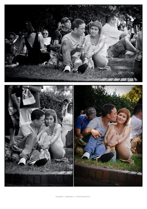
The following is my first ever Triptych which I've titled "Forgive". It was taken at The Rocks on Australia Day 2011 - my daughter and I were just having a rest in the park next to the MCA and listening to one of the concerts when we noticed this couple near us and the moments unfolding. The chronological sequence is the bottom left image first and then the central top image and finally the bottom right - the images were taken about one to two minutes apart. This (the centre top one) is probably my own favourite candid street image from the day.  NIKON D90 + 17.0-50.0 mm f/2.8 @ 50 mm, 1/50 sec at f / 5, ISO 200 I'd be interested to see what others thought and if the single colour image is OK or should I have gone all monochrome in the set. D600, D7000, Nikon/Sigma/Tamron Lenses, Nikon Flashes, Sirui/Manfrotto/Benro SticksRodney - My Photo BlogWant: Fast Wide (14|20|24)
-

Remorhaz
- Senior Member
-
- Posts: 2547
- Joined: Thu Apr 29, 2010 8:14 pm
- Location: Sydney - Lower North Shore - D600
-
 by Aussie Dave on Mon Jan 31, 2011 7:54 pm by Aussie Dave on Mon Jan 31, 2011 7:54 pm
Hi Rodney, Really nice photos and a great idea. For me, I'm not sure I'm sold on the 2 B&W with 1 colour image. I also read the sequence as being top image, then bottom left, then bottom right (not bottom left, top, bottom right)...though I see what you were trying to elude to (a trianglular pattern...yes??) I think the B&W treatment suits these images and you could have done so for all three....or as an experiment I wonder what it would look like if bottom left was B&W, top was desaturated (from full colour) by 50% and bottom right was in full colour....sort of transcending from B&W to colour as the three images progress. Not sure if this would work but just an idea that sprung to mind as I was typing...  Good stuff either way! Dave Dave
Nikon D7000 | 18-105 VR Lens | Nikon 50 1.8G | Sigma 70-300 APO II Super Macro | Tokina 11-16 AT-X | Nikon SB-800 | Lowepro Mini Trekker AWII
Photography = Compromise
-

Aussie Dave
- Senior Member
-
- Posts: 1427
- Joined: Sun Nov 21, 2004 1:40 pm
- Location: West. Suburbs, Melbourne [Nikon D7000]
 by gstark on Tue Feb 01, 2011 9:02 am by gstark on Tue Feb 01, 2011 9:02 am
I would lay them out in a horizontal plan, cropping the height on the first and last to match that of the middle image.
And I don't like the third image being in colour either; the transition from mono to colour does nothing for me.
One final point - of detail - is the fence at the bottom of the image; you have a very different angle for the fence on the last of the images here; I think that may be a little distracting; do you have an alternate image with a more consistent fenceline in it that can be substituted here?
g.
Gary Stark
Nikon, Canon, Bronica .... stuff
The people who want English to be the official language of the United States are uncomfortable with their leaders being fluent in it - US Pres. Bartlet
-

gstark
- Site Admin
-
- Posts: 22926
- Joined: Thu Aug 05, 2004 11:41 pm
- Location: Bondi, NSW
 by Alex on Tue Feb 01, 2011 9:06 am by Alex on Tue Feb 01, 2011 9:06 am
I agree, great series. I would make them all b&w. I think the logical sequence is top left to right to bottom, but you can interpret it the other way too, I guess. The suggestion to put them all in one row horizontally is great.
Alex
-

Alex
- Senior Member
-
- Posts: 3465
- Joined: Thu Feb 24, 2005 6:14 pm
- Location: Melbourne - Nikon
-
 by Remorhaz on Wed Feb 02, 2011 3:49 pm by Remorhaz on Wed Feb 02, 2011 3:49 pm
Aussie Dave wrote:For me, I'm not sure I'm sold on the 2 B&W with 1 colour image.
I also read the sequence as being top image, then bottom left, then bottom right (not bottom left, top, bottom right)...though I see what you were trying to elude to (a trianglular pattern...yes??)
well... not really I just liked the "middle image" the best so I made sure it was the largest one at the top I think the B&W treatment suits these images and you could have done so for all three....
gstark wrote:I would lay them out in a horizontal plan, cropping the height on the first and last to match that of the middle image.
Thanks - I've tried making three verticals next to each other bot then finally settled on three square crops which I eventually liked better. And I don't like the third image being in colour either; the transition from mono to colour does nothing for me.
and gone - all same processed mono now  One final point - of detail - is the fence at the bottom of the image; you have a very different angle for the fence on the last of the images here; I think that may be a little distracting; do you have an alternate image with a more consistent fenceline in it that can be substituted here?
I didn't - I wasn't actually looking through the viewfinder when I took the images - just sort of pointing the camera in the right direction - the last I purposely angled the camera - I wasn't expecting to make a triptych at the time so was expecting the image to standalone. So I've had to crop and rotate to make them all seem more similar  Alex wrote:I agree, great series. I would make them all b&w. I think the logical sequence is top left to right to bottom, but you can interpret it the other way too, I guess. The suggestion to put them all in one row horizontally is great.
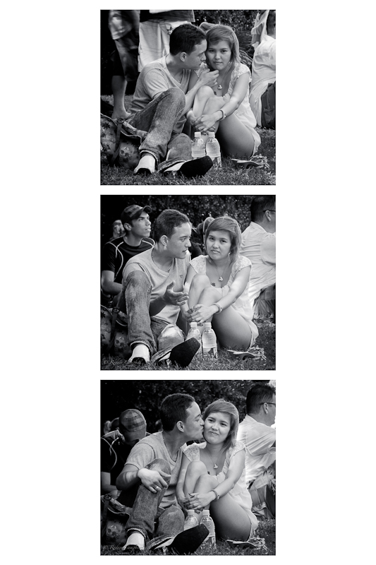
Thankyou all for your great feedback - I've created a new version now and would be interested to see if you think it's been improved...  D600, D7000, Nikon/Sigma/Tamron Lenses, Nikon Flashes, Sirui/Manfrotto/Benro SticksRodney - My Photo BlogWant: Fast Wide (14|20|24)
-

Remorhaz
- Senior Member
-
- Posts: 2547
- Joined: Thu Apr 29, 2010 8:14 pm
- Location: Sydney - Lower North Shore - D600
-
 by Div on Thu Feb 03, 2011 9:03 am by Div on Thu Feb 03, 2011 9:03 am
To go against the grain I like the original actually.
The arrangement with the wider photo up the top and then the cropped ones underneath, gives the feel of looking at a scene, seeing something interesting and focusing on the subject to see what happens.
I quite like the colour photo at the end aswell as it gives the final statement and makes the triptych more interesting in my opinion. I like the original crops also as then i want to spend more time in each image as they seem different, with slightly different perspectives. With the new crops i just found i quickly browse over them thinking they are almost the same.
Tricks of the mind
Great captures though.
-Dave
-
Div
- Member
-
- Posts: 111
- Joined: Thu Sep 14, 2006 11:21 am
- Location: Turner
 by surenj on Thu Feb 03, 2011 11:07 am by surenj on Thu Feb 03, 2011 11:07 am
Prefer the #2 version. quite like how it's got more DOF. Makes it feel more impormptu rather than staged. 
-

surenj
- Senior Member
-
- Posts: 7197
- Joined: Fri Sep 15, 2006 8:21 pm
- Location: Artarmon NSW
 by sirhc55 on Thu Feb 03, 2011 12:23 pm by sirhc55 on Thu Feb 03, 2011 12:23 pm
I agree with Gary in that a triptych would normally be on a horizontal plane and would tell the story in a more fluid manner.
Also the sequence, it does not really matter in which order the pics were taken, more how the story unfolds. To this end I would suggest (from the horizontal configuration) the order as follows - left pic 2 (middle shot), centre pic 1 (top shot) and finally pic 3.
The flow then would give a more precise story.
By the way, love the shots.
Chris
--------------------------------
I started my life with nothing and I’ve still got most of it left
-

sirhc55
- Key Member
-
- Posts: 12930
- Joined: Fri Sep 17, 2004 6:57 pm
- Location: Port Macquarie - Olympus EM-10
 by Mj on Thu Feb 03, 2011 9:37 pm by Mj on Thu Feb 03, 2011 9:37 pm
I agree very much with Chris... change the order... reframe it horizontal and then you've got a beaut.
Photography is not a crime, but perhaps my abuse of artistic license is?
-

Mj
- Senior Member
-
- Posts: 1048
- Joined: Fri Aug 20, 2004 3:37 pm
- Location: Breakfast Point, Sydney {Australia}
 by gstark on Fri Feb 04, 2011 7:08 am by gstark on Fri Feb 04, 2011 7:08 am
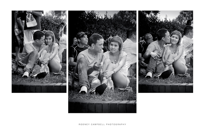
I agree with Chris agreeing with Gary .... oh, wait, that's me agreeing with me.  Seriously, I like how you've now cropped the images square, which has removed the fence that was previously giving me issues. Good work. As an additional thought on the way the triptych is aligned, let's say that you want to print this and have them mounted, framed, and hung on a wall, perhaps displayed in your living room? I have a triptych in my living room, a signed, numbered print that I acquired in N'Awlins in 1995. To me, this set of images expresses the essence that's New Orleans, and it contains two smaller images with a larger one in the middle. Each if the images is about 14" high; there's about three inches between each one plus one and a half inches to each side. Laid out horizontally (as it is), this set is in a frame and basically takes up a panoramic format, but it would have no issues at all enjoying a position on pretty much any wall, any where. Were this to be laid out in a vertical format, it would then want to occupy over four feet of vertical space, making it somewhat difficult to place in many instances. You might like to consider that aspect as you lay these images out .... g.
Gary Stark
Nikon, Canon, Bronica .... stuff
The people who want English to be the official language of the United States are uncomfortable with their leaders being fluent in it - US Pres. Bartlet
-

gstark
- Site Admin
-
- Posts: 22926
- Joined: Thu Aug 05, 2004 11:41 pm
- Location: Bondi, NSW
 by Remorhaz on Fri Feb 04, 2011 4:59 pm by Remorhaz on Fri Feb 04, 2011 4:59 pm
Thanks everyone for their very helpful feedback... and for persisting with me  gstark wrote:I agree with Chris agreeing with Gary .... oh, wait, that's me agreeing with me.  As an additional thought on the way the triptych is aligned, let's say that you want to print this and have them mounted, framed, and hung on a wall, perhaps displayed in your living room? ...
Yeah - I wasn't really thinking about how this was going to look framed but rather how it was going to look posted on my blog (with a more narrow central column)  Anyway - here is the original (well middle version) horizontal, all monochrome, vertical crops triptych I had created before the vertical squares one. Obviously the order is still chronological but personally I like the central larger image the most which is why I originally gave it precedence   D600, D7000, Nikon/Sigma/Tamron Lenses, Nikon Flashes, Sirui/Manfrotto/Benro SticksRodney - My Photo BlogWant: Fast Wide (14|20|24)
-

Remorhaz
- Senior Member
-
- Posts: 2547
- Joined: Thu Apr 29, 2010 8:14 pm
- Location: Sydney - Lower North Shore - D600
-
Return to Image Reviews and Critiques
|
