|
Got a thin skin? Then look elsewhere. Post a link to an image that you've made, and invite others to offer their critiques. Honesty is encouraged, but please be positive in your constructive criticism. Flaming and just plain nastiness will not be tolerated. Please note that this is not an area for you to showcase your images, nor is this a place for you to show-off where you have been. This is an area for you to post images so that you may share with us a technique that you have mastered, or are trying to master. Typically, no more than about four images should be posted in any one post or thread, and the maximum size of any side of any image should not exceed 950 px.
Moderators: Greg B, Nnnnsic, Geoff, Glen, gstark, Moderators
Forum rules
Please note that image critiquing is a matter of give and take: if you post images for critique, and you then expect to receive criticism, then it is also reasonable, fair and appropriate that, in return, you post your critique of the images of other members here as a matter of courtesy. So please do offer your critique of the images of others; your opinion is important, and will help everyone here enjoy their visit to far greater extent.
Also please note that, unless you state something to the contrary, other members might attempt to repost your image with their own post processing applied. We see this as an acceptable form of critique, but should you prefer that others not modify your work, this is perfectly ok, and you should state this, either within your post, or within your signature.
Images posted here should conform with the general forum guidelines. Image sizes should not exceed 950 pixels along the largest side (height or width) and typically no more than four images per post or thread.
Please also ensure that you have a meaningful location included in your profile. Please refer to the FAQ for details of what "meaningful" is.
 by !~DeViNe~DaRkNeSs~! on Mon Mar 14, 2011 8:09 pm by !~DeViNe~DaRkNeSs~! on Mon Mar 14, 2011 8:09 pm
Hi Guys, Haven't posted in AGES! Recently I tried to re-visit an old technique I used for a pic I took a year back and am very unsure of it, same as when I originally took the first yet everyone else loved it....I just can't be happy lol Anyway, your opinions greatly appreciated! The first that I never really liked: 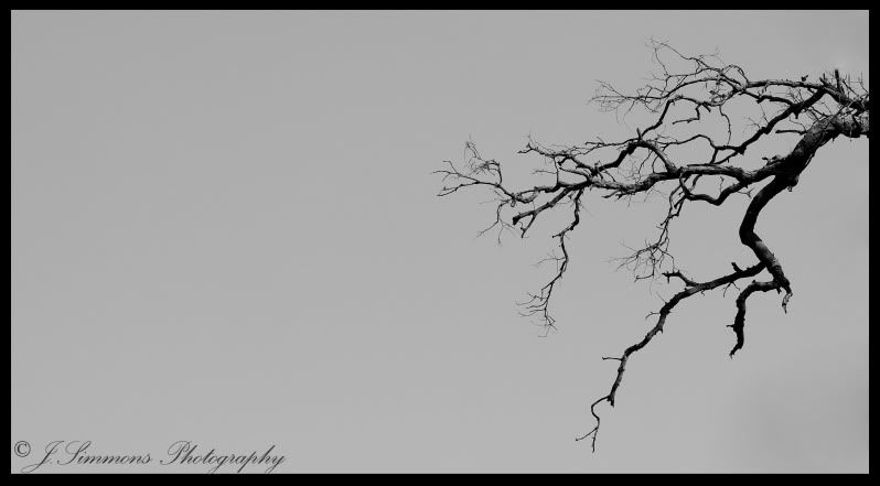 And my more recent attempt .... 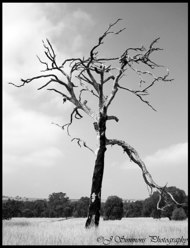 Canon EOS 40D
Canon EOS 400D
50mm 1.8 EF
-

!~DeViNe~DaRkNeSs~!
- Member
-
- Posts: 437
- Joined: Mon Dec 18, 2006 9:19 am
- Location: Essendon - MELBOURNE
by Remorhaz on Mon Mar 14, 2011 8:33 pm
I prefer the first to the second (although perhaps just a little too much negative space) - it's simple and elegant. The second is probably a bit too busy to be minimal.
D600, D7000, Nikon/Sigma/Tamron Lenses, Nikon Flashes, Sirui/Manfrotto/Benro SticksRodney - My Photo BlogWant: Fast Wide (14|20|24)
-

Remorhaz
- Senior Member
-
- Posts: 2547
- Joined: Thu Apr 29, 2010 8:14 pm
- Location: Sydney - Lower North Shore - D600
-
by aim54x on Mon Mar 14, 2011 8:42 pm
I like #1, but #2 does not work for me. Is it forum softening or is it just a bit soft?
Cameron Nikon F/Nikon 1 | Hasselblad V/XPAN| Leica M/LTM |Sony α/FE/E/Maxxum/M42Wishlist Nikkor 24/85 f/1.4| Fuji Natura BlackScout-Images | Flickr | 365Project
-

aim54x
- Senior Member
-
- Posts: 7305
- Joined: Fri Feb 01, 2008 10:13 pm
- Location: Penshurst, Sydney
-
by Reschsmooth on Mon Mar 14, 2011 9:43 pm
I prefer the 1st as well but agree it needs a small amount chopped off the left.
Regards, Patrick
Two or three lights, any lens on a light-tight box are sufficient for the realisation of the most convincing image. Man Ray 1935.
Our mug is smug
-

Reschsmooth
- Senior Member
-
- Posts: 4164
- Joined: Tue Aug 01, 2006 2:16 pm
- Location: Just next to S'nives.
-
by surenj on Mon Mar 14, 2011 9:51 pm
I prefer the composition of #1 and the tones of #2. Go figure! BTW Welcome back! I'd encourage you to critique some other photos here if you want to shake off the cob webs.... 
-

surenj
- Senior Member
-
- Posts: 7197
- Joined: Fri Sep 15, 2006 8:21 pm
- Location: Artarmon NSW
by dviv on Tue Mar 15, 2011 8:41 am
I like number 1 but feel it would be better if there was some gradation/detail in the clouds - not a lot, just enough so it's not a solid colour.
7D, 60D, 70-200mm f/4LIS, 17-50mm f/2.8, 10-22mm f/3.5-4.5, 50mm f/1.4, 100mm f/2.8 Macro, 580EX II
-

dviv
- Senior Member
-
- Posts: 1085
- Joined: Tue Oct 10, 2006 8:50 am
- Location: North Shore, Sydney
by biggerry on Tue Mar 15, 2011 9:19 am
And my more recent attempt ....
needs some more 'punch', the image looks grey and muddy, imo, boost the contrast to make the blacks black and teh whites white. surenj wrote:I prefer the composition of #1 and the tones of #2. Go figure! BTW Welcome back! I'd encourage you to critique some other photos here if you want to shake off the cob webs....

-

biggerry
- Senior Member
-
- Posts: 5930
- Joined: Tue May 13, 2008 12:40 am
- Location: Under the flight path, Newtown, Sydney
-
Return to Image Reviews and Critiques
|
