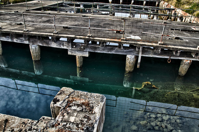
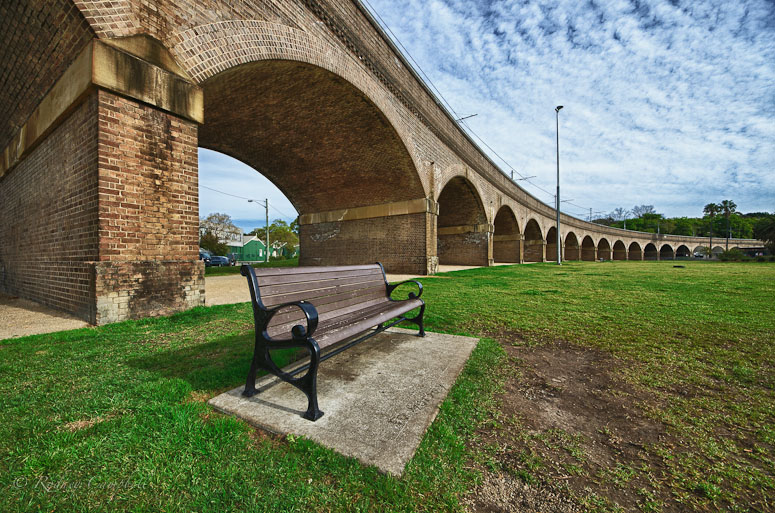
I'm not exactly sure which of the following two images I like best (if any
Bridges...Moderators: Greg B, Nnnnsic, Geoff, Glen, gstark, Moderators
Forum rules
Please note that image critiquing is a matter of give and take: if you post images for critique, and you then expect to receive criticism, then it is also reasonable, fair and appropriate that, in return, you post your critique of the images of other members here as a matter of courtesy. So please do offer your critique of the images of others; your opinion is important, and will help everyone here enjoy their visit to far greater extent. Also please note that, unless you state something to the contrary, other members might attempt to repost your image with their own post processing applied. We see this as an acceptable form of critique, but should you prefer that others not modify your work, this is perfectly ok, and you should state this, either within your post, or within your signature. Images posted here should conform with the general forum guidelines. Image sizes should not exceed 950 pixels along the largest side (height or width) and typically no more than four images per post or thread. Please also ensure that you have a meaningful location included in your profile. Please refer to the FAQ for details of what "meaningful" is.
Previous topic • Next topic
6 posts
• Page 1 of 1
Bridges...Next to the dockyards along Rozelle Bay... this was taken handheld high up in the air pointing the camera over a fence.
 I'm not exactly sure which of the following two images I like best (if any   D600, D7000, Nikon/Sigma/Tamron Lenses, Nikon Flashes, Sirui/Manfrotto/Benro Sticks
Rodney - My Photo Blog Want: Fast Wide (14|20|24)
Re: Bridges...#1 for sure. It has viewpoints and much more whereas #2 appears more, how can I put this, dull
Chris
-------------------------------- I started my life with nothing and I’ve still got most of it left
Re: Bridges...I find #1 visually more interesting, with more things going on. #2 doesn't look quite right to me, probably due to the top of the arch being cut off.
Love the dockyards shot 
Re: Bridges...An yet I prefer the second, I find the composition
more fluid. For me it is a case of less is more.
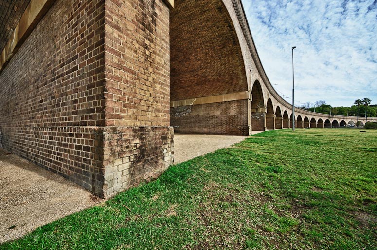
Re: Bridges...Despite a slight compositional imbalance, I prefer the look of #2. There is a certain merit to this composition which flows nicely but doesn't necessarily lead anywhere.
The cars in the background distract a little though. Interesting use for HDR however. #3 could made into an unusual image by cropping drastically from the bottom about 55% way up!
Re: Bridges...Prefer no 1 as it is more interesting.
The two from Annandale appear unbalanced as the top of the bridge is cut off. Also not a fan of the HDR treatment. Regards, Patrick
Two or three lights, any lens on a light-tight box are sufficient for the realisation of the most convincing image. Man Ray 1935. Our mug is smug
Previous topic • Next topic
6 posts
• Page 1 of 1
|