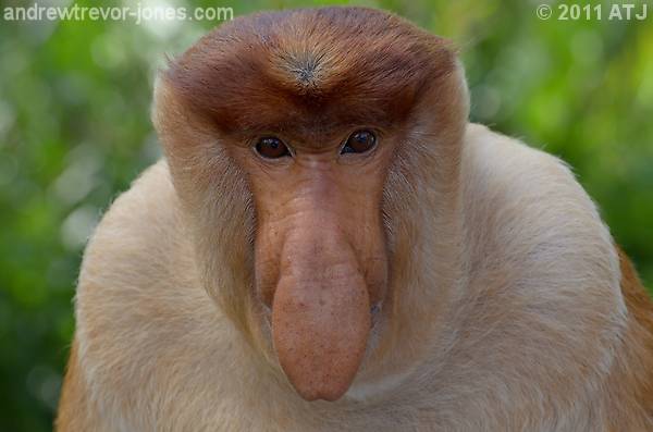
It looks better in Lightroom and it seems to be losing something in the export.
Proboscis MonkeyModerators: Greg B, Nnnnsic, Geoff, Glen, gstark, Moderators
Forum rules
Please note that image critiquing is a matter of give and take: if you post images for critique, and you then expect to receive criticism, then it is also reasonable, fair and appropriate that, in return, you post your critique of the images of other members here as a matter of courtesy. So please do offer your critique of the images of others; your opinion is important, and will help everyone here enjoy their visit to far greater extent. Also please note that, unless you state something to the contrary, other members might attempt to repost your image with their own post processing applied. We see this as an acceptable form of critique, but should you prefer that others not modify your work, this is perfectly ok, and you should state this, either within your post, or within your signature. Images posted here should conform with the general forum guidelines. Image sizes should not exceed 950 pixels along the largest side (height or width) and typically no more than four images per post or thread. Please also ensure that you have a meaningful location included in your profile. Please refer to the FAQ for details of what "meaningful" is.
Previous topic • Next topic
18 posts
• Page 1 of 1
Proboscis MonkeyI need some advice on this image. I really like it but it seems to be missing something - I'm not sure what. Is it to dark? Not enough contrast? What do you think I could do to improve it?
 It looks better in Lightroom and it seems to be losing something in the export.
Re: Proboscis MonkeyIt is wasting a bit of latitude on the bright end of the scale, hitting "auto-levels" in Preview made it look a bit better (EDIT: but it made the bokeh look worse).
That said, it is a very nice portrait of a curious looking creature. It would make a good forum avatar, too  Cheers Steffen. lust for comfort suffocates the soul
Re: Proboscis MonkeyI am finding the bright area top left is pulling my eye away. Dodge it perhaps (or is it burn - I can never remember).
I am also wondering if a square crop would work - if only for the avatar The pano crop created by the "post reply" window improves things enormously. That may be just getting rid of the bright area I mentioned above, or it may be considered in its own right. It cut the tip of his (?) nose off and cut the forehead at about where the pale fur on the side of the head meets the edge of his head. Does that make sense? Greg
It's easy to be good... when there is nothing else to do
Re: Proboscis MonkeyAndrew
I think the original is better than the square crop. I agree it looks a bit flat and share Steffen's views re: the AutoTone etc. Curves and level adjustment needed IMHO and perhaps vignette the corners and brighten the centre. Edit: Forgot to say I also like the image. the eye contact makes it IMHO. Peter
Disclaimer: I know nothing about anything. *** smugmug galleries: http://www.stubbsy.smugmug.com ***
Re: Proboscis MonkeyI think the image is a little flat in two regards, 1) the processing leaves it a bit flat, there are a number of ways to beat this one on the head which could make it a stonger image 2) the composition makes it seem flat, the position of the monkey within the frame is uninteresting, good from a scientific point of view but a bit boring from a photography point of view. I think jazzing up the composition could have gone a long way to improving the depth of the image, even as simple as a off centre composition may well work here.
With that said, working with teh image you have, if it does not have enough impact, do as the film makers say, 'go wider or go tighter' in this case I reckon go tighter and work on teh processing. Also i think adusting the vertical tilt a fraction may help in giving more of a symmetrical frame. here is a 30 sec crack on the low res version which may give you some alternative ideas. if you want it removed or object to your images being edited le me know and i will remove it. He/she has some intense eyes, possibly working that avenue will help.  gerry's photography journey
No amount of processing will fix bad composition - trust me i have tried.
Re: Proboscis MonkeyI see one monkey and raise you another.... [btw what's on it's nose?

Re: Proboscis MonkeyIt's just unfortunate that the light wasn't your best friend to give you more depth that day. It is a flat image because the nose and face just seem to melt together.
I quite like the square crop as it helps isolate the more interesting parts of the image which for me is the monkey's face. Hassy, Leica, Nikon, iPhone
Come follow the rabbit hole...
Re: Proboscis MonkeyHi Andrew - Firstly - very interesting find and image - wow what a nose
D600, D7000, Nikon/Sigma/Tamron Lenses, Nikon Flashes, Sirui/Manfrotto/Benro Sticks
Rodney - My Photo Blog Want: Fast Wide (14|20|24)
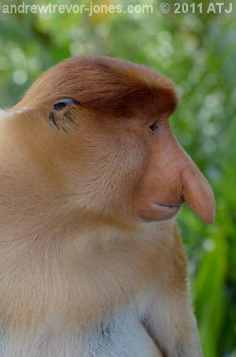
Re: Proboscis MonkeyIs the composition of these any better?
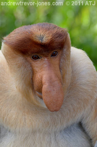 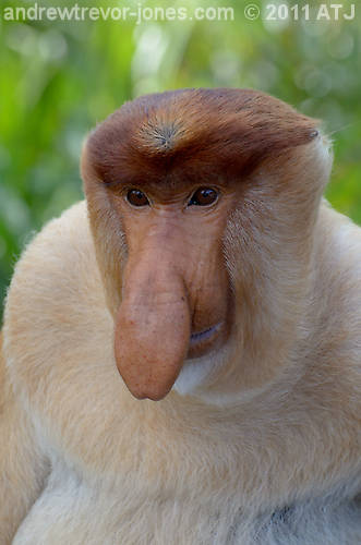 
Re: Proboscis MonkeyAndrew, I was thinking of an even tighter crop.
More like this:  I cropped and straightened so the eyes were on a horizontal plane, the increased contrast then added fill light to compensate for the excessive darkening around the eyes. Greg
It's easy to be good... when there is nothing else to do
Re: Proboscis MonkeyI like the composition in the first.
I think the eyes are the key - are you able to bring them out even more? (kinda like Gerry has done but with just the eyes) Might be as simple as that 7D, 60D, 70-200mm f/4LIS, 17-50mm f/2.8, 10-22mm f/3.5-4.5, 50mm f/1.4, 100mm f/2.8 Macro, 580EX II
Re: Proboscis Monkey
yep in order of preference, 3,2,1. makes him/her more than just his/her snout! gerry's photography journey
No amount of processing will fix bad composition - trust me i have tried.
Re: Proboscis Monkey
 Craig
Lifes journey is not to arrive at our grave in a well preserved body but, rather to skid in sideways, totally worn out, shouting, "Wow what a ride." D70s, D300, 70-300ED, 18-70 Kit Lens, Nikkor 105 Micro. Manfrotto 190Prob Ball head. SB800 x 2.
Re: Proboscis MonkeyOh wow, they're all excellent (and arguably better than the original one). My favourite is the last (profile) image. I can't help but chuckle at all of them…
Cheers Steffen. lust for comfort suffocates the soul
Re: Proboscis MonkeyFor those that prefer the first image, here it is with the bright bit darkened and the eyes highlighted:
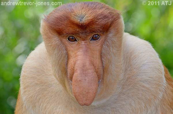 And here's a bright version of the profile. 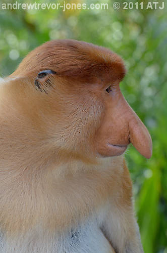 Note that the males have the big nose. The female's nose is relatively small: 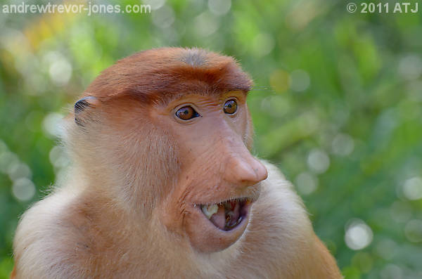
Re: Proboscis MonkeyAndrew
I think you've nailed it with the rework and those are the pick of the images as well. For me I far prefer the male in profile despite the great eye contact in the other image. I think it shows the proboscis better. Peter
Disclaimer: I know nothing about anything. *** smugmug galleries: http://www.stubbsy.smugmug.com ***
Previous topic • Next topic
18 posts
• Page 1 of 1
|