
Untitled by .Chris.K, on Flickr

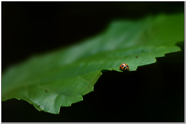
Big World; Little Bug by .Chris.K, on Flickr
edit: right way up now. thanks andrew.

Couple more crittersModerators: Greg B, Nnnnsic, Geoff, Glen, gstark, Moderators
Forum rules
Please note that image critiquing is a matter of give and take: if you post images for critique, and you then expect to receive criticism, then it is also reasonable, fair and appropriate that, in return, you post your critique of the images of other members here as a matter of courtesy. So please do offer your critique of the images of others; your opinion is important, and will help everyone here enjoy their visit to far greater extent. Also please note that, unless you state something to the contrary, other members might attempt to repost your image with their own post processing applied. We see this as an acceptable form of critique, but should you prefer that others not modify your work, this is perfectly ok, and you should state this, either within your post, or within your signature. Images posted here should conform with the general forum guidelines. Image sizes should not exceed 950 pixels along the largest side (height or width) and typically no more than four images per post or thread. Please also ensure that you have a meaningful location included in your profile. Please refer to the FAQ for details of what "meaningful" is.
Previous topic • Next topic
11 posts
• Page 1 of 1
Couple more crittersGeoff motivated me. ty.
  Untitled by .Chris.K, on Flickr  Big World; Little Bug by .Chris.K, on Flickr edit: right way up now. thanks andrew.  Last edited by chrisk on Mon Nov 21, 2011 8:52 pm, edited 1 time in total.
EM1 l 7.5 l 12-40 l 14 l 17 l 25 l 45 l 60 l 75 l AW1 l V3
Re: Couple more crittersExcellent, too!
Re: Couple more crittersI like the perspective of the ladybird.
The placement of the female St Andrew's cross spider doesn't work for me. I do love the background and detail on the spider. It also appears to be upside-down.
Re: Couple more critters
i swear it was the other way around when i last looked at it. I agree, this would look better rotated 180 degrees. Great use of space on the ladybird and it just shows sometimes getting in tight does not always work better. gerry's photography journey
No amount of processing will fix bad composition - trust me i have tried.
Re: Couple more critters
  I do like the ladybird shot, the framing is fantastic and gives a great sense of scale. Fuji X-Pro1 | X-E1 | X-T1 | XF14 | XF23 | XF27 | XF35 | XF56 | XF60 | XF10-24 | XF18-55 | XF55-200 | MCEX-11
http://gmarshall.zenfolio.com http://xtographer.weebly.com
Re: Couple more critters
It is now the right way up. I do prefer it with the head down as it is showing now, but still would prefer it if it was towards the centre more.
Re: Couple more critters
Wouldn't life be boring if we were all the same? I think Chris's use of space in both of these shots is excellent. g.
Gary Stark Nikon, Canon, Bronica .... stuff The people who want English to be the official language of the United States are uncomfortable with their leaders being fluent in it - US Pres. Bartlet
Re: Couple more critters
yes, it was upside down. i swapped it after you pointed it out. ty  im not much for pics in the centre andrew, i have no idea why. lol my main issue with the first is that its not quite perfectly in focus and sharp. im seriously rusty to miss what was really a pretty basic shot. im not much for pics in the centre andrew, i have no idea why. lol my main issue with the first is that its not quite perfectly in focus and sharp. im seriously rusty to miss what was really a pretty basic shot.EM1 l 7.5 l 12-40 l 14 l 17 l 25 l 45 l 60 l 75 l AW1 l V3
Re: Couple more critters
Sorry, I wasn't suggesting it should be in the centre... poor wording on my part... by "more to the centre" I really meant "not so close to the sides". I like off centre, but in the image it is so close to the edge that it looks like a mistake.
Re: Couple more crittersyes that could be right, a little more room may have worked better.
EM1 l 7.5 l 12-40 l 14 l 17 l 25 l 45 l 60 l 75 l AW1 l V3
Re: Couple more crittersNice shot on the lady beetle. Love the shallow dof.
Previous topic • Next topic
11 posts
• Page 1 of 1
|