|
Got a thin skin? Then look elsewhere. Post a link to an image that you've made, and invite others to offer their critiques. Honesty is encouraged, but please be positive in your constructive criticism. Flaming and just plain nastiness will not be tolerated. Please note that this is not an area for you to showcase your images, nor is this a place for you to show-off where you have been. This is an area for you to post images so that you may share with us a technique that you have mastered, or are trying to master. Typically, no more than about four images should be posted in any one post or thread, and the maximum size of any side of any image should not exceed 950 px.
Moderators: Greg B, Nnnnsic, Geoff, Glen, gstark, Moderators
Forum rules
Please note that image critiquing is a matter of give and take: if you post images for critique, and you then expect to receive criticism, then it is also reasonable, fair and appropriate that, in return, you post your critique of the images of other members here as a matter of courtesy. So please do offer your critique of the images of others; your opinion is important, and will help everyone here enjoy their visit to far greater extent.
Also please note that, unless you state something to the contrary, other members might attempt to repost your image with their own post processing applied. We see this as an acceptable form of critique, but should you prefer that others not modify your work, this is perfectly ok, and you should state this, either within your post, or within your signature.
Images posted here should conform with the general forum guidelines. Image sizes should not exceed 950 pixels along the largest side (height or width) and typically no more than four images per post or thread.
Please also ensure that you have a meaningful location included in your profile. Please refer to the FAQ for details of what "meaningful" is.
 by norwest on Tue Jan 24, 2012 10:47 pm by norwest on Tue Jan 24, 2012 10:47 pm
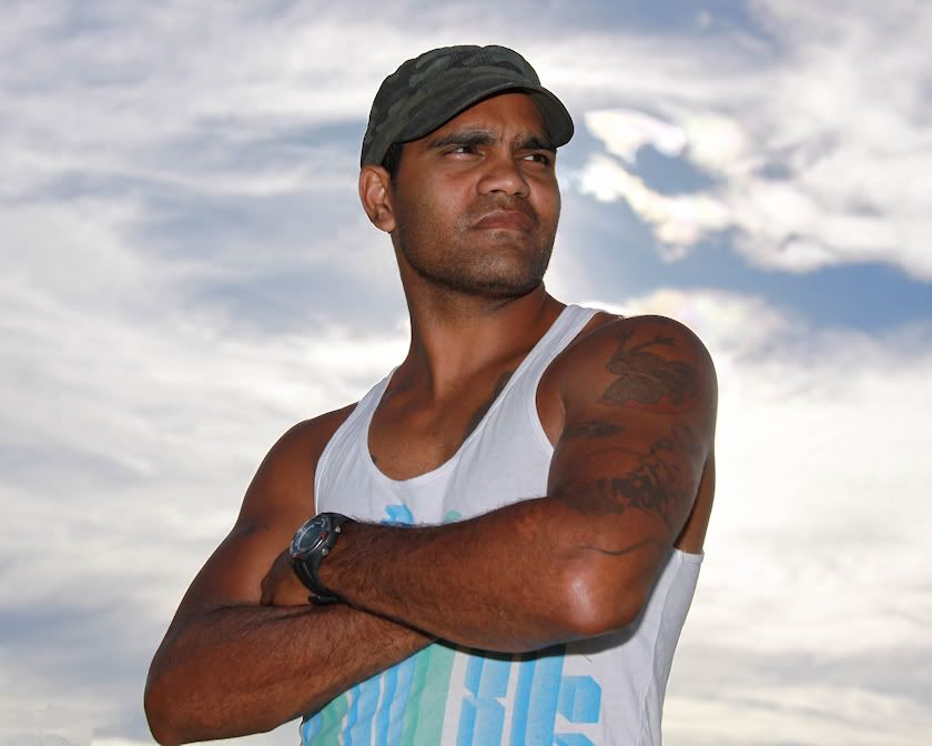
Yes, another sports related shot.  I needed a shot of the region's returning star rugby league player, the new captain/coach of his home town. A shot that displayed a message of determination, authority and confidence with a hint of intimidation. I caught up with him late afternoon at training and i'm reasonably happy with the result. 
-
norwest
- Member
-
- Posts: 265
- Joined: Mon Oct 13, 2008 3:12 pm
- Location: Namoi Valley North West NSW
 by surenj on Wed Jan 25, 2012 1:55 am by surenj on Wed Jan 25, 2012 1:55 am
Nice and low perspective to enhance his power.
I think you can still improve by darkening the sky and using some good old dodge, burn on the skin to make it more sculpted etc.
Also slightest bit of desat to make it look like a advert/movie poster.
-

surenj
- Senior Member
-
- Posts: 7197
- Joined: Fri Sep 15, 2006 8:21 pm
- Location: Artarmon NSW
 by gstark on Wed Jan 25, 2012 7:32 am by gstark on Wed Jan 25, 2012 7:32 am
Great image. Did you perchance get one of him looking into the lens?
g.
Gary Stark
Nikon, Canon, Bronica .... stuff
The people who want English to be the official language of the United States are uncomfortable with their leaders being fluent in it - US Pres. Bartlet
-

gstark
- Site Admin
-
- Posts: 22926
- Joined: Thu Aug 05, 2004 11:41 pm
- Location: Bondi, NSW
 by Remorhaz on Wed Jan 25, 2012 7:34 am by Remorhaz on Wed Jan 25, 2012 7:34 am
From the EXIF data it looks like you shot this using high speed sync (1/4000) so I'm wondering why the sky wasn't dark anyway - must have been nuclear bright - shot into the sun? Nicely crisply separated from the background - almost cutout - and looks pretty sculpted to me  Given there's no background with troubles to separate you probably could have shot more stopped down to both get a tad more dof (the face is sharp as but that front arm is a little oof) and darken the background D600, D7000, Nikon/Sigma/Tamron Lenses, Nikon Flashes, Sirui/Manfrotto/Benro SticksRodney - My Photo BlogWant: Fast Wide (14|20|24)
-

Remorhaz
- Senior Member
-
- Posts: 2547
- Joined: Thu Apr 29, 2010 8:14 pm
- Location: Sydney - Lower North Shore - D600
-
 by the foto fanatic on Wed Jan 25, 2012 9:02 am by the foto fanatic on Wed Jan 25, 2012 9:02 am
Great job on the skin tones. I don't see any need to do anything more with the subject, but I would like to see the sky a little darker (not much).
One way the pros do this is to shoot with tungsten WB and a gel on the flash, but I don't know how that setup would work with darker skin tones like you have here.
I like the composition and having the subject looking off-camera gives him a more dominant air.
-

the foto fanatic
- Moderator
-
- Posts: 4212
- Joined: Tue Aug 24, 2004 7:53 pm
- Location: Teneriffe, Brisbane
-
 by biggerry on Wed Jan 25, 2012 9:57 am by biggerry on Wed Jan 25, 2012 9:57 am
nice one, I think this would also work as a portrait orientation. I reckon this is a good shot of a good role model  
-

biggerry
- Senior Member
-
- Posts: 5930
- Joined: Tue May 13, 2008 12:40 am
- Location: Under the flight path, Newtown, Sydney
-
 by PiroStitch on Wed Jan 25, 2012 10:15 am by PiroStitch on Wed Jan 25, 2012 10:15 am
Great concept and execution. Just a few nitpicky details, some have already been mentioned. Darken the sky a bit more to create more mood, try cropping to a portrait orientation and do you have one where his right elbow isn't chopped off. The elbow is a very small thing but once I noticed it, I can't ignore it.
-

PiroStitch
- Senior Member
-
- Posts: 4669
- Joined: Sat Mar 05, 2005 1:08 am
- Location: Hong Kong
-
 by norwest on Wed Jan 25, 2012 1:13 pm by norwest on Wed Jan 25, 2012 1:13 pm
surenj wrote:Nice and low perspective to enhance his power.
I think you can still improve by darkening the sky and using some good old dodge, burn on the skin to make it more sculpted etc.
Also slightest bit of desat to make it look like a advert/movie poster.
Down on my knees to gain a stand over, intimidating stance and have all sky as the background. Yes, agree and have darkened the sky a smidgen in the original. I tried a grey scale copy and it lends itself very well. gstark wrote:Great image. Did you perchance get one of him looking into the lens?
Thanks. No, i didn't. I asked him to look at the camera and it appeared unnatural, so, other than the arms folded, I just let him do what felt best. I wanted the arrogant, 'bugga you' look anyway, so it didn't really matter in the end. He was actually a very natural model but he's played for his country in differing forms of the game so is pretty relaxed around attention even though he's a quiet bloke. Remorhaz wrote:From the EXIF data it looks like you shot this using high speed sync (1/4000) so I'm wondering why the sky wasn't dark anyway - must have been nuclear bright - shot into the sun? Nicely crisply separated from the background - almost cutout - and looks pretty sculpted to me  Given there's no background with troubles to separate you probably could have shot more stopped down to both get a tad more dof (the face is sharp as but that front arm is a little oof) and darken the background
Yes, high speed sync flash @ +2 and -1 exposure comp. I positioned him with the sun directly behind the nape of his neck to get the look you describe. Given more time, i did only 4 shots at various settings before he excused himself to join training, I'd have stopped down the ambient a touch further and increased the flash output. the foto fanatic wrote:Great job on the skin tones. I don't see any need to do anything more with the subject, but I would like to see the sky a little darker (not much).
One way the pros do this is to shoot with tungsten WB and a gel on the flash, but I don't know how that setup would work with darker skin tones like you have here.
I like the composition and having the subject looking off-camera gives him a more dominant air.
Thanks. Yes, dark skin tones are difficult and I'd be lost without fill flash. It's a bugga to gain detail with shadows and actions shots when a flash isn't practical. biggerry wrote:nice one, I think this would also work as a portrait orientation. I reckon this is a good shot of a good role model  
Thanks Jerry. Agree and have done it in both. PiroStitch wrote:Great concept and execution. Just a few nitpicky details, some have already been mentioned. Darken the sky a bit more to create more mood, try cropping to a portrait orientation and do you have one where his right elbow isn't chopped off. The elbow is a very small thing but once I noticed it, I can't ignore it.
Yep, I know what you mean. Like an itch that has be scratched.
-
norwest
- Member
-
- Posts: 265
- Joined: Mon Oct 13, 2008 3:12 pm
- Location: Namoi Valley North West NSW
Return to Image Reviews and Critiques
|


