|
Got a thin skin? Then look elsewhere. Post a link to an image that you've made, and invite others to offer their critiques. Honesty is encouraged, but please be positive in your constructive criticism. Flaming and just plain nastiness will not be tolerated. Please note that this is not an area for you to showcase your images, nor is this a place for you to show-off where you have been. This is an area for you to post images so that you may share with us a technique that you have mastered, or are trying to master. Typically, no more than about four images should be posted in any one post or thread, and the maximum size of any side of any image should not exceed 950 px.
Moderators: Greg B, Nnnnsic, Geoff, Glen, gstark, Moderators
Forum rules
Please note that image critiquing is a matter of give and take: if you post images for critique, and you then expect to receive criticism, then it is also reasonable, fair and appropriate that, in return, you post your critique of the images of other members here as a matter of courtesy. So please do offer your critique of the images of others; your opinion is important, and will help everyone here enjoy their visit to far greater extent.
Also please note that, unless you state something to the contrary, other members might attempt to repost your image with their own post processing applied. We see this as an acceptable form of critique, but should you prefer that others not modify your work, this is perfectly ok, and you should state this, either within your post, or within your signature.
Images posted here should conform with the general forum guidelines. Image sizes should not exceed 950 pixels along the largest side (height or width) and typically no more than four images per post or thread.
Please also ensure that you have a meaningful location included in your profile. Please refer to the FAQ for details of what "meaningful" is.
 by Remorhaz on Sun Mar 11, 2012 8:33 pm by Remorhaz on Sun Mar 11, 2012 8:33 pm
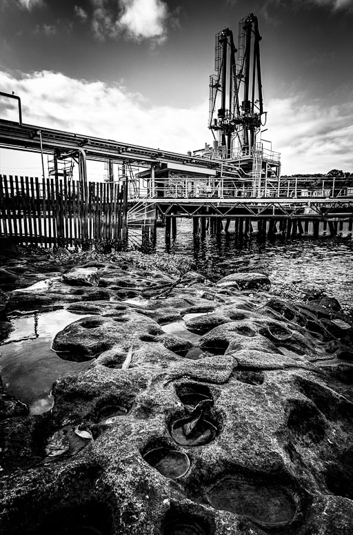
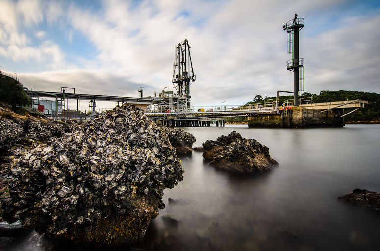
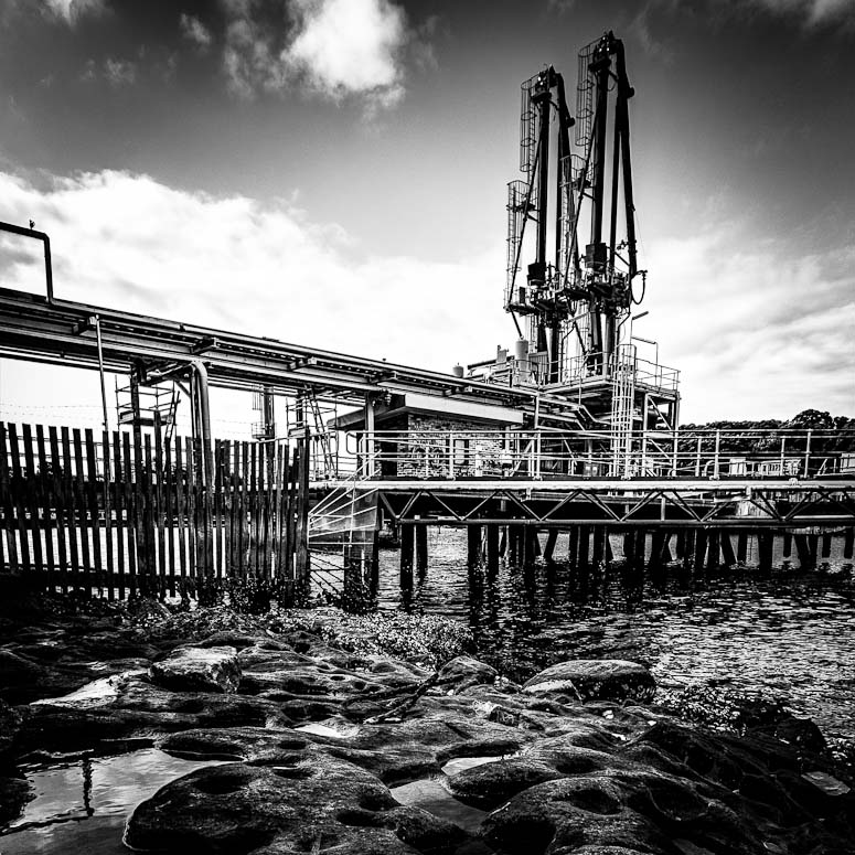
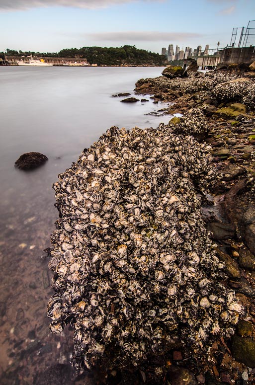
I thought I'd visit somewhere on Sydney harbour that I hadn't been before and so here we are at Greenwich on the north shore. There is a very large Shell refining terminal consuming one side of the Greenwich finger of land along Gore Cove. It was about two hours before sunset so I went for a walk around the headland and ended up here on the rocks beside the southern end of the refinery terminal. I'd particularly like to know what you think of this monochrome conversion of a scene near the waters edge (both the composition and the mono processing)  and for this image I've taken out the bigstopper (10 stop ND) and put the tripod out in the water and placed it just behind this large oyster encrusted boulder  D600, D7000, Nikon/Sigma/Tamron Lenses, Nikon Flashes, Sirui/Manfrotto/Benro SticksRodney - My Photo BlogWant: Fast Wide (14|20|24)
-

Remorhaz
- Senior Member
-
- Posts: 2547
- Joined: Thu Apr 29, 2010 8:14 pm
- Location: Sydney - Lower North Shore - D600
-
 by PiroStitch on Sun Mar 11, 2012 9:18 pm by PiroStitch on Sun Mar 11, 2012 9:18 pm
I do like the first image as there's lots of detail there to see, and the boulder provides a nice line to the refinery. Not sure about the vignette or burning the top edge though, as it seems to have darkened one of the towers slightly.
The second image is great with the lower viewpoint. A bit more contrast and vibrancy in the sky will finish the image off nicely.
-

PiroStitch
- Senior Member
-
- Posts: 4669
- Joined: Sat Mar 05, 2005 1:08 am
- Location: Hong Kong
-
 by biggerry on Sun Mar 11, 2012 10:57 pm by biggerry on Sun Mar 11, 2012 10:57 pm
The BW one feels flat and as Piro mentioned this is probably due to the high level of detail, the compo is good and i would be interested in seeing it in colour. The second image is quite nice, it has that classic warmed contrast look from the bigstopper which i like. I reckon this could have been a candidate for the 8-16, a bit more water around the oyster rock would have isolated it a bit more and brought it into teh thirds which imo could have it moreso of the anchor point. nice location too, i suppose asio were watching you 
-

biggerry
- Senior Member
-
- Posts: 5930
- Joined: Tue May 13, 2008 12:40 am
- Location: Under the flight path, Newtown, Sydney
-
 by gstark on Mon Mar 12, 2012 9:40 am by gstark on Mon Mar 12, 2012 9:40 am
I don't particularly care for the foreground in the first image; it's competing with the wharf and crane for attention as the primary subject of the image.
I'd be cropping most of this out, and perhaps leaving just a little of the rocks in place, more as a framing feature than anything else.
With the second image, do you have one from a slightly higher point of view? The way that the central rock interrupts the view of the wharf disturbs me, and a higher PoV would relieve this issue.
g.
Gary Stark
Nikon, Canon, Bronica .... stuff
The people who want English to be the official language of the United States are uncomfortable with their leaders being fluent in it - US Pres. Bartlet
-

gstark
- Site Admin
-
- Posts: 22926
- Joined: Thu Aug 05, 2004 11:41 pm
- Location: Bondi, NSW
 by Remorhaz on Mon Mar 12, 2012 11:39 am by Remorhaz on Mon Mar 12, 2012 11:39 am
PiroStitch wrote:I do like the first image as there's lots of detail there to see... Not sure about the vignette or burning the top edge though, as it seems to have darkened one of the towers slightly.
Thanks for the tip - I'd burnt down the area on and around those two towers because it was too light for me - I've toned that down  The second image is great with the lower viewpoint. A bit more contrast and vibrancy in the sky will finish the image off nicely.
Done  biggerry wrote:The BW one feels flat and as Piro mentioned this is probably due to the high level of detail, the compo is good and i would be interested in seeing it in colour.
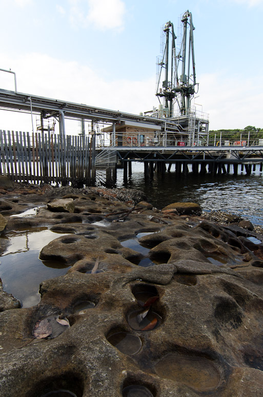
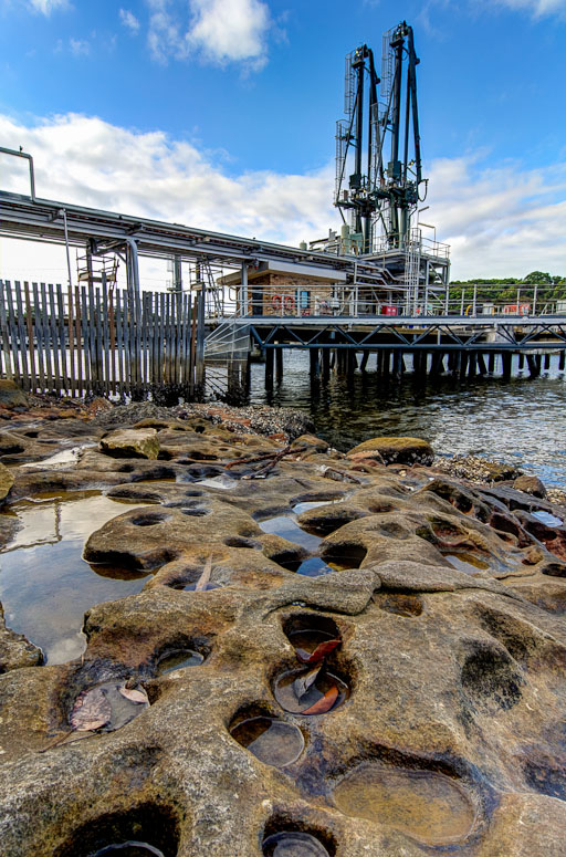
and here we have - firstly the original 0EV image - untouched except for rotation - and then the colour HDR I created (actually it's not tonemapped - it's an exposure fusion) - which probably explains some of the flatness you see    The second image is quite nice, it has that classic warmed contrast look from the bigstopper which i like. I reckon this could have been a candidate for the 8-16, a bit more water around the oyster rock would have isolated it a bit more and brought it into teh thirds which imo could have it moreso of the anchor point.
Yep - I agree - I did have the 8-16 with me but unfortunately it's not filter (and thus bigstopper) friendly  nice location too, i suppose asio were watching you 
Actually... I essentially just stumbled across this place - but the warning signs at the front did say it's under constant video surveillance, etc  gstark wrote:I don't particularly care for the foreground in the first image; it's competing with the wharf and crane for attention as the primary subject of the image. I'd be cropping most of this out, and perhaps leaving just a little of the rocks in place, more as a framing feature than anything else.
Thanks Gary - although you know I was going for the whole lotsa rocks in the foreground using the ultra wide angle look... That said here is a straight square crop of the top (which includes my rework of my burning over the towers that piro suggested)  With the second image, do you have one from a slightly higher point of view? The way that the central rock interrupts the view of the wharf disturbs me, and a higher PoV would relieve this issue.
Unfortunately no - I did take this one from a higher POV facing the other direction but my feelings on it are a bit meh...  D600, D7000, Nikon/Sigma/Tamron Lenses, Nikon Flashes, Sirui/Manfrotto/Benro SticksRodney - My Photo BlogWant: Fast Wide (14|20|24)
-

Remorhaz
- Senior Member
-
- Posts: 2547
- Joined: Thu Apr 29, 2010 8:14 pm
- Location: Sydney - Lower North Shore - D600
-
 by biggerry on Wed Mar 14, 2012 1:49 pm by biggerry on Wed Mar 14, 2012 1:49 pm
Remorhaz wrote: and here we have - firstly the original 0EV image - untouched except for rotation - and then the colour HDR I created (actually it's not tonemapped - it's an exposure fusion) - which probably explains some of the flatness you see
I reckon teh colour version is much better than the BW. Yep - I agree - I did have the 8-16 with me but unfortunately it's not filter (and thus bigstopper) friendly
ahh yes, fair call.
-

biggerry
- Senior Member
-
- Posts: 5930
- Joined: Tue May 13, 2008 12:40 am
- Location: Under the flight path, Newtown, Sydney
-
Return to Image Reviews and Critiques
|
