A dose of the trotsModerators: Greg B, Nnnnsic, Geoff, Glen, gstark, Moderators
Forum rules
Please note that image critiquing is a matter of give and take: if you post images for critique, and you then expect to receive criticism, then it is also reasonable, fair and appropriate that, in return, you post your critique of the images of other members here as a matter of courtesy. So please do offer your critique of the images of others; your opinion is important, and will help everyone here enjoy their visit to far greater extent. Also please note that, unless you state something to the contrary, other members might attempt to repost your image with their own post processing applied. We see this as an acceptable form of critique, but should you prefer that others not modify your work, this is perfectly ok, and you should state this, either within your post, or within your signature. Images posted here should conform with the general forum guidelines. Image sizes should not exceed 950 pixels along the largest side (height or width) and typically no more than four images per post or thread. Please also ensure that you have a meaningful location included in your profile. Please refer to the FAQ for details of what "meaningful" is.
Previous topic • Next topic
17 posts
• Page 1 of 1
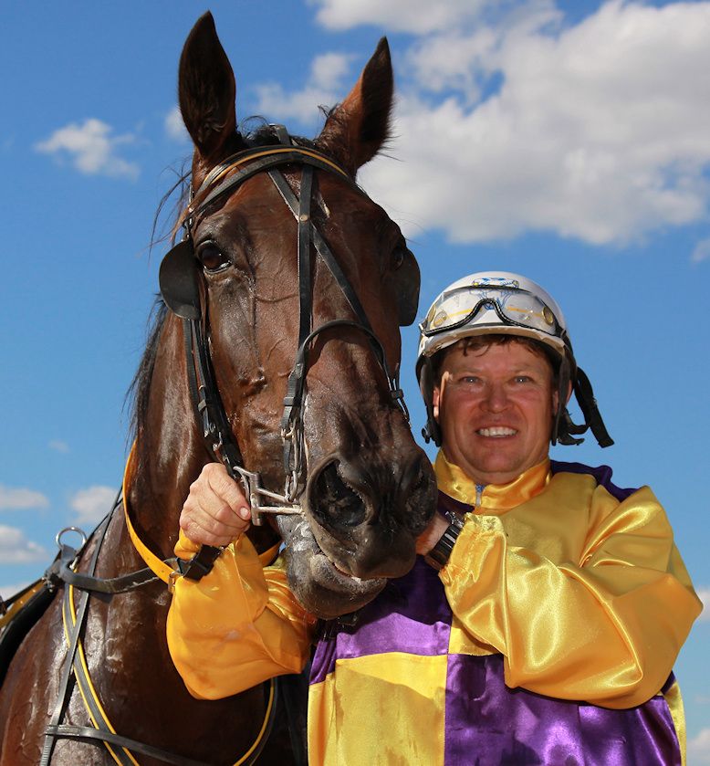
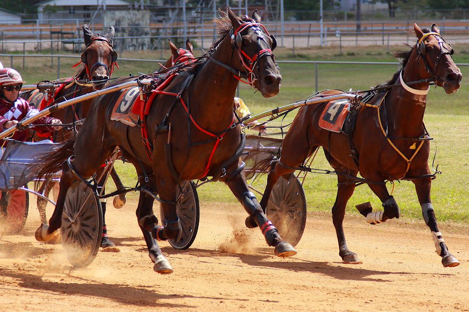
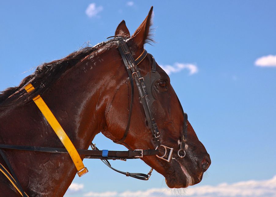
A dose of the trotsNo, not the trots you were thinking,
  
Re: A dose of the trots#2 is a nice capture - initially I was thinking that it could have done with a little more on both the left and right (and maybe it still could) but now I'm starting to light the tighter crop.
D600, D7000, Nikon/Sigma/Tamron Lenses, Nikon Flashes, Sirui/Manfrotto/Benro Sticks
Rodney - My Photo Blog Want: Fast Wide (14|20|24)
Re: A dose of the trotsNot your best Norwest and I know you could do better.
#1 whilst the horse is in focus the man is not and to make it worse he is looking just out of frame. My eyes are firstly drawn to teh man due to teh brighter part of teh frame, hence I firstly notice the OOF before i notice the goodness of the horse. #2 Probably teh best shot, however feels like you missed the composition by a few seconds, too tight imo. #3 I don't think teh fill lighting works here, it feels a bit unatural and not complimentary - i know that does not make much sense.. but I cannot quite put my finger on it. hth. gerry's photography journey
No amount of processing will fix bad composition - trust me i have tried.
Re: A dose of the trotsGerry - could you please, please fix your keyboard so that teh becomes the - ta mate
Chris
-------------------------------- I started my life with nothing and I’ve still got most of it left
A dose of the trotsBeen there, done that... Didn't work.
Do a search for it if you really want a laugh
Re: A dose of the trots
I did try for a good week to try and nail it everytime...but gave up after that, i even re labelled the keys on the board but that just absolute chaos. but check it... there is one right 'the' in that sentence...woot, i am a recovering 'teh-aholic' right, now we have that outta our systems lets get back on topic. gerry's photography journey
No amount of processing will fix bad composition - trust me i have tried.
Re: A dose of the trots
 Chris
-------------------------------- I started my life with nothing and I’ve still got most of it left
Re: A dose of the trots
Hiya Gerry. Yep, could of been a lot better. Shot @ F5.6 which i thought would give enough depth. The driver was holding horse after the race while a hobble was being untangled from a rear leg. He was talking to someone so i dived in and down for a quick shot. # 1 & 3 were both shot @ - 1 full stop ex. comp & + 1 full stop flash comp. The shot below is the frame following the 2nd shot above. 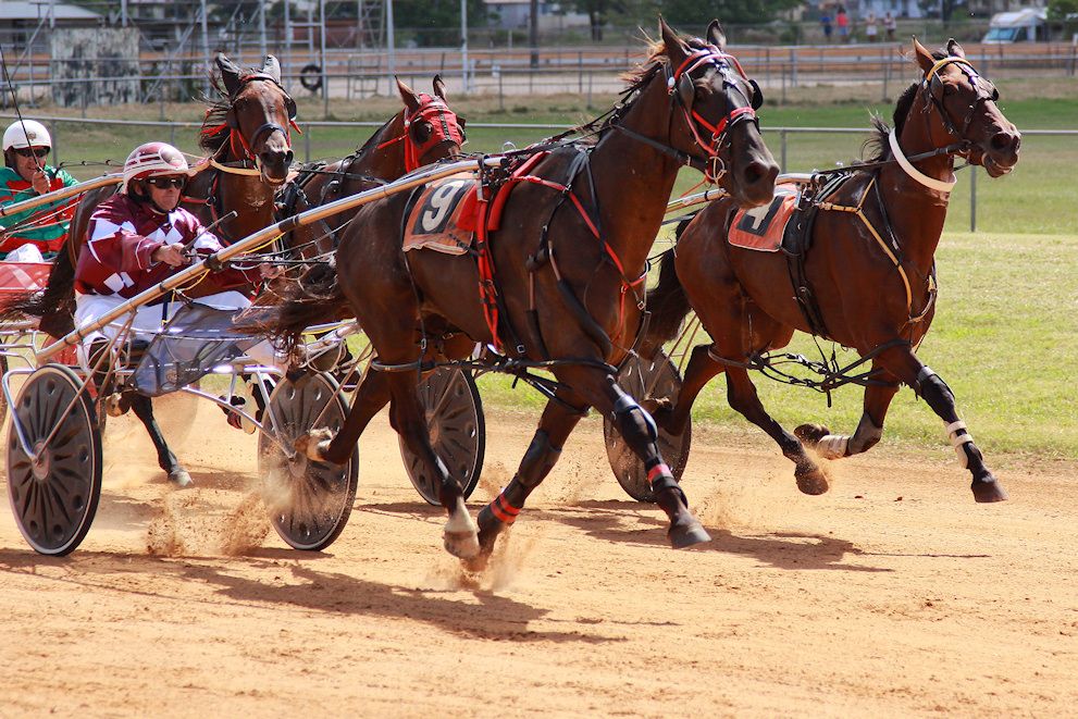
Re: A dose of the trotsThat last image is much better imo.
  gerry's photography journey
No amount of processing will fix bad composition - trust me i have tried.
Re: A dose of the trotsLast one is looking good as it's got more space around the subject to let it breath.

Re: A dose of the trotsJust as a matter of interest, all the sports shots i post are for a regional newspaper whom publish them, 'usually', in a very small format of around 3x4 in column inches ( can't take too much advertising space
I know, i know, i shouldn't be so lazy and re edit before i post. However, i agree wholeheartedly that a reasonably clear air leading out of frame and a 'not so sqeezy" crop, but not a loose crop, not only looks the best, it is the best. BTW, they mustn't have noticed the oof face in the first shot above. Just spoke with them and it's getting a half back page tomorrow with the trophy presentation shot.  Thanks for comments, fellas.
Re: A dose of the trotsI reckon the average layman would probably not notice - sometimes its the content that is important rather than the technical side of sharpness.
For papers/rags, i thought supplying slightly wider shots was desirable so the editor can crop to their desire. gerry's photography journey
No amount of processing will fix bad composition - trust me i have tried.
Re: A dose of the trots
Yep, that's normal more often than not, however, as they don't have experienced photographers and photo editors on staff and having previously seen their photo presentation, part of my conditions were and still are doing my own editing. They gave their standard regular sizes in picas and i size accordingly and provide in 400dpi files. If required, ( not too often) they can also reduced or enlarged when doing page layouts and/or minimal cropping. They also like it as it saves them a heap of time. The shots above were part of of 25 shots sent which included social, (people shots for the social pages) trophy presentations and pacing. The shot below got a half page with a little cropped off both the top (just below the N on the winning post) and bottom. (to the base of the gig wheel) The name familiar? 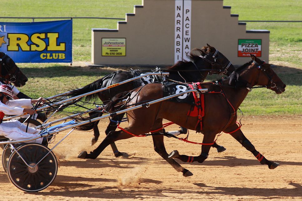
Re: A dose of the trotsThat's an interesting story! It's nice to see that they are actually using nice pictures than ones from grandmas HTC or iphone.
Are you getting payment for your time?
Re: A dose of the trotsYes, Surenj. Been doing contract/freelance work since moving from the coast half a dozen years ago and busy every weekend and some weekdays, depending on the events and occasions at the time. It's very different running around like a blue arsed fly and I'm usually totally pooped out, but it's extremely enjoyable covering anything in social occasions, community events and most sports.
Community 'stuff' is important in country towns so there's quite an emphasis on it. I'm looking forward to soon shooting some sports for the first time. Polocrosse, Rodeo events and Horse Football. Yes, horse football. Football played on horseback. Passing a beachball sized ball between riders, kinda like polocrosse but using only the hands. Imagine a rider leaning way out of the saddle to reach down and scoop up the ball with one hand while at a full gallop. Not for the feint hearted. Equestrian events are obviously popular in a country region. And that's no bull.
Re: A dose of the trots
lol, never been to the paceway at Narrabri, i guess its dried out now gerry's photography journey
No amount of processing will fix bad composition - trust me i have tried.
Re: A dose of the trotsYes, a couple of months ago the horses had to wear flippers, the gig wheels were replaced with floats and i was shooting them from a 12 foot tinny with an electric motor so it didn't spook the horses.
Previous topic • Next topic
17 posts
• Page 1 of 1
|