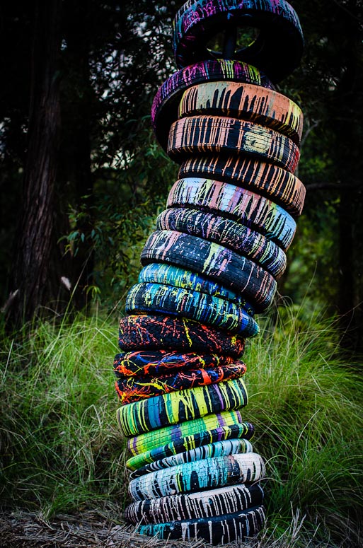
Colour Wheel...Moderators: Greg B, Nnnnsic, Geoff, Glen, gstark, Moderators
Forum rules
Please note that image critiquing is a matter of give and take: if you post images for critique, and you then expect to receive criticism, then it is also reasonable, fair and appropriate that, in return, you post your critique of the images of other members here as a matter of courtesy. So please do offer your critique of the images of others; your opinion is important, and will help everyone here enjoy their visit to far greater extent. Also please note that, unless you state something to the contrary, other members might attempt to repost your image with their own post processing applied. We see this as an acceptable form of critique, but should you prefer that others not modify your work, this is perfectly ok, and you should state this, either within your post, or within your signature. Images posted here should conform with the general forum guidelines. Image sizes should not exceed 950 pixels along the largest side (height or width) and typically no more than four images per post or thread. Please also ensure that you have a meaningful location included in your profile. Please refer to the FAQ for details of what "meaningful" is.
Previous topic • Next topic
7 posts
• Page 1 of 1
Colour Wheel... D600, D7000, Nikon/Sigma/Tamron Lenses, Nikon Flashes, Sirui/Manfrotto/Benro Sticks
Rodney - My Photo Blog Want: Fast Wide (14|20|24)
Re: Colour Wheel...I like it, but cannot help thinking it would be better as a (vertical) pano crop.
Greg
It's easy to be good... when there is nothing else to do
Re: Colour Wheel...Love the subject but I think the processing doesn't quite work.
The vignetted lighting applied to highlight the the stack misses the top... this is something you could play with however I would have also preferred to see the top of the last tyre as it is stacked differently and therefore completes the sequence.... unless you cropped it that's a bit more difficult to change (if you wanted to). The location makes the shot seem a little staged to me but of course if that where you found it that was not your doing !!! Photography is not a crime, but perhaps my abuse of artistic license is?
Re: Colour Wheel...Nice tyre stack, with a bit more room on the top and bottom I reckon the composition would sing alot better and thus allowing one to really develop and run through implied curved line of teh tyres. Dial back teh vignetting 80%, if it smacks you in teh face first thing then its be over applied imo, vignettig is something that should become apparent only after the eyes have explored and digested the whole image.
gerry's photography journey
No amount of processing will fix bad composition - trust me i have tried.
Re: Colour Wheel...Rodney,
What's the story behind these?
Re: Colour Wheel...
Thanks Greg - I was heading more towards the ROT I think...
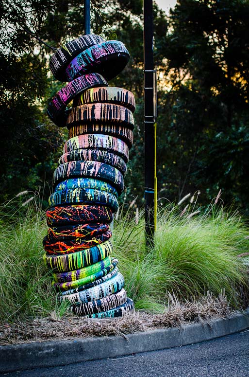
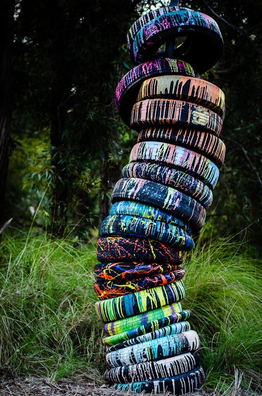
This shot is as taken (crop wise) but I do have others from different angles and from further away to include more of the stack (see below) - It was very late in the afternoon (sun setting) and I was trying to cut out the bright sky as best I could (and poles and signs and other distracting stuff I didn't stage these
Thanks Gerry - agree re vignette and have dialed it back some. Some other earlier shots showing more of the location/environment and more breathing room around the stack. Perhaps I should take the first and try content aware filling the pole on the right which would leave lots more breathing room around the stack?   D600, D7000, Nikon/Sigma/Tamron Lenses, Nikon Flashes, Sirui/Manfrotto/Benro Sticks
Rodney - My Photo Blog Want: Fast Wide (14|20|24)
Re: Colour Wheel...The image is a bit tired...sorry about that.
Great colours and an interesting subject. President, A.A.A.A.A (Australian Association Against Acronym Abuse)
Canon EOS R6, RF 24-105 F4, RF 70-200 F4, RF 35mm F1.8, RF 16mm F2.8 "And ye shall know the truth, and the truth shall make you free." (John 8:32)
Previous topic • Next topic
7 posts
• Page 1 of 1
|

