|
Got a thin skin? Then look elsewhere. Post a link to an image that you've made, and invite others to offer their critiques. Honesty is encouraged, but please be positive in your constructive criticism. Flaming and just plain nastiness will not be tolerated. Please note that this is not an area for you to showcase your images, nor is this a place for you to show-off where you have been. This is an area for you to post images so that you may share with us a technique that you have mastered, or are trying to master. Typically, no more than about four images should be posted in any one post or thread, and the maximum size of any side of any image should not exceed 950 px.
Moderators: Greg B, Nnnnsic, Geoff, Glen, gstark, Moderators
Forum rules
Please note that image critiquing is a matter of give and take: if you post images for critique, and you then expect to receive criticism, then it is also reasonable, fair and appropriate that, in return, you post your critique of the images of other members here as a matter of courtesy. So please do offer your critique of the images of others; your opinion is important, and will help everyone here enjoy their visit to far greater extent.
Also please note that, unless you state something to the contrary, other members might attempt to repost your image with their own post processing applied. We see this as an acceptable form of critique, but should you prefer that others not modify your work, this is perfectly ok, and you should state this, either within your post, or within your signature.
Images posted here should conform with the general forum guidelines. Image sizes should not exceed 950 pixels along the largest side (height or width) and typically no more than four images per post or thread.
Please also ensure that you have a meaningful location included in your profile. Please refer to the FAQ for details of what "meaningful" is.
 by Remorhaz on Tue Jun 26, 2012 1:22 pm by Remorhaz on Tue Jun 26, 2012 1:22 pm
After our less than stellar sunrise at North Head we headed into the bushland there on the cliffs looking for macro and details. Unfortunately I hadn't brought either my new LED macro ring light nor my flash and macro diffuser so I was somewhat limited on the lighting front for macro work. I opted to take some longer exposures on a tripod in the hopes of getting something half decent of some flowers - which wasn't easy in the windy conditions on the coast - trying to time a slow shutter inbetween wind gusts was like toying with frustration  Nothing much to write home about but here are a couple which turned out ok... 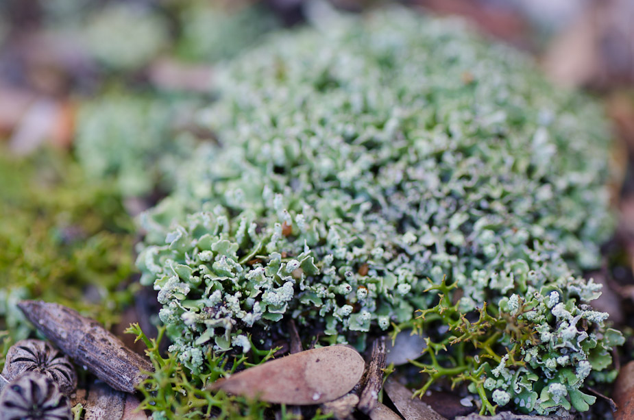 NIKON D7000 + 90.0 mm f/2.8 @ 90 mm, 1/20 sec at f/8, ISO 100 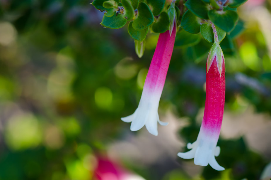 NIKON D7000 + 90.0 mm f/2.8 @ 90 mm, 1/25 sec at f/11, ISO 100 Not a macro but it was a close focus shot with the ultrawide of some interesting textures covering the ground 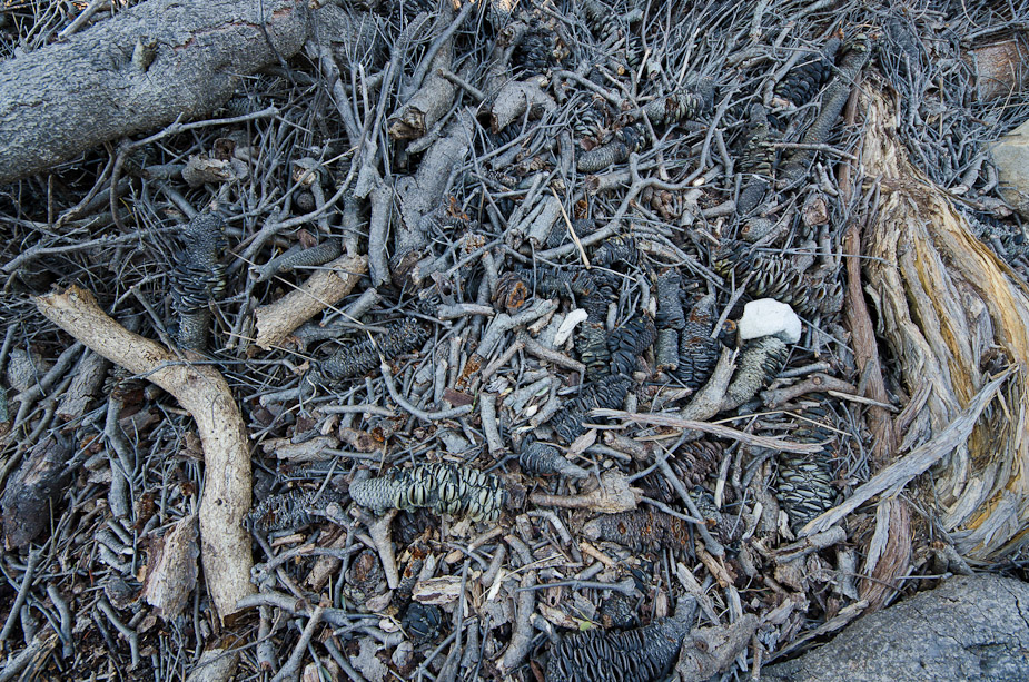 NIKON D7000 + 8.0-16.0 mm f/4.5-5.6 @ 8 mm, 1/6 sec at f/9, ISO 100 D600, D7000, Nikon/Sigma/Tamron Lenses, Nikon Flashes, Sirui/Manfrotto/Benro SticksRodney - My Photo BlogWant: Fast Wide (14|20|24)
-

Remorhaz
- Senior Member
-
- Posts: 2547
- Joined: Thu Apr 29, 2010 8:14 pm
- Location: Sydney - Lower North Shore - D600
-
by biggerry on Tue Jun 26, 2012 9:47 pm
for some reason i always thought you were gonna do that last image in BW, seeing it in colour reinforces the fact that i think it should be in BW  The main focus is those textures and that chaos that is...or should i say ..was a tree. I reckon try the BW and just work on one primary element...the texture, remove all other distracting elements (like the colour) and possibly use something like a tonal contrast or something to accenutate the texture..even push it more towards a abstract that somethign that immediately identifies what it is.
-

biggerry
- Senior Member
-
- Posts: 5930
- Joined: Tue May 13, 2008 12:40 am
- Location: Under the flight path, Newtown, Sydney
-
by surenj on Wed Jun 27, 2012 7:16 pm
Hey Rodney and Gerry,
I prefer the last in colour. I quite like those blue, yellow tones! Take out that white blob though. Sticks out. I think a bit of tonal contrast would be ok (clarity).
Better luck next time with the sun/clouds...
Suren
-

surenj
- Senior Member
-
- Posts: 7197
- Joined: Fri Sep 15, 2006 8:21 pm
- Location: Artarmon NSW
by zafra52 on Wed Jun 27, 2012 9:12 pm
The first one is a real challenge for my eyes. I guess that's
the reason I like it best.
-

zafra52
- Senior Member
-
- Posts: 4895
- Joined: Thu Dec 01, 2005 10:22 pm
- Location: Brisbane
by Remorhaz on Wed Jun 27, 2012 11:39 pm
biggerry wrote:for some reason i always thought you were gonna do that last image in BW, seeing it in colour reinforces the fact that i think it should be in BW The main focus is those textures and that chaos that is...or should i say ..was a tree. I reckon try the BW and just work on one primary element...the texture, remove all other distracting elements (like the colour) and possibly use something like a tonal contrast or something to accenutate the texture..even push it more towards a abstract that somethign that immediately identifies what it is.
Thanks Gerry - here you go - a fairly aggressive monochrome processing with a heavy dose of tonal contrast (all in Lightroom I might add) 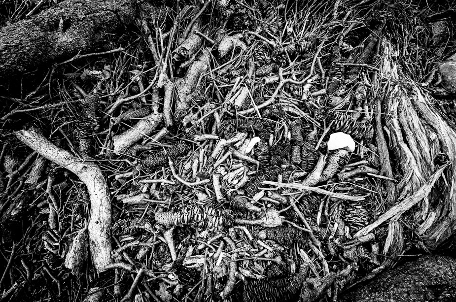 surenj wrote:I prefer the last in colour. I quite like those blue, yellow tones! Take out that white blob though. Sticks out. I think a bit of tonal contrast would be ok (clarity).
- I liked the white blob (a white stone) - even included it sort of on purpose Better luck next time with the sun/clouds...
Better luck next time getting out of bed on time  zafra52 wrote:The first one is a real challenge for my eyes. I guess that's the reason I like it best.
Thanks Zafra If it matters my daughter likes the second the best  D600, D7000, Nikon/Sigma/Tamron Lenses, Nikon Flashes, Sirui/Manfrotto/Benro SticksRodney - My Photo BlogWant: Fast Wide (14|20|24)
-
Remorhaz
- Senior Member
-
- Posts: 2547
- Joined: Thu Apr 29, 2010 8:14 pm
- Location: Sydney - Lower North Shore - D600
-
by biggerry on Thu Jun 28, 2012 9:18 am
craploads better in my opinion - now i can't stop looking at that white blob... 
-
biggerry
- Senior Member
-
- Posts: 5930
- Joined: Tue May 13, 2008 12:40 am
- Location: Under the flight path, Newtown, Sydney
-
by zafra52 on Thu Jun 28, 2012 1:16 pm
Although I find the last one doesn't seem
to have a main subject, but seems to be a
complex design of shapes and subtle colours,
I still find that colour is preferable for the eye.
In fact, I would advise you to use filters and
be creative and see what you come up with.
-
zafra52
- Senior Member
-
- Posts: 4895
- Joined: Thu Dec 01, 2005 10:22 pm
- Location: Brisbane
Return to Image Reviews and Critiques
|
