|
Got a thin skin? Then look elsewhere. Post a link to an image that you've made, and invite others to offer their critiques. Honesty is encouraged, but please be positive in your constructive criticism. Flaming and just plain nastiness will not be tolerated. Please note that this is not an area for you to showcase your images, nor is this a place for you to show-off where you have been. This is an area for you to post images so that you may share with us a technique that you have mastered, or are trying to master. Typically, no more than about four images should be posted in any one post or thread, and the maximum size of any side of any image should not exceed 950 px.
Moderators: Greg B, Nnnnsic, Geoff, Glen, gstark, Moderators
Forum rules
Please note that image critiquing is a matter of give and take: if you post images for critique, and you then expect to receive criticism, then it is also reasonable, fair and appropriate that, in return, you post your critique of the images of other members here as a matter of courtesy. So please do offer your critique of the images of others; your opinion is important, and will help everyone here enjoy their visit to far greater extent.
Also please note that, unless you state something to the contrary, other members might attempt to repost your image with their own post processing applied. We see this as an acceptable form of critique, but should you prefer that others not modify your work, this is perfectly ok, and you should state this, either within your post, or within your signature.
Images posted here should conform with the general forum guidelines. Image sizes should not exceed 950 pixels along the largest side (height or width) and typically no more than four images per post or thread.
Please also ensure that you have a meaningful location included in your profile. Please refer to the FAQ for details of what "meaningful" is.
 by Remorhaz on Wed Jun 19, 2013 3:48 am by Remorhaz on Wed Jun 19, 2013 3:48 am
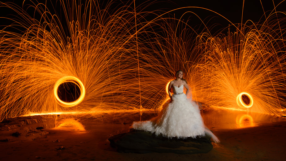
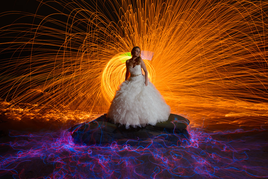
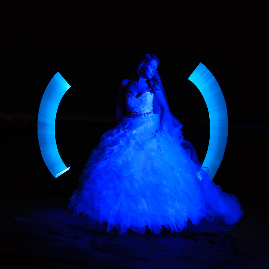
Our evening of light painting at Forresters beach on the NSW Central Coast culminated in the arrival of our beautiful model Elyse all dressed an elaborate wedding gown. Steel wool, orbs, EL wire, cold cathodes, coloured LED's & lasers all armed and ready. A model in a flowing white wedding dress, the ocean surging in and burning molten metal flying everywhere - what could go wrong....  Glowing Bride to Be  This one a little closer and a more central composition with just one whirling dirvish directly behind and the addition of some EL wire groundwork Trapped  and finally something a lot more simple - I lit our bride just using a blue LED torch and then some "angel wings" were added at the back using a blue cold cathode tube Blue Angel  D600, D7000, Nikon/Sigma/Tamron Lenses, Nikon Flashes, Sirui/Manfrotto/Benro SticksRodney - My Photo BlogWant: Fast Wide (14|20|24)
-

Remorhaz
- Senior Member
-
- Posts: 2547
- Joined: Thu Apr 29, 2010 8:14 pm
- Location: Sydney - Lower North Shore - D600
-
 by aim54x on Wed Jun 19, 2013 9:16 am by aim54x on Wed Jun 19, 2013 9:16 am
I like the first, but there are so many things that could have gone wrong in creating that image....didn't you hear about that bride that got drowned by her dress in the US?
The last image would be stronger if she was not painted blue, just using the cold cathode to paint the wings and lighting her normally. I don't like the second image, the EL wire does not add anything and looks out of place
Cameron Nikon F/Nikon 1 | Hasselblad V/XPAN| Leica M/LTM |Sony α/FE/E/Maxxum/M42Wishlist Nikkor 24/85 f/1.4| Fuji Natura BlackScout-Images | Flickr | 365Project
-

aim54x
- Senior Member
-
- Posts: 7305
- Joined: Fri Feb 01, 2008 10:13 pm
- Location: Penshurst, Sydney
-
 by Mj on Wed Jun 19, 2013 12:29 pm by Mj on Wed Jun 19, 2013 12:29 pm
Mmm...
High tech light painting --- tick
Model shoot --- tick
Wedding dress by the beach --- tick
Combine all of the above --- NOOOOOOOOOOOOO.
With some more considered thought to composition and subject I think there's some potential.
I'd like to explore a possible shoot if your interested.
Photography is not a crime, but perhaps my abuse of artistic license is?
-

Mj
- Senior Member
-
- Posts: 1048
- Joined: Fri Aug 20, 2004 3:37 pm
- Location: Breakfast Point, Sydney {Australia}
 by biggerry on Wed Jun 19, 2013 3:33 pm by biggerry on Wed Jun 19, 2013 3:33 pm
First off, i reckon it's a pretty cool concept, albeit just because it's a wedding dress, girl and a bunch of sparks..but cool nonetheless.  I think you will get varied feedback, as you have probably noticed across the mediums, ie gplus they seem to love it but here it may be a bit different.. anyway my thoughts are (and i post them here since critique seems a bit outta place on gplus): first thought: yeah thats cool second thougth and after looking at it: the composition looks like your all lined up next to each other and this kinda shows, i think the guys on the right of you would have had a better composition, eye contact for this, i think, is key, there is little reason for the model to be looking out of the frame, unless there is something (like a sunset for eg.) there to connect her. Given the large number of people involved it is hard to achieve your desired composition and eye contact and to be honest this contributed to me not wanting to be involved, you probably know my thoughts one this, 3 people is kinda the best number, it gives enough hands to do the shit but also means you still have somewhat ample room to compose and setup tripods. The first image would have gone from 'yeah cool' to 'shit sweet as bro' if she had direct eye contact with the camera, also the uniformity of the wool circles would have improved it and the removal of the one directly behind the model, its not adding anything. Looking at it further, if you had placed the model on the left side of the frame and had her looking into the frame, that may have worked, but having her on the right side and looking out of the frame..nope. same comments for the second, eye contact is need, the snooted light is cool and the EL adds to it, with the EL wire, you musta had a sore back at that stage since I have seen better from you  needs to be more of a sea with a few less defined trails, IMO. I reckon really rip it up and cover that rock so it looks like electrified pedestal..!!!! with the last, a pop with the flash on the face to give her some colour would have made it a stronger image.
-

biggerry
- Senior Member
-
- Posts: 5930
- Joined: Tue May 13, 2008 12:40 am
- Location: Under the flight path, Newtown, Sydney
-
 by Matt. K on Wed Jun 19, 2013 6:46 pm by Matt. K on Wed Jun 19, 2013 6:46 pm
I think every time you mess with this stuff you get a little smarter....you learn a little more, you get creative, you see possibilities. Whilst none of these fire me up, I see some real possibilities in the cool blue swirls in the second image.....and making the model more of the main subject. She needs to be better lighted....perhaps reclining, and maybe dressed in something more reflective like sequins that will pick up the colour. She needs to be holding flowers or sparklers or something. Looks like fun! Regards
Matt. K
-

Matt. K
- Former Outstanding Member Of The Year and KM
-
- Posts: 9981
- Joined: Mon Sep 06, 2004 7:12 pm
- Location: North Nowra
 by zafra52 on Wed Jun 19, 2013 7:10 pm by zafra52 on Wed Jun 19, 2013 7:10 pm
I prefer the second because the bride is at the centre.
I find circles at both sides of the bride distracting; while
the 3rd is a bit too dark and the bride seems to be in the
middle instead of the focus of attention.
-

zafra52
- Senior Member
-
- Posts: 4895
- Joined: Thu Dec 01, 2005 10:22 pm
- Location: Brisbane
 by Remorhaz on Thu Jun 20, 2013 10:40 am by Remorhaz on Thu Jun 20, 2013 10:40 am
aim54x wrote:I like the first, but there are so many things that could have gone wrong in creating that image....didn't you hear about that bride that got drowned by her dress in the US? The last image would be stronger if she was not painted blue, just using the cold cathode to paint the wings and lighting her normally. I don't like the second image, the EL wire does not add anything and looks out of place
Thanks Cam - appreciate the candid comments Note that we were pretty careful with the shot - it looks much worse than it was in reality - the wool spin was done in the same plane as the model so went sideways instead of towards her and was actually quite a long way behind her (it looks much closer in the image than it was in reality) - the guy doing the spinning directly behind her in both shots is her fiance Mj wrote:With some more considered thought to composition and subject I think there's some potential. I'd like to explore a possible shoot if your interested.
I'm sure a few of us would be Mj - thanks I should note that I actually quite like the first shot myself Matt. K wrote:I think every time you mess with this stuff you get a little smarter....you learn a little more, you get creative, you see possibilities. Whilst none of these fire me up, I see some real possibilities in the cool blue swirls in the second image.....and making the model more of the main subject. She needs to be better lighted....perhaps reclining, and maybe dressed in something more reflective like sequins that will pick up the colour. She needs to be holding flowers or sparklers or something. Looks like fun!
Thanks Matt - it was a bit of fun after all zafra52 wrote:I prefer the second because the bride is at the centre. I find circles at both sides of the bride distracting; while the 3rd is a bit too dark and the bride seems to be in the
middle instead of the focus of attention.
Cheers Zafra - appreciate the comments D600, D7000, Nikon/Sigma/Tamron Lenses, Nikon Flashes, Sirui/Manfrotto/Benro SticksRodney - My Photo BlogWant: Fast Wide (14|20|24)
-

Remorhaz
- Senior Member
-
- Posts: 2547
- Joined: Thu Apr 29, 2010 8:14 pm
- Location: Sydney - Lower North Shore - D600
-
 by Remorhaz on Thu Jun 20, 2013 10:58 am by Remorhaz on Thu Jun 20, 2013 10:58 am
biggerry wrote:First off, i reckon it's a pretty cool concept, albeit just because it's a wedding dress, girl and a bunch of sparks..but cool nonetheless. I think you will get varied feedback, as you have probably noticed across the mediums, ie gplus they seem to love it but here it may be a bit different.. anyway my thoughts are (and i post them here since critique seems a bit outta place on gplus): first thought: yeah thats cool second thougth and after looking at it: the composition looks like your all lined up next to each other and this kinda shows, i think the guys on the right of you would have had a better composition, eye contact for this, i think, is key, there is little reason for the model to be looking out of the frame, unless there is something (like a sunset for eg.) there to connect her. Given the large number of people involved it is hard to achieve your desired composition and eye contact and to be honest this contributed to me not wanting to be involved, you probably know my thoughts one this, 3 people is kinda the best number, it gives enough hands to do the shit but also means you still have somewhat ample room to compose and setup tripods. The first image would have gone from 'yeah cool' to 'shit sweet as bro' if she had direct eye contact with the camera, also the uniformity of the wool circles would have improved it and the removal of the one directly behind the model, its not adding anything. Looking at it further, if you had placed the model on the left side of the frame and had her looking into the frame, that may have worked, but having her on the right side and looking out of the frame..nope. same comments for the second, eye contact is need, the snooted light is cool and the EL adds to it, with the EL wire, you musta had a sore back at that stage since I have seen better from you  needs to be more of a sea with a few less defined trails, IMO. I reckon really rip it up and cover that rock so it looks like electrified pedestal..!!!! with the last, a pop with the flash on the face to give her some colour would have made it a stronger image.
Thanks Gerry for your extensive and well though out feedback/critique/suggestions I agree gplus is not really conducive to critique - I keep having to send private posts to people when I want to give any real meaningful critique - gplus is much more like flickr in that regard - people generally just say good things unless you really know the person. That said I find the +1's and reshares a semi useful gauge of general appeal of an image (and for that I certainly don't seem to be able to pick what will or won't be mass popular - I guess it's the old what a photographer might like vs the general population - very different tastes) You picked it - I was towards the left of the huge row of tripods (about 15 shooters) and as you say thats far too many - still like many of these things it's more about being a social experience and learning fun rather than any serious endevour - especially when you have a number of people simultaneously driving creative input  . Personally with my framing (and I was at the spot I was because there's a large rock in the water directly behind her which you can't really see in my frame but the guy doing the spin in the first shot is standing on it and the guy with the flash was trying to light it with the flash as well  ) I wanted the key light on the left and model looking left but someone else was doing that (plus there was a tall rock on the right for the guy with the flash to stand on) You're lucky I didn't post any of the other frames where they added other useless sh*t like LED orbs with steel wool in the one frame with her  With the last I didn't want flash because I wanted her just lit blue (if I'd had my flash with blue gel I'd have been happier) - it's also quite soft (and has closed eyes) because of that too unfortunately - by this stage she was getting very cold so we did two quick takes and ended the evening and went to dinner  D600, D7000, Nikon/Sigma/Tamron Lenses, Nikon Flashes, Sirui/Manfrotto/Benro SticksRodney - My Photo BlogWant: Fast Wide (14|20|24)
-

Remorhaz
- Senior Member
-
- Posts: 2547
- Joined: Thu Apr 29, 2010 8:14 pm
- Location: Sydney - Lower North Shore - D600
-
 by Mj on Thu Jun 20, 2013 3:49 pm by Mj on Thu Jun 20, 2013 3:49 pm
Remorhaz wrote:about 15 shooters
eek... no wonder she turned blue in the end !!! Impossible to sort out a good composition and get the best from a model under those conditions... but as long as fun was had. A better ratio would be one or two togs and 6 or so suppporting the lighting, 1 or 2 on model prep etc... and a day or so of storyboarding to come in with a plan to kick off from. I would consider looking at possible cosplay themes... eg... Tron type scifi or Harry Potter type fantasy... that might better suit a lightpaint concept. Photography is not a crime, but perhaps my abuse of artistic license is?
-

Mj
- Senior Member
-
- Posts: 1048
- Joined: Fri Aug 20, 2004 3:37 pm
- Location: Breakfast Point, Sydney {Australia}
Return to Image Reviews and Critiques
|
