Kristen


Portrait of a pastorModerators: Greg B, Nnnnsic, Geoff, Glen, gstark, Moderators
Forum rules
Please note that image critiquing is a matter of give and take: if you post images for critique, and you then expect to receive criticism, then it is also reasonable, fair and appropriate that, in return, you post your critique of the images of other members here as a matter of courtesy. So please do offer your critique of the images of others; your opinion is important, and will help everyone here enjoy their visit to far greater extent. Also please note that, unless you state something to the contrary, other members might attempt to repost your image with their own post processing applied. We see this as an acceptable form of critique, but should you prefer that others not modify your work, this is perfectly ok, and you should state this, either within your post, or within your signature. Images posted here should conform with the general forum guidelines. Image sizes should not exceed 950 pixels along the largest side (height or width) and typically no more than four images per post or thread. Please also ensure that you have a meaningful location included in your profile. Please refer to the FAQ for details of what "meaningful" is.
Previous topic • Next topic
6 posts
• Page 1 of 1
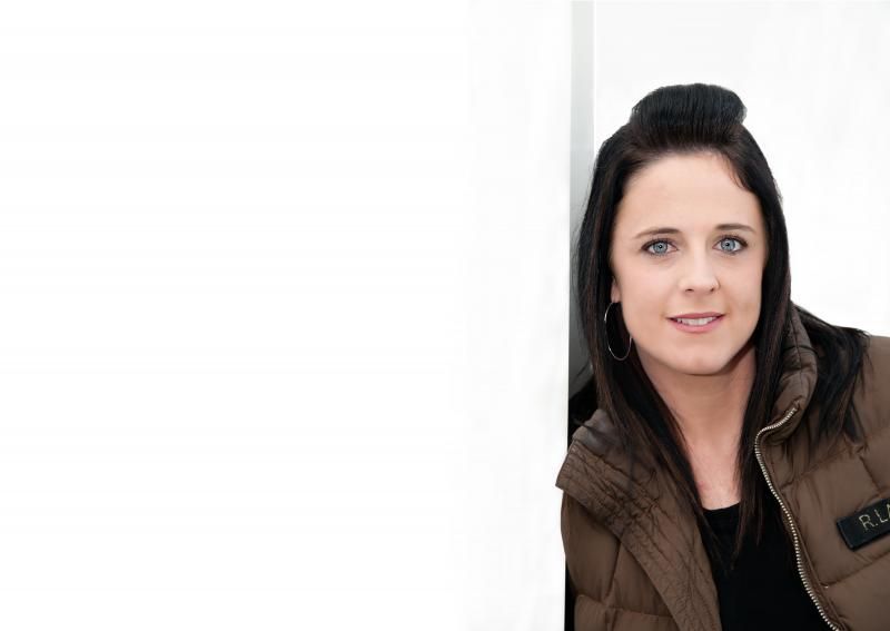
Portrait of a pastorHi Folks, long time no post. Kids have kept me very busy lately plus i've been busy with my photography. I was recently asked to do a christian Pastors photos for a web site (Sister), I am pretty happy with how they've turned out and I would love to know what you guys thought and if there is anything else I can do to improve either of them.Just worth noting is that it was requested that the images had negative space to the left. I've been looking over loads of the IRC and flip there have been some spectacular images posted since my last visit...... hope everyone is well and keeping busy.
Kristen   2 x Fuji xt1,vg-xt1 grip, Fujinon xf 18-55mm 2.8-4, Fujinon xf 14mm, Fujinon 56mm 1.2.
Portrait of a pastorThe first is wonderful. The negative space is brilliant. For me there is a tad too much chopped off her body in the second. Really like the idea though.
EM1 l 7.5 l 12-40 l 14 l 17 l 25 l 45 l 60 l 75 l AW1 l V3
Re: Portrait of a pastorI guess the left space needs to be there for
some particular caption. The first photo is very good, but it pixilates a bit around your subject and I am assuming that it will not happen in a larger uncompressed version of the same. As far as the second, I tend to agree with the comment above that we should see more of the subject. I like how you managed to capture her pleasant smile, her beautiful eyes and relaxed posture.
Re: Portrait of a pastorOk so my 5c worth...
The first image is spot on for what you are after... nice soft shadows and just the right amount of colour variation on the background to keep it from being too flat... and nice relaxed pose from the model. The second shot doesn't work however. I think you needed some reflection below/left to soften the jawline... that's something not so easy to sort in post. In post you could look to have her fill the frame more top to bottom and remove the other artifacts (wall?, shadow etc)... unless that all forms some part of the final composition you're not showing us yet? Photography is not a crime, but perhaps my abuse of artistic license is?
Re: Portrait of a pastorThanks guys for the comments, in particular the comments about the second image. I know she personally liked that particular image as it captured her eyes the way she had hoped for a close up. I do have another few images of her similar to that image with a little more body etc. Will go back and have a re look at them and see what I can get from them. The wall however was something she was naturally leaning against, it was literally only a 10cm corner to what purpose it served I had and still have no idea. So the actual white negative space wasn't added in post processing. On zooming in on the 1st image on my screen even at 300% there's no pixelation. It was shrunk for web so maybe the compression has done that zafra. I hope anyway!!
When I walked into her office I noticed the orange feature wall and thought to myself I really like colour and suggested we do some images against it, she was quite hesitant at first as she had always thought it was gastly but she trusted me and my preferences and dropped her shoulder for the pose as awkward as it was it worked and I am personally pleased with that 1st image. Thanks guys will post another image once completed a little PP just to tidy it up etc. 2 x Fuji xt1,vg-xt1 grip, Fujinon xf 18-55mm 2.8-4, Fujinon xf 14mm, Fujinon 56mm 1.2.
Re: Portrait of a pastorSo with the second image, given your Client has expressed her interest in it, I would do some PP to have her fill the frame vertically and just PP out the shadow edge of the wall.
The main issue I think is that the image just looks unfinished and some simple PP can deal with that. Don't waste an image that a Client likes on the strength of some silly photogs like us. Photography is not a crime, but perhaps my abuse of artistic license is?
Previous topic • Next topic
6 posts
• Page 1 of 1
|