Bronte Lines

Horizontal or Vertical...Moderators: Greg B, Nnnnsic, Geoff, Glen, gstark, Moderators
Forum rules
Please note that image critiquing is a matter of give and take: if you post images for critique, and you then expect to receive criticism, then it is also reasonable, fair and appropriate that, in return, you post your critique of the images of other members here as a matter of courtesy. So please do offer your critique of the images of others; your opinion is important, and will help everyone here enjoy their visit to far greater extent. Also please note that, unless you state something to the contrary, other members might attempt to repost your image with their own post processing applied. We see this as an acceptable form of critique, but should you prefer that others not modify your work, this is perfectly ok, and you should state this, either within your post, or within your signature. Images posted here should conform with the general forum guidelines. Image sizes should not exceed 950 pixels along the largest side (height or width) and typically no more than four images per post or thread. Please also ensure that you have a meaningful location included in your profile. Please refer to the FAQ for details of what "meaningful" is.
Previous topic • Next topic
12 posts
• Page 1 of 1
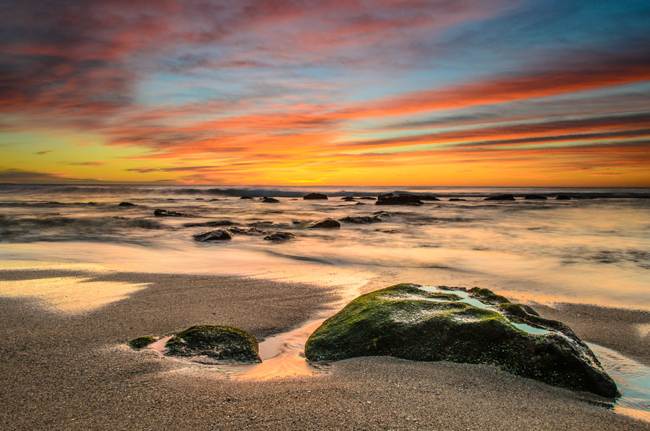
Horizontal or Vertical...Red Ribbons @ Bronte
 Bronte Lines  D600, D7000, Nikon/Sigma/Tamron Lenses, Nikon Flashes, Sirui/Manfrotto/Benro Sticks
Rodney - My Photo Blog Want: Fast Wide (14|20|24)
Re: Horizontal or Vertical...If you hadn't chopped that rock in the foreground, I'd have said Vertical. As it is, Meh.
Maybe a square crop out if the landscape. Greg
It's easy to be good... when there is nothing else to do
Re: Horizontal or Vertical...Vertical all the way.
Change the blacks a little. Looks slightly over tone mapped....
Re: Horizontal or Vertical...Vertical
Craig
Lifes journey is not to arrive at our grave in a well preserved body but, rather to skid in sideways, totally worn out, shouting, "Wow what a ride." D70s, D300, 70-300ED, 18-70 Kit Lens, Nikkor 105 Micro. Manfrotto 190Prob Ball head. SB800 x 2.
Re: Horizontal or Vertical...Thanks fellas
Note no tone mapping involved - this is a single RAW. I believe I did use Color Efex to add more crunchy detail via some selective Tonal Contrast for the vertical version D600, D7000, Nikon/Sigma/Tamron Lenses, Nikon Flashes, Sirui/Manfrotto/Benro Sticks
Rodney - My Photo Blog Want: Fast Wide (14|20|24)
Re: Horizontal or Vertical...Vertical
Chris
-------------------------------- I started my life with nothing and I’ve still got most of it left
Re: Horizontal or Vertical...as per my vote on gplus
landscape orientation ( so what did the masses prefer on gplus?
vertical when you enter the pub and horizontal is when you come out.. any further questions? gerry's photography journey
No amount of processing will fix bad composition - trust me i have tried.
Re: Horizontal or Vertical...I am going to vote landscape...you just get more of those beaut clouds and more leading lines
Cameron
Nikon F/Nikon 1 | Hasselblad V/XPAN| Leica M/LTM |Sony α/FE/E/Maxxum/M42 Wishlist Nikkor 24/85 f/1.4| Fuji Natura Black Scout-Images | Flickr | 365Project
Re: Horizontal or Vertical...Vertical. It has more energy, more power. The landscape stretches out too far and becomes placid.
Regards
Matt. K
Re: Horizontal or Vertical...
It's not exactly a scientific or fair comparison since I posted them separately - the landscape one day and the vert a couple days later but the raw stats show: Landscape: 208 +1's, 19 Reshares, 44 Comments & 5715 Views Vertical: 294 +1's, 28 Reshares, 60 Comments & 7782 Views so I guess that would be a win for vertical? D600, D7000, Nikon/Sigma/Tamron Lenses, Nikon Flashes, Sirui/Manfrotto/Benro Sticks
Rodney - My Photo Blog Want: Fast Wide (14|20|24)
Re: Horizontal or Vertical...
Thanks Cam
Thanks Matt so my rough feeling is about 50/50 D600, D7000, Nikon/Sigma/Tamron Lenses, Nikon Flashes, Sirui/Manfrotto/Benro Sticks
Rodney - My Photo Blog Want: Fast Wide (14|20|24)
Previous topic • Next topic
12 posts
• Page 1 of 1
|