|
Got a thin skin? Then look elsewhere. Post a link to an image that you've made, and invite others to offer their critiques. Honesty is encouraged, but please be positive in your constructive criticism. Flaming and just plain nastiness will not be tolerated. Please note that this is not an area for you to showcase your images, nor is this a place for you to show-off where you have been. This is an area for you to post images so that you may share with us a technique that you have mastered, or are trying to master. Typically, no more than about four images should be posted in any one post or thread, and the maximum size of any side of any image should not exceed 950 px.
Moderators: Greg B, Nnnnsic, Geoff, Glen, gstark, Moderators
Forum rules
Please note that image critiquing is a matter of give and take: if you post images for critique, and you then expect to receive criticism, then it is also reasonable, fair and appropriate that, in return, you post your critique of the images of other members here as a matter of courtesy. So please do offer your critique of the images of others; your opinion is important, and will help everyone here enjoy their visit to far greater extent.
Also please note that, unless you state something to the contrary, other members might attempt to repost your image with their own post processing applied. We see this as an acceptable form of critique, but should you prefer that others not modify your work, this is perfectly ok, and you should state this, either within your post, or within your signature.
Images posted here should conform with the general forum guidelines. Image sizes should not exceed 950 pixels along the largest side (height or width) and typically no more than four images per post or thread.
Please also ensure that you have a meaningful location included in your profile. Please refer to the FAQ for details of what "meaningful" is.
 by Remorhaz on Fri Mar 14, 2014 9:16 am by Remorhaz on Fri Mar 14, 2014 9:16 am
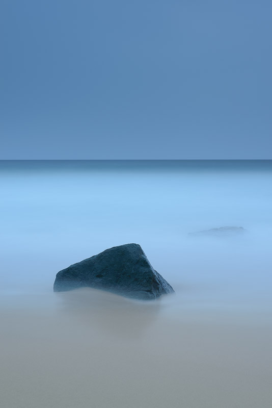
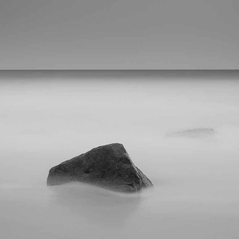
I was heading back along the coast towards Garie beach and the carpark after a very overcast and rainy morning shoot - I spied this rock in the sand out at the waters edge with the waves swishing back and forth past it and two smaller rocks behind which just peeked above the water every now and then as the waves receded. I'd for some time wanted to shoot a super simplified seascape scene and this looked reasonably close to what I had envisioned in my mind. So it was out with my gear again and setup for the shot. ISO 50 and 247 seconds later - Lee 0.6 grad and a Lee BigStopper we have Garie Simplified  This one is nearly straight out of camera with only some minor adjustments in post - I didn't want to mess with the very low contrast feel and the very simple subtle look I also did a sort of fine art square monochrome rendition - I'd be interested to see which you might prefer (I have my own thoughts)  D600, D7000, Nikon/Sigma/Tamron Lenses, Nikon Flashes, Sirui/Manfrotto/Benro SticksRodney - My Photo BlogWant: Fast Wide (14|20|24)
-

Remorhaz
- Senior Member
-
- Posts: 2547
- Joined: Thu Apr 29, 2010 8:14 pm
- Location: Sydney - Lower North Shore - D600
-
 by the foto fanatic on Fri Mar 14, 2014 9:31 am by the foto fanatic on Fri Mar 14, 2014 9:31 am
What a lovely image. Well planned, spotted and set up.
I do like #1, but I feel that #2 is far better. The conversion and the crop really finish the photograph off IMO.
Excellent work.
-

the foto fanatic
- Moderator
-
- Posts: 4212
- Joined: Tue Aug 24, 2004 7:53 pm
- Location: Teneriffe, Brisbane
-
 by bigsarg7 on Fri Mar 14, 2014 12:09 pm by bigsarg7 on Fri Mar 14, 2014 12:09 pm
Well done, I personally like #1 for the moodiness and the colour. Which in my opinion make the image quite mystical to me. I've actually been after something in a similar colour tone to use as an acrylic or canvas for my new house. Will have to speak to my husband and see what he thinks but if your willing to let me get it printed (with your watermarks ) to hang in a prime location in my house i'd love it! The only thing that bothers me is that subtle rock behind the main rock, it distracts my eye but overall i love the whole thirds you've got happening colour wise. Well done again!
2 x Fuji xt1,vg-xt1 grip, Fujinon xf 18-55mm 2.8-4, Fujinon xf 14mm, Fujinon 56mm 1.2.
-

bigsarg7
- Senior Member
-
- Posts: 667
- Joined: Tue Oct 21, 2008 2:11 pm
- Location: Goulburn Valley (Victoria, Australia)
 by Matt. K on Fri Mar 14, 2014 5:42 pm by Matt. K on Fri Mar 14, 2014 5:42 pm
The colour image is very interesting. I have never seen a horizon that demands so much attention from the viewer before. It's almost as if the horizon IS the main element of the image. The rock is beautiful In its own right.....but I can't help thinking a splash of dark red somewhere in the image wouldn't have lifted it to a higher plane. A rose floating in the water...or something similar.
As usual from you...beautiful work!
Regards
Matt. K
-

Matt. K
- Former Outstanding Member Of The Year and KM
-
- Posts: 9981
- Joined: Mon Sep 06, 2004 7:12 pm
- Location: North Nowra
 by zafra52 on Fri Mar 14, 2014 8:21 pm by zafra52 on Fri Mar 14, 2014 8:21 pm
I agree with the above comments. The first photo is superb on account of the colours.
The B&W version wins because of the composition. So, why don't you create a colour
version of the B&W? It's the type of picture that exudes serenity and peace of mind.
-

zafra52
- Senior Member
-
- Posts: 4893
- Joined: Thu Dec 01, 2005 10:22 pm
- Location: Brisbane
 by colin_12 on Fri Mar 14, 2014 8:53 pm by colin_12 on Fri Mar 14, 2014 8:53 pm
I like the first image. It has something unreal about it.
Regards Colin
Cameras, lenses and a lust for life
-

colin_12
- Senior Member
-
- Posts: 1853
- Joined: Thu Jan 04, 2007 7:10 pm
- Location: Hazelbrook
 by ozimax on Fri Mar 14, 2014 11:24 pm by ozimax on Fri Mar 14, 2014 11:24 pm
Rodney, the first (colour) image is un-bloomin-believable. It is wonderful. I spent many youthful years travelling to Garie beach on Saturdays and indeed the RNP, but I never envisaged something like this.
Your work never ceases to amaze and inspire.
Ozi.
President, A.A.A.A.A (Australian Association Against Acronym Abuse)
Canon EOS R6, RF 24-105 F4, RF 70-200 F4, RF 35mm F1.8, RF 16mm F2.8
"And ye shall know the truth, and the truth shall make you free." (John 8:32)
-

ozimax
- Senior Member
-
- Posts: 5289
- Joined: Wed Jan 05, 2005 11:58 am
- Location: Coffs Harbour, NSW
 by Geoff M on Sat Mar 15, 2014 6:46 am by Geoff M on Sat Mar 15, 2014 6:46 am
Both have merit and I struggle to choose one over the other, I do think that Zafra is onto something in his suggestions.
Geoff
-

Geoff M
- Senior Member
-
- Posts: 1225
- Joined: Sat Jun 18, 2005 10:54 pm
- Location: Tamborine Mountain QLD.
 by Remorhaz on Sat Mar 15, 2014 4:46 pm by Remorhaz on Sat Mar 15, 2014 4:46 pm
Thankyou everyone Zafra (and others) - are you suggesting a square crop of the colour one (same framing as the B&W)? A rose in the water would have been tricky (with a 250 second exposure)  but I hear what you're saying (the dark rock was meant to be the counterpoint tho) bigsarg - fyi the rock behind should be trivial to clone out D600, D7000, Nikon/Sigma/Tamron Lenses, Nikon Flashes, Sirui/Manfrotto/Benro SticksRodney - My Photo BlogWant: Fast Wide (14|20|24)
-

Remorhaz
- Senior Member
-
- Posts: 2547
- Joined: Thu Apr 29, 2010 8:14 pm
- Location: Sydney - Lower North Shore - D600
-
Return to Image Reviews and Critiques
|


