|
Got a thin skin? Then look elsewhere. Post a link to an image that you've made, and invite others to offer their critiques. Honesty is encouraged, but please be positive in your constructive criticism. Flaming and just plain nastiness will not be tolerated. Please note that this is not an area for you to showcase your images, nor is this a place for you to show-off where you have been. This is an area for you to post images so that you may share with us a technique that you have mastered, or are trying to master. Typically, no more than about four images should be posted in any one post or thread, and the maximum size of any side of any image should not exceed 950 px.
Moderators: Greg B, Nnnnsic, Geoff, Glen, gstark, Moderators
Forum rules
Please note that image critiquing is a matter of give and take: if you post images for critique, and you then expect to receive criticism, then it is also reasonable, fair and appropriate that, in return, you post your critique of the images of other members here as a matter of courtesy. So please do offer your critique of the images of others; your opinion is important, and will help everyone here enjoy their visit to far greater extent.
Also please note that, unless you state something to the contrary, other members might attempt to repost your image with their own post processing applied. We see this as an acceptable form of critique, but should you prefer that others not modify your work, this is perfectly ok, and you should state this, either within your post, or within your signature.
Images posted here should conform with the general forum guidelines. Image sizes should not exceed 950 pixels along the largest side (height or width) and typically no more than four images per post or thread.
Please also ensure that you have a meaningful location included in your profile. Please refer to the FAQ for details of what "meaningful" is.
 by Remorhaz on Fri Jun 06, 2014 5:26 pm by Remorhaz on Fri Jun 06, 2014 5:26 pm
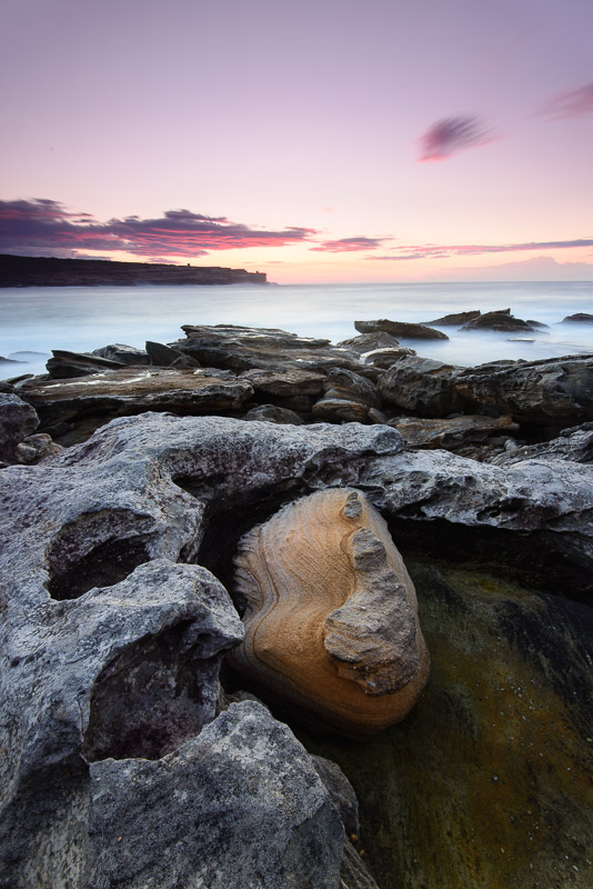
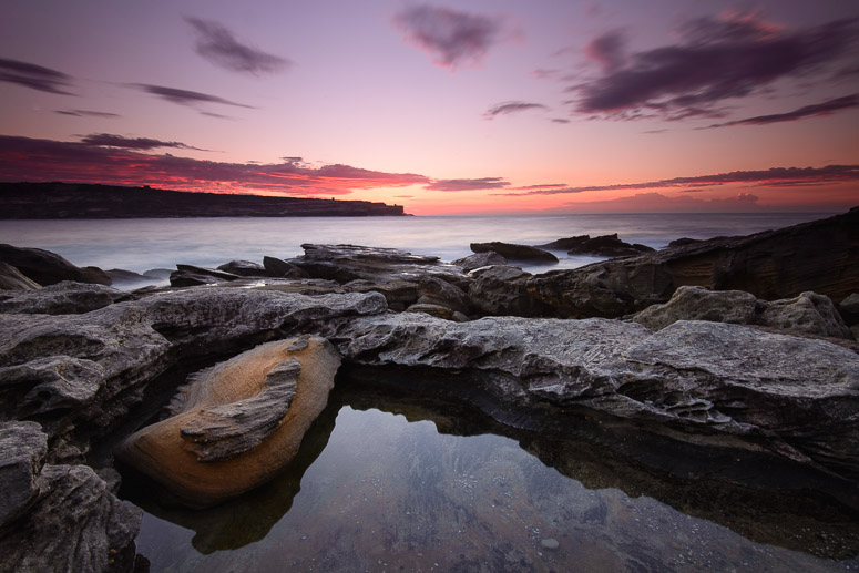
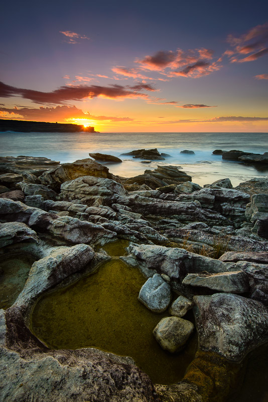
Gerry - this was that session at Long Bay (next to the Golf Course) at Malabar we'd kind of impromptu planned the night before a couple weeks back Unfortunately Gerry had a bit of a family emergency and couldn't make it but I was up and there so I figured I'd see how I'd go - the clouds were looking a little non-existent but you never know... Locked  We're just about on sunrise just over behind the headland on the other side of Long Bay here The Wedge  and then I went in search of another pool for some foreground interest. Here with the suns rays peeking over the far headland of Malabar Long Rays  With the image above I was playing around with focus stacking landscapes - I'd taken three shots at f/9 - one focused for the immediate close foreground, another for the rocks in the mid distance and the final shot for the far headland and horizon (infinity). In photoshop I layered the three images and manually blended them using layer masks Personally I'm not sure it did much better than just taking the single frame at f/11 - f/16 at this focal length but it's goot to experiement and I was also able to get a little more DR by also adjusting the exposure across the frames too (even with the use of a 3 stop reverse grad as I was using here) D600, D7000, Nikon/Sigma/Tamron Lenses, Nikon Flashes, Sirui/Manfrotto/Benro SticksRodney - My Photo BlogWant: Fast Wide (14|20|24)
-

Remorhaz
- Senior Member
-
- Posts: 2547
- Joined: Thu Apr 29, 2010 8:14 pm
- Location: Sydney - Lower North Shore - D600
-
 by biggerry on Thu Jun 12, 2014 1:48 pm by biggerry on Thu Jun 12, 2014 1:48 pm
Hm, i think the place I was referring to was a bit further round the golf course, in any case, i think i like the last image the best, I am a sucker for images with a nice pool/puddle in foreground and in this case the sky has some nice interest. Dunno whether the focus stacking has achieved much, at this low resolution you will never notice imo. I do have a shot from a recent session where the sand ripples in the foreground are slightly OOF and suspect this could have been a candidate for focus stacking. With the last image, try and adjust the colour balance on the lower portion of the frame, it feels like it has a greenish cast to it. FYI tickles is better, albeit still blowing out lots of snot. 
-

biggerry
- Senior Member
-
- Posts: 5930
- Joined: Tue May 13, 2008 12:40 am
- Location: Under the flight path, Newtown, Sydney
-
Return to Image Reviews and Critiques
|
