LighthouseModerators: Greg B, Nnnnsic, Geoff, Glen, gstark, Moderators
Forum rules
Please note that image critiquing is a matter of give and take: if you post images for critique, and you then expect to receive criticism, then it is also reasonable, fair and appropriate that, in return, you post your critique of the images of other members here as a matter of courtesy. So please do offer your critique of the images of others; your opinion is important, and will help everyone here enjoy their visit to far greater extent. Also please note that, unless you state something to the contrary, other members might attempt to repost your image with their own post processing applied. We see this as an acceptable form of critique, but should you prefer that others not modify your work, this is perfectly ok, and you should state this, either within your post, or within your signature. Images posted here should conform with the general forum guidelines. Image sizes should not exceed 950 pixels along the largest side (height or width) and typically no more than four images per post or thread. Please also ensure that you have a meaningful location included in your profile. Please refer to the FAQ for details of what "meaningful" is.
Previous topic • Next topic
6 posts
• Page 1 of 1
LighthouseNikon D7100/D7200, Nikkor 18-55, Nikkor 55-300, Nikkor 30, Nikkor 105 macro, Nikkor 10 - 24, Tokina 11 - 16, Tamron 150-600mm, SB600, Misc other
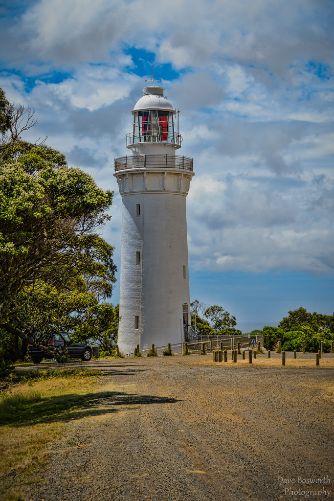
Re: LighthouseVery nice photograph. I would be tempted to crop a little of the empty foreground out, and maybe take care not to over sharpen your digital images.
   Regards
Matt. K
Re: Lighthouse
Thanks, what gives the impression of over sharpen, just so i know what im looking for. I think this image was given a treatment in Topaz, could that be what has given the over sharpen look ? Nikon D7100/D7200, Nikkor 18-55, Nikkor 55-300, Nikkor 30, Nikkor 105 macro, Nikkor 10 - 24, Tokina 11 - 16, Tamron 150-600mm, SB600, Misc other
Re: LighthouseI tend to agree with Matt.
Re: LighthouseOver sharpened images tend to look 'hard' and have a false 'magazine' style presentation that just doesn't look natural. It is a major fault for new comers to photography. I think your image is just borderline in this respect....remeber, it is possible to sharpen just a few of the elements in your picture to attract the eye whilst leaving other areas such as clouds or trees a little softer. Over sharpening digital images is sooo easy to do and I have been guilty of it myself and need to remind myself to back off a little.
This is just my personal opinion. Regards Matt. K Regards
Matt. K
Re: Lighthouse
thats good advice... Dave, I think the Topaz filter/preset which also looks like clarity or tonal contrast tweaking has contributed here, look at the horizon on teh right and you can see soft haloing... also on the lighthouse structure, see the different 'coloured' or tonal whites. The Topaz / presets are good, but you need to watch them to ensure you don't head into that 'crunchy' stage since this is when you have heaps of detail and and heaps of dynamic range but the image ends up looking flat, often since there is no light and dark to the image. in terms of sharpening... look for a white halo line close to edges of objects, a sure sign of too much on the sharpener.... hth gerry's photography journey
No amount of processing will fix bad composition - trust me i have tried.
Previous topic • Next topic
6 posts
• Page 1 of 1
|

