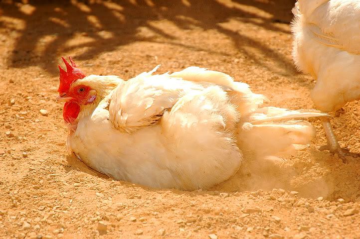
D70 + kit lens.
Chicken RunModerators: Greg B, Nnnnsic, Geoff, Glen, gstark, Moderators
Forum rules
Please note that image critiquing is a matter of give and take: if you post images for critique, and you then expect to receive criticism, then it is also reasonable, fair and appropriate that, in return, you post your critique of the images of other members here as a matter of courtesy. So please do offer your critique of the images of others; your opinion is important, and will help everyone here enjoy their visit to far greater extent. Also please note that, unless you state something to the contrary, other members might attempt to repost your image with their own post processing applied. We see this as an acceptable form of critique, but should you prefer that others not modify your work, this is perfectly ok, and you should state this, either within your post, or within your signature. Images posted here should conform with the general forum guidelines. Image sizes should not exceed 950 pixels along the largest side (height or width) and typically no more than four images per post or thread. Please also ensure that you have a meaningful location included in your profile. Please refer to the FAQ for details of what "meaningful" is.
Previous topic • Next topic
8 posts
• Page 1 of 1
Chicken Run
D70 + kit lens.
Hi
Hi Can't agree with you more. It's burn out highlights. Didn't notice it cos our eyes adapt so very effectively. regards, Arthur
Great pic
I'll have fries with that...
I like the shot but agree with the highlights problem. It's something that I always manage to do in my photos as well. I think I'll have to spot-meter more areas before deciding on the exposure. Simon
D300 l MB-D10 l D70 l SB-800 l 70-200 VR l TC 17-E l 18-70 f3.5-4.5 l 70-300 f4-5.6 l 50 f1.4 l 90 Macro f2.8 l 12-24 f4 http://www.redbubble.com/people/manta
There is certainly a cast in this pic and would suggest using selective colour in PS (image - adjustments - selective colour). Select white and adjust Cyan, Magenta and yellow to 0. See how it looks.
Chris
-------------------------------- I started my life with nothing and I’ve still got most of it left
Hi
It was this colour cast that I saw that made me took the picture. The mood that I was trying to convey was the warm, hot spa (soil bath) that it was enjoying. regards, Arthur
You can take one big step in the right direction by simply using PS Auto Color. Image>Adjustments>Auto Color. It doesn't make the color perfect in this case, but it certainly does push this image in the right direction with an absolute minimum of fuss. The KISS principle, you know.
Hard work pays off in the future. Laziness pays off now.
Previous topic • Next topic
8 posts
• Page 1 of 1
|