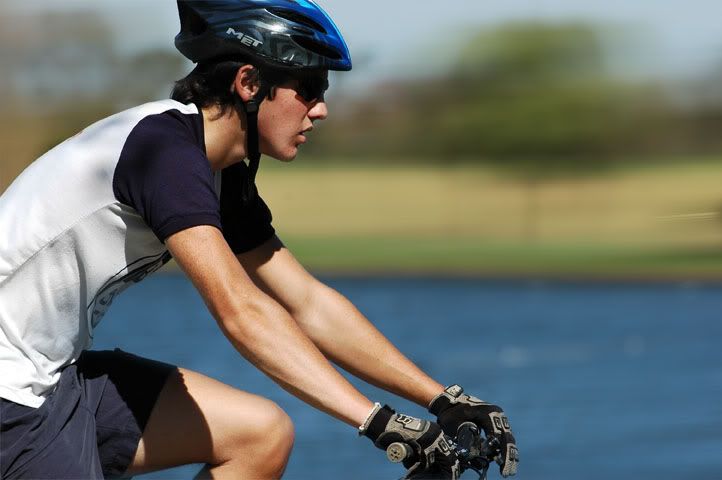
Photoshop - motion blurr applied to the background.
D70 + AFS 300F4. Handheld.
CyclistModerators: Greg B, Nnnnsic, Geoff, Glen, gstark, Moderators
Forum rules
Please note that image critiquing is a matter of give and take: if you post images for critique, and you then expect to receive criticism, then it is also reasonable, fair and appropriate that, in return, you post your critique of the images of other members here as a matter of courtesy. So please do offer your critique of the images of others; your opinion is important, and will help everyone here enjoy their visit to far greater extent. Also please note that, unless you state something to the contrary, other members might attempt to repost your image with their own post processing applied. We see this as an acceptable form of critique, but should you prefer that others not modify your work, this is perfectly ok, and you should state this, either within your post, or within your signature. Images posted here should conform with the general forum guidelines. Image sizes should not exceed 950 pixels along the largest side (height or width) and typically no more than four images per post or thread. Please also ensure that you have a meaningful location included in your profile. Please refer to the FAQ for details of what "meaningful" is.
Previous topic • Next topic
5 posts
• Page 1 of 1
I agree with Mic. You did very well on the background. Nice shot.
my gallery of so-so photos
http://www.pbase.com/kerrypierce/
HiThanks.
I did the following in Photoshop:- 1. duplicate the picture into another layer. 2. lasso out the background and select "feathering" at 10 pixels 3. copy and paste the background into a new layer. 4. applied motion blurr to the background 5. move the duplicated picture to the top of all the other layers 6. set the "fill" to about 20 - 30 % 7. select the background layer 7. use the "eraser" tool to remove overlapping blurr on the cyclist from the background layer. regards, Arthur
Previous topic • Next topic
5 posts
• Page 1 of 1
|