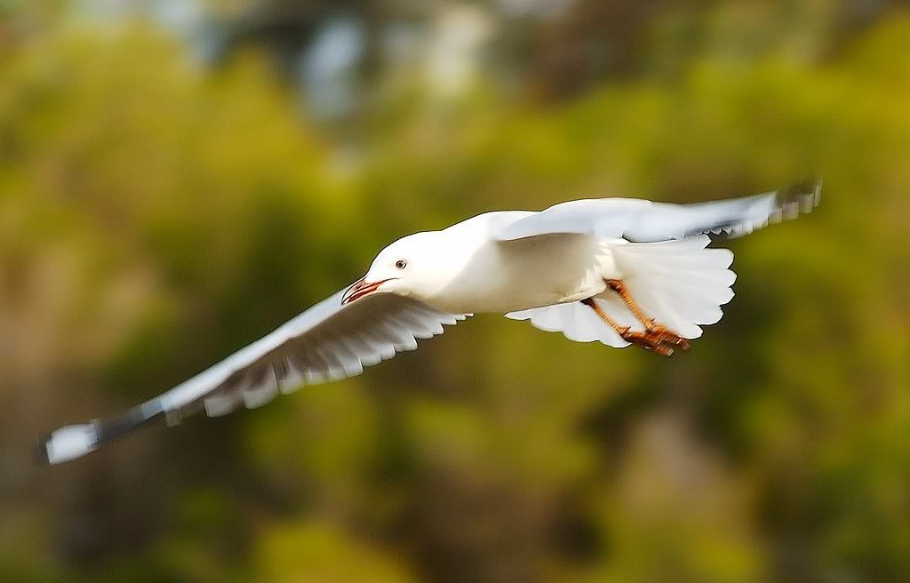
D70 + AFS 300F4.
Sudden StopModerators: Greg B, Nnnnsic, Geoff, Glen, gstark, Moderators
Forum rules
Please note that image critiquing is a matter of give and take: if you post images for critique, and you then expect to receive criticism, then it is also reasonable, fair and appropriate that, in return, you post your critique of the images of other members here as a matter of courtesy. So please do offer your critique of the images of others; your opinion is important, and will help everyone here enjoy their visit to far greater extent. Also please note that, unless you state something to the contrary, other members might attempt to repost your image with their own post processing applied. We see this as an acceptable form of critique, but should you prefer that others not modify your work, this is perfectly ok, and you should state this, either within your post, or within your signature. Images posted here should conform with the general forum guidelines. Image sizes should not exceed 950 pixels along the largest side (height or width) and typically no more than four images per post or thread. Please also ensure that you have a meaningful location included in your profile. Please refer to the FAQ for details of what "meaningful" is.
Previous topic • Next topic
10 posts
• Page 1 of 1
Sudden Stop
D70 + AFS 300F4.
Arthur,
I'm puzzled by OnePutt's comment; the head looks oversharpened to me. Have you been messing around in PS and not telling anyone? g.
Gary Stark Nikon, Canon, Bronica .... stuff The people who want English to be the official language of the United States are uncomfortable with their leaders being fluent in it - US Pres. Bartlet
HI
Hi Garry, Yes, I did apply USM in Nikon Capture. The camera's AF could not keep up with the speed of the Seaqull coming down. Yes, only a part of the Seaqull's body is in focus. It was taken about 5pm under cloudy conditions - I could use faster shutter speed if it were brighter. regards, Arthur
What ISO did you use?
Nice photo. The blurred motion gives it a sense of movement so don't get caught up that it wasn't too in focus
Hi
It was ISO 200. Yeap - the focus wasn't good. I'm looking forward to more practice sessions. Arthur.
Arthur,
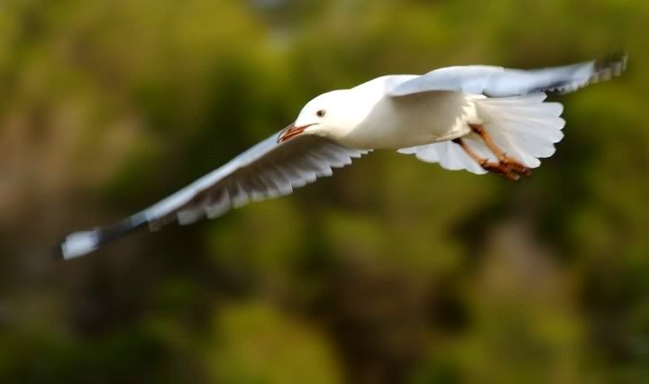
Would you like to also post an unsharpened version of this? The motion in the wings is great, and while I suspect the image may be a tad OOF, I'm not yet convinced that being OOF would be to it's detriment. Consider this one, for instance. Hopelessly OOF, but to me, it works. g.
Gary Stark Nikon, Canon, Bronica .... stuff The people who want English to be the official language of the United States are uncomfortable with their leaders being fluent in it - US Pres. Bartlet
Arthur - I see a an interesting shot - the head appears to be sharp to me but what I really like is the 3D effect on the leading edge of the wings - I like
Chris
-------------------------------- I started my life with nothing and I’ve still got most of it left
Hi Garry, here it is. 
regards, Arthur
Previous topic • Next topic
10 posts
• Page 1 of 1
|