Hovering

Got a thin skin? Then look elsewhere. Post a link to an image that you've made, and invite others to offer their critiques. Honesty is encouraged, but please be positive in your constructive criticism. Flaming and just plain nastiness will not be tolerated. Please note that this is not an area for you to showcase your images, nor is this a place for you to show-off where you have been. This is an area for you to post images so that you may share with us a technique that you have mastered, or are trying to master. Typically, no more than about four images should be posted in any one post or thread, and the maximum size of any side of any image should not exceed 950 px.

Moderators: Greg B, Nnnnsic, Geoff, Glen, gstark, Moderators

Forum rules
Please note that image critiquing is a matter of give and take: if you post images for critique, and you then expect to receive criticism, then it is also reasonable, fair and appropriate that, in return, you post your critique of the images of other members here as a matter of courtesy. So please do offer your critique of the images of others; your opinion is important, and will help everyone here enjoy their visit to far greater extent.

Also please note that, unless you state something to the contrary, other members might attempt to repost your image with their own post processing applied. We see this as an acceptable form of critique, but should you prefer that others not modify your work, this is perfectly ok, and you should state this, either within your post, or within your signature.

Images posted here should conform with the general forum guidelines. Image sizes should not exceed 950 pixels along the largest side (height or width) and typically no more than four images per post or thread.

Please also ensure that you have a meaningful location included in your profile. Please refer to the FAQ for details of what "meaningful" is.

Hovering

Postby yeocsa on Wed Apr 20, 2005 2:17 pm

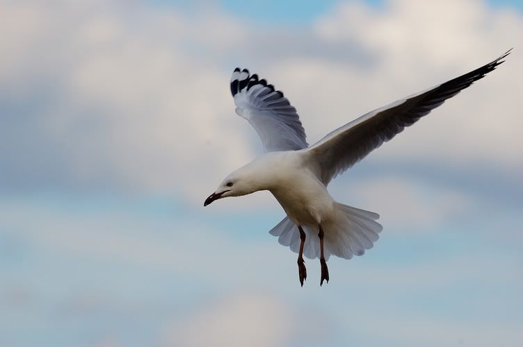
This one is easier to capture as it was "hovering".

Image

regards,

Arthur
D70, AFS 300F4
yeocsa
Senior Member
 
Posts: 966
Joined: Fri Oct 15, 2004 12:04 pm
Location: Melbourne

Postby agriffiths on Wed Apr 20, 2005 2:23 pm

Nice posture! Looks like it's ready for the kill :twisted: Did you take that hand held?
Looks like you might have a spec of dust on either you lens or your CCD. Just above the birds head.
User avatar
agriffiths
Member
 
Posts: 445
Joined: Fri Mar 11, 2005 1:11 pm
Location: Melbourne / Canberra

HI

Postby yeocsa on Wed Apr 20, 2005 2:26 pm

agriffiths wrote:Nice posture! Looks like it's ready for the kill :twisted: Did you take that hand held?
Looks like you might have a spec of dust on either you lens or your CCD. Just above the birds head.


Yes, shot was handheld. There are quite a few spots - big and small on the CCD. :)

regards,

Arthur
yeocsa
Senior Member
 
Posts: 966
Joined: Fri Oct 15, 2004 12:04 pm
Location: Melbourne

Postby KerryPierce on Wed Apr 20, 2005 2:30 pm

Nice shot, Arthur. Sharp with good DOF. :D Looks a notch dark on my monitor though.
my gallery of so-so photos
http://www.pbase.com/kerrypierce/
User avatar
KerryPierce
Senior Member
 
Posts: 1233
Joined: Wed Mar 16, 2005 5:20 pm
Location: Detroit, MI

Hi

Postby yeocsa on Wed Apr 20, 2005 2:32 pm

KerryPierce wrote:Nice shot, Arthur. Sharp with good DOF. :D Looks a notch dark on my monitor though.


Hi

Thanks. Yes it is slightly underexposed. Would be better if i have the flash on.

regards,

Arthur.
yeocsa
Senior Member
 
Posts: 966
Joined: Fri Oct 15, 2004 12:04 pm
Location: Melbourne


Return to Image Reviews and Critiques