HellModerators: Greg B, Nnnnsic, Geoff, Glen, gstark, Moderators
Forum rules
Please note that image critiquing is a matter of give and take: if you post images for critique, and you then expect to receive criticism, then it is also reasonable, fair and appropriate that, in return, you post your critique of the images of other members here as a matter of courtesy. So please do offer your critique of the images of others; your opinion is important, and will help everyone here enjoy their visit to far greater extent. Also please note that, unless you state something to the contrary, other members might attempt to repost your image with their own post processing applied. We see this as an acceptable form of critique, but should you prefer that others not modify your work, this is perfectly ok, and you should state this, either within your post, or within your signature. Images posted here should conform with the general forum guidelines. Image sizes should not exceed 950 pixels along the largest side (height or width) and typically no more than four images per post or thread. Please also ensure that you have a meaningful location included in your profile. Please refer to the FAQ for details of what "meaningful" is.
Previous topic • Next topic
10 posts
• Page 1 of 1
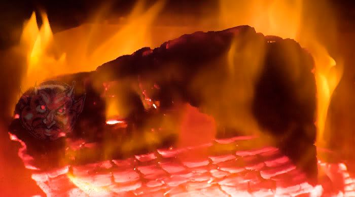
Is this the result of lust after death?
Birddog114
VNAF, My Beloved Country and Airspace
Interesting shot, Philip
http://wolfeyes.com.au Tactical Torches - Tactical Flashlights Police torch rechargeable torch military torch police military HID surefire flashlight LED torch tactical torch rechargeable wolf eyes flashlight surefire torch wolf eyes tactical torchpolice torch
Thank You
Nice composition, but it looks far too comfortable and cozy to be Hell
Cheers, John
Leek@Flickr | Leek@RedBubble | Leek@DeviantArt D700; D200; Tokina 12-24; Nikkor 50mm f1.4,18-70mm,85mm f1.8, 105mm,80-400VR, SB-800s; G1227LVL; RRS BH-55; Feisol 1401
Nice image, but the Satan-like image floating over the top is too strong, I think... I also think the edges of that image need to blend more into the background.
Producer & Editor @ GadgetGuy.com.au
Contributor for fine magazines such as PC Authority and Popular Science.
I like it, I like it alot, but I must agree with Nnnnsic's comments about about the "Satan like image". A tad too overdone? Maybe that image needs to be more subtle
I know nutzinc
You guys are right about the little devil's face. Blame it on my sitting posture, when I recline with my feet on the desk, the angle of the LCD screen renders the image different to when I sit up, I got to remember to stop editing photos with my feet on the desk.
__________
Phillip **Nikon D7000**
You only get to do that when you use a CRT.
Producer & Editor @ GadgetGuy.com.au
Contributor for fine magazines such as PC Authority and Popular Science.
Previous topic • Next topic
10 posts
• Page 1 of 1
|

